For such an outstanding broad based rally by the overall market, I found the rally size was pretty small in the Commodities pillar of the market.
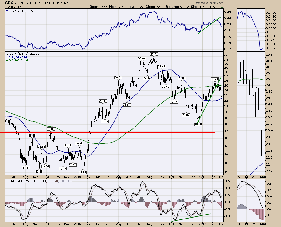
The Gold stocks (GDX) rallied 1/2%. While a rally is great, when it underperforms the broad index rally by less than 1/2 the size, it is a bit underwhelming. The 50 DMA has been nice support and resistance for the Gold Miners for over a year. Today was a bounce off the 50 DMA. Perhaps its the start of a new rally. If it had led the market today, that would have been a little better clue. At this point, it looks more like it got dragged upward with the market.
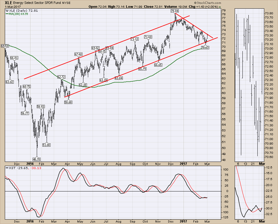
The Energy stocks tried to bounce off the uptrending channel. The XLE bounced 2.00% which was above the broad market index returns of ~ 1.5% today. Friday it looked like it was going to sell off, Today's big surge shows it testing the 2-month trend line. Stay tuned.
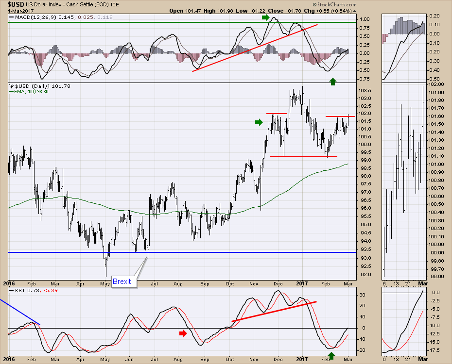
 The bigger play in my review today was the $USD surge to 7-week highs. While there is still potential for a small head/shoulder topping structure with 99.2 as the neckline, the break today pushed to fresh highs for the right shoulder.
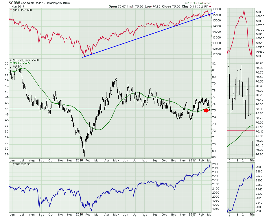
 The Canadian Dollar ($CDW) had a terrible day Tuesday, March 1. The price of $WTIC correlates pretty well to the Canadian Dollar ($CDW). This currency action would suggest some weakness may hit the price of oil.
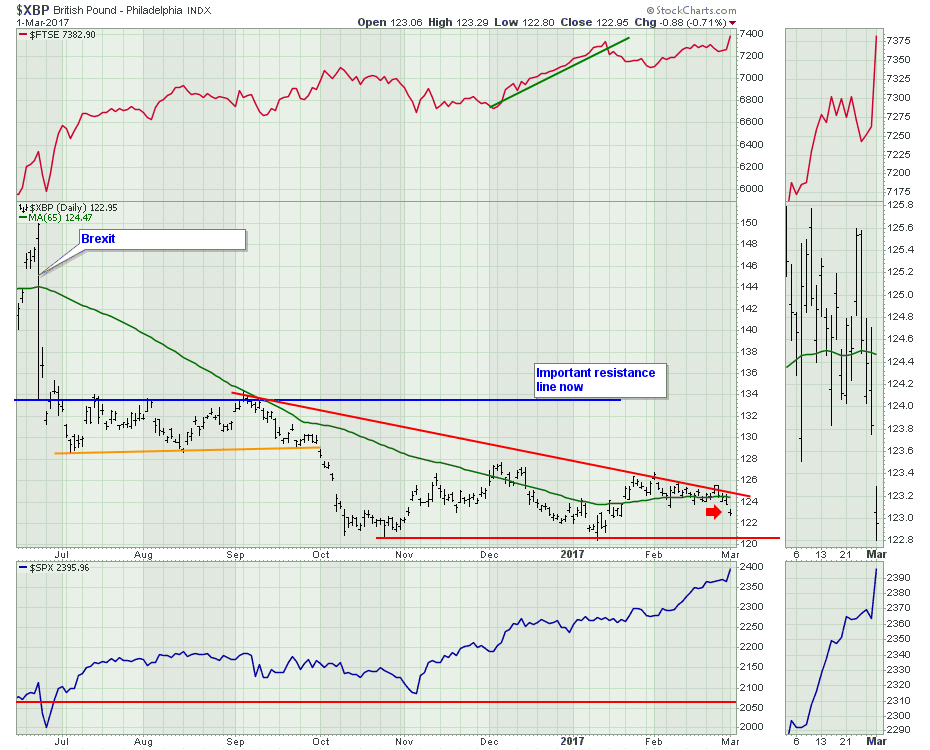
 The Australian dollar didn't fall as hard, but the British Pound ($XBP) also lost support of the 65 DMA. The Pound fell to new 5-week lows and back below the 65 DMA. After consolidating for a month and looking like it might finally start to head higher, it was unable to break through horizontal resistance as well as the down trend. I would expect a firm test of 121 which has been support since the Trump Jump.
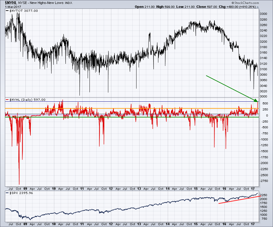
 I did post a rather spectacular chart on the webinar, which I reviewed quite thoroughly. The chart that was so spectacular is the $NYHL (New Highs - New Lows). It hit 597 on Monday. While that in itself does not sound too compelling, history suggests it is a huge outlier in over 30 years of data.
The red information in the centre of the chart shows the $NYHL levels since the 2009 lows. We achieved this 597 level in 2010 but we also had more companies or active stocks at 2010 by about 100. The black chart at the top plots the number of active listings on the NYSE. The market actually crested with that sudden surge in 2010 and pulled back for six months.
 On the Commodities Countdown weekly video review, I stretched the chart timeline back to the early 1980's to demonstrate how rare this high was. You can follow this link to see the recording.
Commodity Countdown With Greg Schnell 2017-03-02 from StockCharts.com on Vimeo.
In general, the Commodities are flashing warning signs everywhere. Year long trendlines are breaking, the stocks related to Commodities have pulled back significantly, and Asia is trading poorly. The rally in $USD is a headwind. But Transports, Airlines, and Trucking all confirmed fresh new highs. I am focused on the Shanghai chart to show some promise for the Commodities. If that does not happen, that's a big problem. After Commodities rolled over in 2014, the transports rolled over in early 2015 confirming the Commodities slowdown. We definitely are not seeing that yet in the Transports space right now so the damage appears to be limited to the Commodities related stocks.
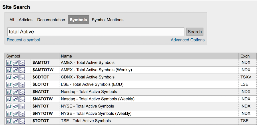
For the educational segment, I would like to focus on the indicators that show you the total number of active stock listings on the markets. I have shown one above, but we also have this for the NASDAQ, Amex, London, the Toronto Exchange and the Venture Exchange in Canada.
In the snapshot below, you can see the ticker symbols. For help, you can always use the search tool to look for any sort of 'total active' symbols as I have displayed below.
 Members will be able to look through these ticker symbols to see the change in stock listings over the past 30 years. Understanding the changes in the markets is so easily presented with graphs. If you are already a member for years, thank you for your continued business support. If you recently joined, we hope you are having success using tools on StockCharts.com. There are a lot of helpful videos and articles to help educate you on the breadth of the tools on site.
I am trying to write a series of educational articles inside each of my blogs on The Canadian Technician, The Commodities Countdown Blog, and Don't Ignore This Chart blog a couple of times a week. You can subscribe by clicking on the Notify me button at the bottom of each blog to help you find these educational hints and tricks.
If you would like to become a member, follow this link to sign up for a free one month trial.
Good trading,
Greg Schnell, CMT, MFTA.