Don't Ignore This Chart! August 31, 2011 at 06:30 PM
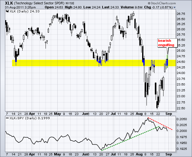
The Technology ETF (XLK) surged to its mid August high and formed a bearish engulfing. Resistance in this area is also marked by broken support. The bearish engulfing has yet to be confirmed though. Look for further weakness below 24 to confirm... Read More
Don't Ignore This Chart! August 30, 2011 at 06:22 PM
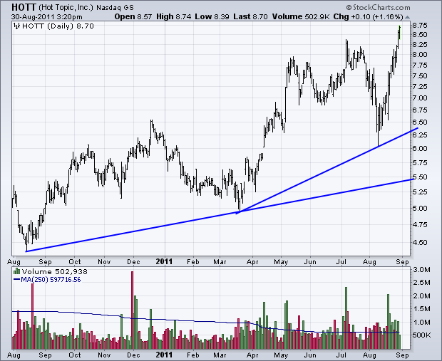
Looking for stocks that are still in favor? Just mosy over to the pre-defined scan page for a look at the stocks making fresh 52-week highs. There were over a dozen in the Nasdaq and over three dozen on the NYSE... Read More
Don't Ignore This Chart! August 29, 2011 at 07:06 PM
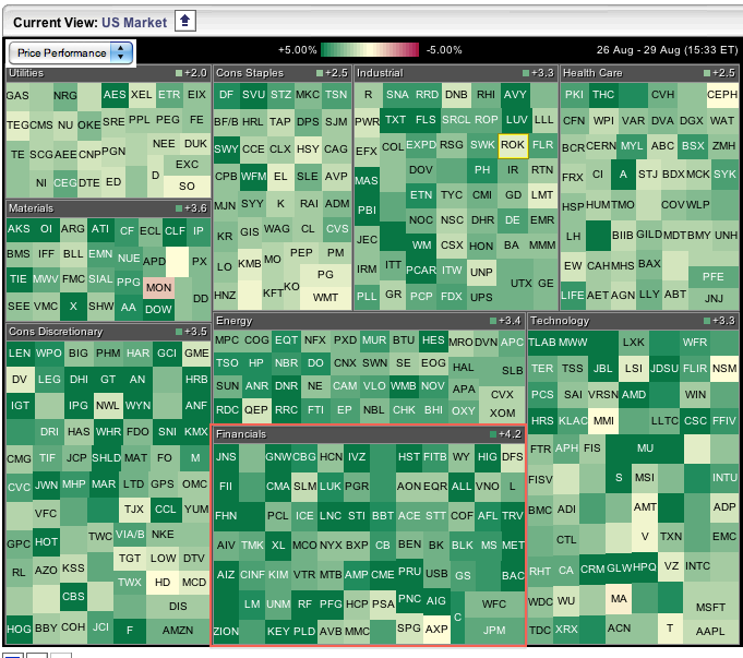
The Sector Carpet shows the finance sector leading the way higher with an aveage gain of 4.2%. Color-wise, this sector shows lots of dark green, which means many stocks were up sharply. The consumer discretionary was second with an average gain of 3.5%... Read More
Don't Ignore This Chart! August 26, 2011 at 03:53 PM
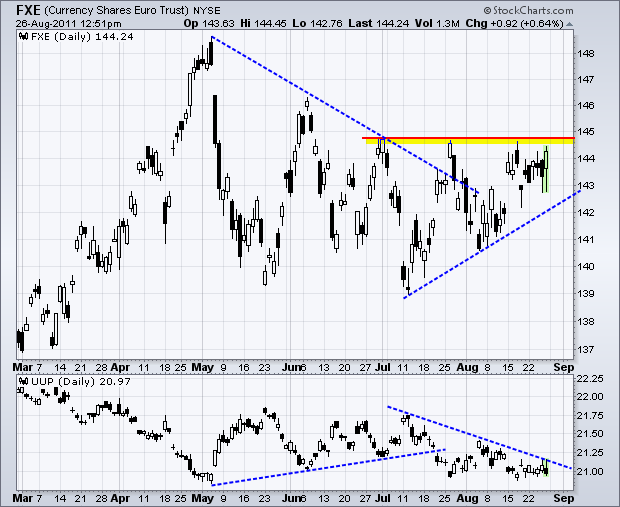
The Euro Currency Trust (FXE) seems to like what it heard from Fed Chairman Bernanke – and the Dollar did not like it. After dipping below 143 in the morning, FXE surged above 144 by mid day. The ETF is still just shy of a breakout... Read More
Don't Ignore This Chart! August 25, 2011 at 02:15 PM
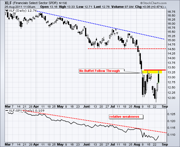
Thursday's announcement that Warren Buffet will invest $5 billion in Bank of America (BAC) sent the Finance SPDR (XLF) sharply higher on the open. XLF opened above 13 and surged above 13.2 in the morning. These gains quickly evaporated as sellers returned... Read More
Don't Ignore This Chart! August 24, 2011 at 09:09 PM
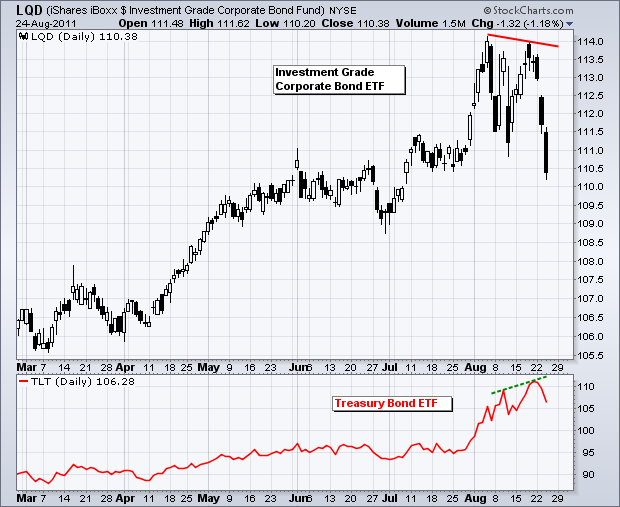
The Investment Grade Corporate Bond ETF (LQD) tumbled for the third straight day and broke below its August low. This ETF formed a lower high in late August as the 20+ year Bond ETF (TLT) formed a higher high (red line chart)... Read More
Don't Ignore This Chart! August 23, 2011 at 05:42 PM
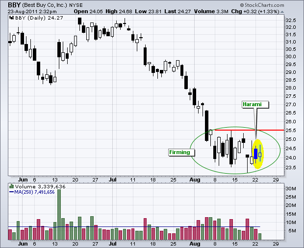
Best Buy (BBY) is attempting to base with several bullish candlesticks over the last two weeks. Most recently, a Harami is taking shape on Monday-Tuesday. Prior to this, BBY formed a Hammer on Thursday and an Inverted Hammer on Friday... Read More
Don't Ignore This Chart! August 22, 2011 at 06:57 PM
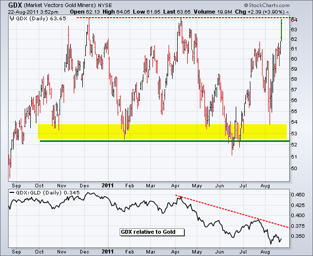
After lagging gold the entire year, the Gold Miners ETF (GDX) is trying to play catch-up with a surge to resistance. The December 2010 and April 2011 highs mark resitance here... Read More
Don't Ignore This Chart! August 19, 2011 at 03:06 PM
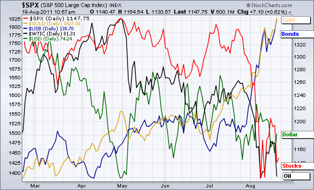
After holding their own until late July, stocks joined oil and the Dollar with a move lower. The chart below shows the US Treasuries Continuous Futures ($USB) and Gold Spot ($GOLD) trading at six month highs... Read More
Don't Ignore This Chart! August 18, 2011 at 11:19 AM
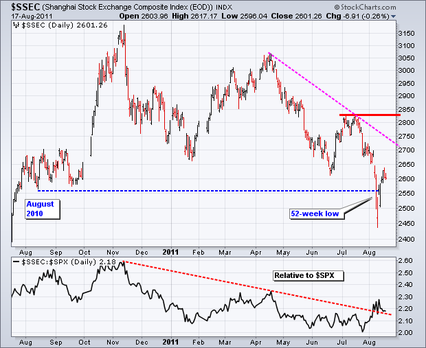
The Shanghai Composite ($SSEC) peaked in November 2010 and hit a new 52-week low in August 2011. As the S&P 500 moved to a new high in April-May 2011, the index formed a lower high in mid April. A support break and 52-week low followed in the next few months... Read More
Don't Ignore This Chart! August 16, 2011 at 05:58 PM
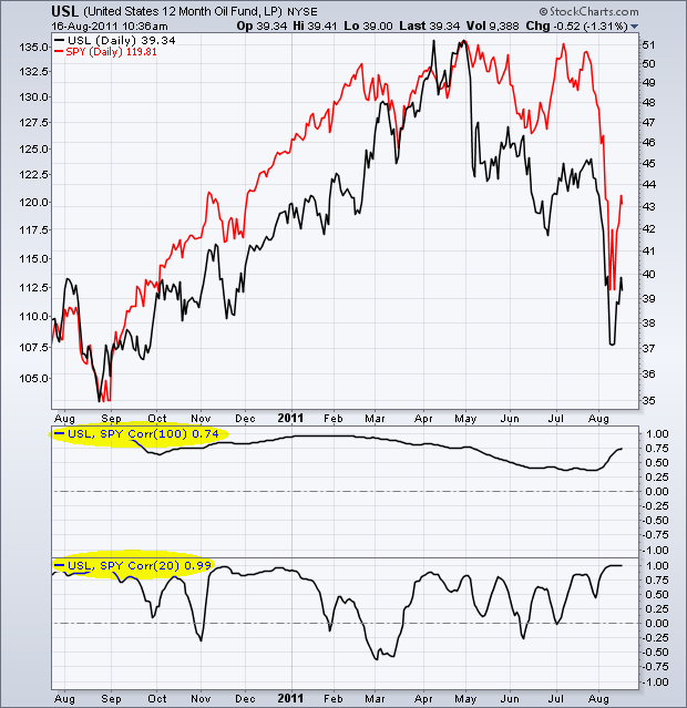
The Correlation Coefficient is used to measure the degree of correlation between two assets. Positive correlation means they move in the same direction. Negative correlation means they move in opposite directions... Read More
Don't Ignore This Chart! August 15, 2011 at 02:53 PM
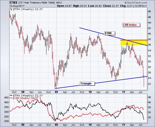
Rates plunged along with stocks over the last several weeks. This makes sense because rates move lower when bonds move high. This chart shows the 10-year Treasury Yield ($TNX) breaking triangle support with a move below 24 (2.4%)... Read More
Don't Ignore This Chart! August 12, 2011 at 05:27 PM
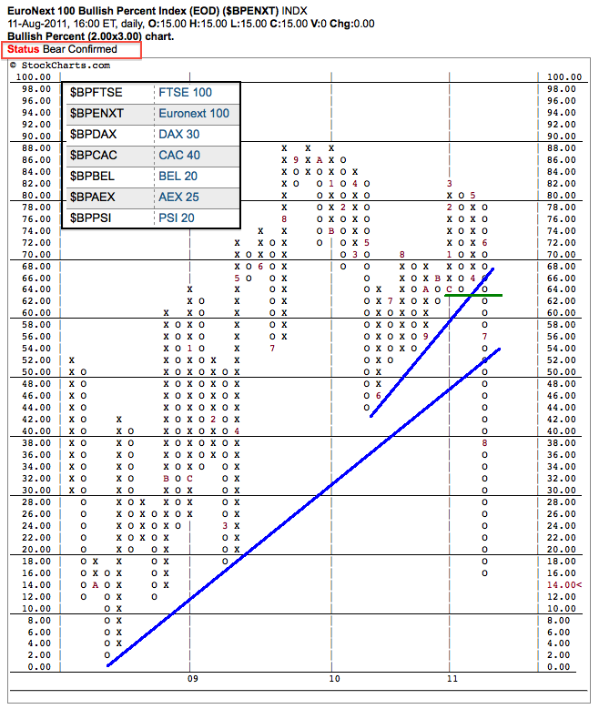
StockCharts.com recently added Bullish Percent Indices for some key European indices. In particular, the Euronext 100 ($BPENXT) broke support in June and continued below its 2010 low in July. There is a status bar at the top of each P&F Bullish Percent Index chart... Read More
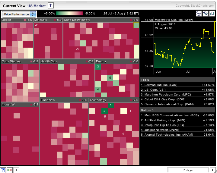
Don't Ignore This Chart! August 11, 2011 at 11:17 PM
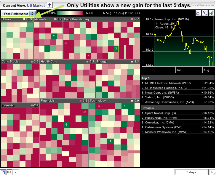
Stocks moved sharply higher for the second time in two days, but remain mixed, at best, over the last five days. The chart below comes from the Sector Carpet. The red squares show losers, while the green squares show gainers. Notice the numbers at the top of each sector box... Read More
Don't Ignore This Chart! August 11, 2011 at 05:03 AM
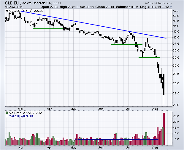
Among other items, Wednesday's sharp decline in stocks was blamed on solvency issues surrounding Societe Generale (GLE.EU), a large French bank. It is, however, worth noting that SocGen, as it is called, was already in a downtrend... Read More
Don't Ignore This Chart! August 10, 2011 at 03:12 AM
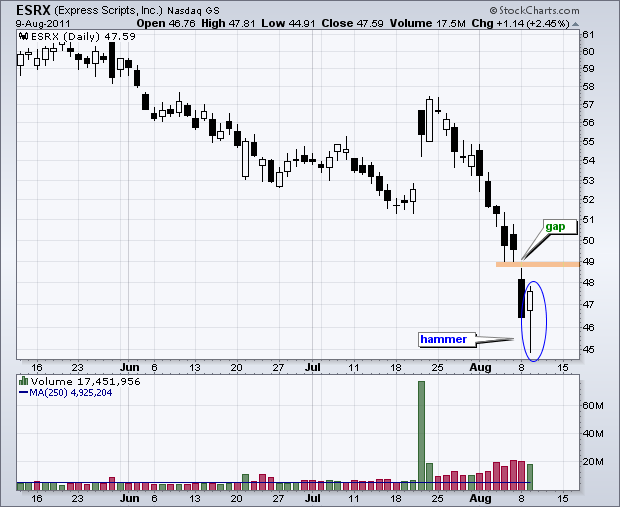
With a big recovery on Tuesday, a number of stocks formed hammers on the price charts. Express Scripts (EXRX) formed a hammer, but has yet to follow through and fill Monday's gap. In other words, the stock is still down for the week... Read More
Don't Ignore This Chart! August 08, 2011 at 03:45 PM
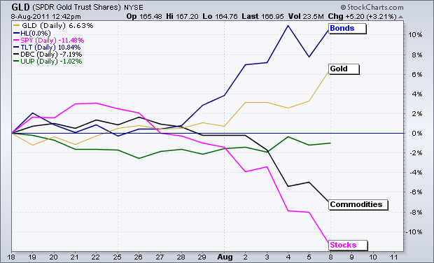
Needless to say, there has been a clear shift in investor sentiment over the last few weeks. In short, money is re-pricing risk. Stocks and commodities, which are viewed as riskier assets, declined over the last two weeks... Read More
Don't Ignore This Chart! August 05, 2011 at 03:42 PM
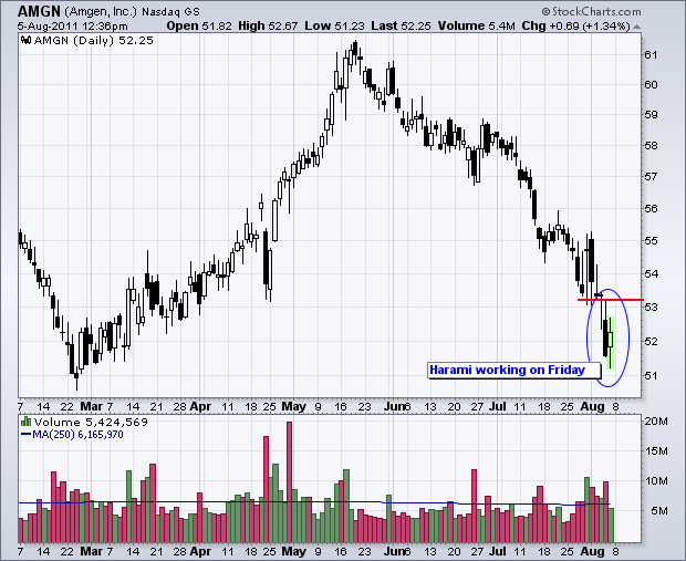
Even though it is just midday, some stocks are showing signs of firmness. Amgen (AMGN) is firming with a Harami taking shape. After a sharp decline on Thursday, the stock opened up and is trading within Thursday's range... Read More
Don't Ignore This Chart! August 03, 2011 at 02:02 PM
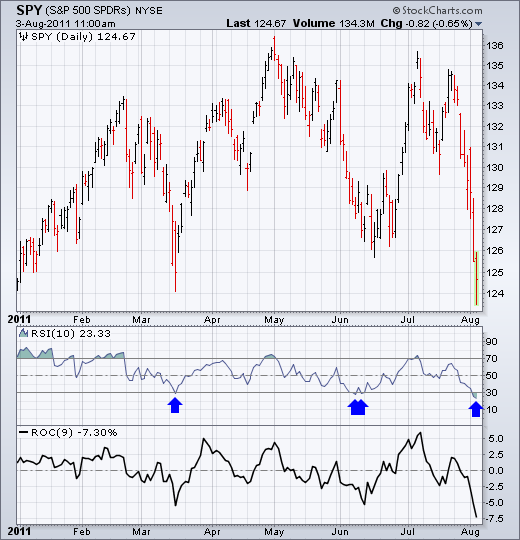
10-day RSI for SPY moved below 30 for the fourth time in 2011. I lowered the look-back period from 14 to 10 to increase sensitivity. RSI became oversold in March, June and now August... Read More
Don't Ignore This Chart! August 02, 2011 at 05:20 PM
The Sector Market Carpet provides a color-coded display of the last seven trading days for the S&P 500 sectors. It is mostlly red as all sectors are down. Stocks holding up the best are shown with green or white-ish squares. Three of the five gainers come from the energy sector... Read More
Don't Ignore This Chart! August 01, 2011 at 06:09 PM
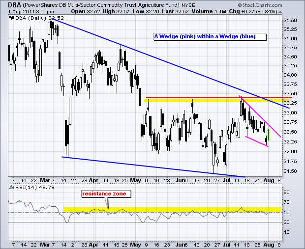
With a decline the last five months, the Agriculture ETF (DBA) formed a falling wedge that extends back to March. The May-July highs mark key resistance just above 33.25. After a surge in late June and early July, a smaller falling wedge took shape the last three weeks... Read More