RRG Charts September 30, 2015 at 11:23 AM
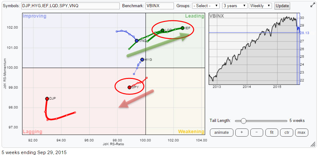
The Relative Rotation Graph below shows the trends in relative strength for a number of asset classes against the Vanguard Balanced Index Fund (VBINX)... Read More
RRG Charts September 21, 2015 at 02:15 PM
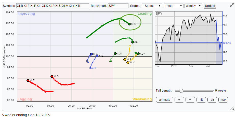
The chart of the S&P 500 index ($SPX) or its ETF equivalent (SPY) has popped up in almost every blog article on the site over the past few weeks/months and the vote has been almost unanimous : It's not looking good! From an absolute point of view that is..... Read More
RRG Charts September 14, 2015 at 08:15 AM
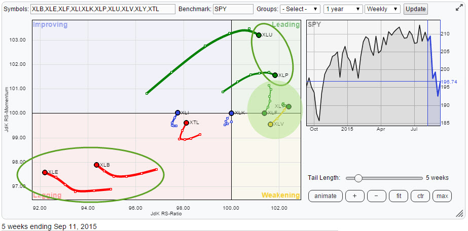
Despite wide swings in the US equity market the Relative Rotation Graph of sector ETFs will help you keep an eye on current sector rotation and point to favourable and less favourable sectors for the coming period... Read More
RRG Charts September 03, 2015 at 08:30 AM
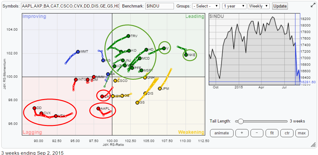
This article takes a look at the relative rotation of the members of the Dow Jones Industrials ($INDU) index. On the relative rotation graph below all members are plotted against $INDU... Read More