RRG Charts March 30, 2016 at 04:52 AM
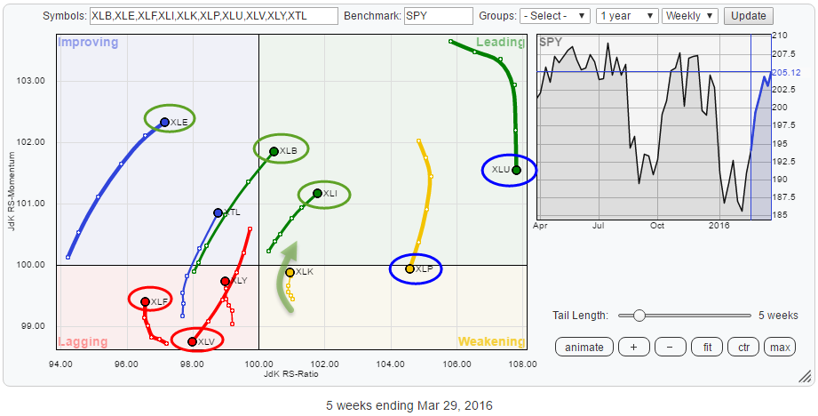
The Relative Rotation Graph for US sectors shows us the relative movement of the various sectors against the benchmark (SPY) and against each other and in this way visualizes the current sector rotation in the US equity market... Read More
RRG Charts March 21, 2016 at 05:42 AM
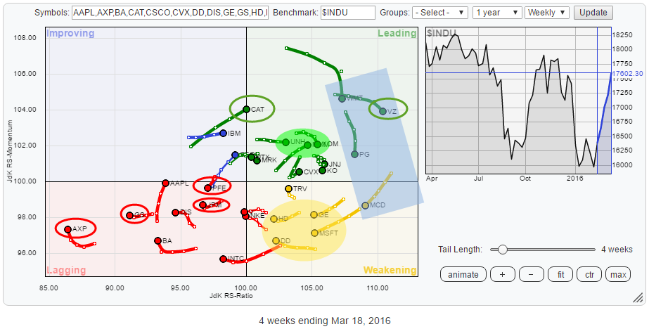
The Relative Rotation Graph above holds the 30 stocks that make up the Dow Jones Industrials Index ($INDU). The rotational patterns of the individual stocks vary widely. The RRG shows you where the opportunities are but, maybe even more important, also shows you the threats... Read More
RRG Charts March 09, 2016 at 08:15 AM
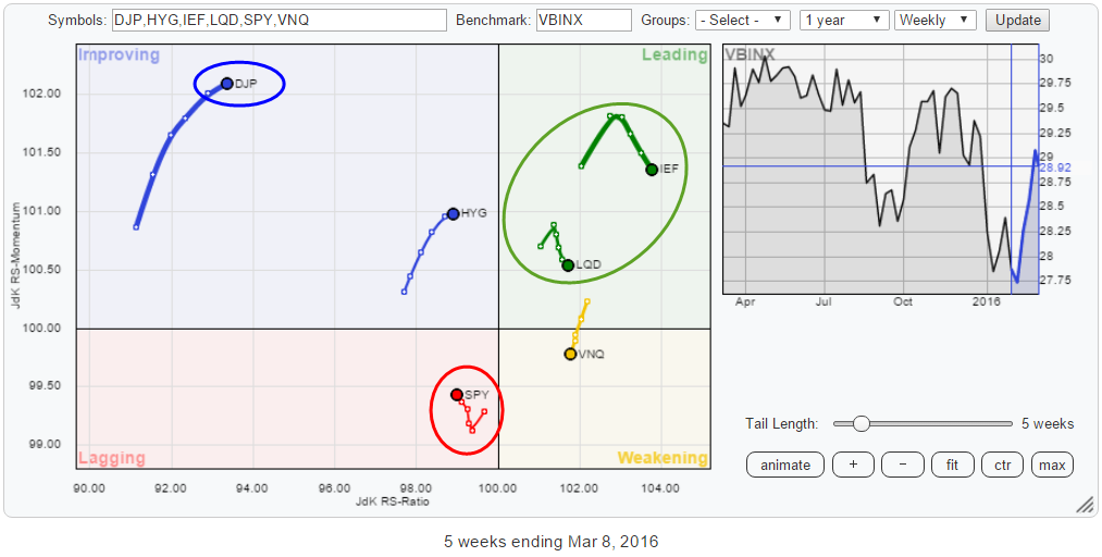
We live in interesting times... or maybe I should say: We live in confusing times.... Because, really, markets are throwing some serious curve balls here and there. It is time to look at some asset class rotations again... Read More