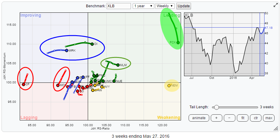
The Relative Rotation Graph below holds the constituents of the Materials sector (XLB) and shows the relative rotation of these stocks against XLB. FCX and NEM stand out on this chart, way out to the right, indicating that they are the two stocks with the strongest relative trends at the moment. But there are a few other stocks in this sector that are worth a further inspection.
From a sector perspective
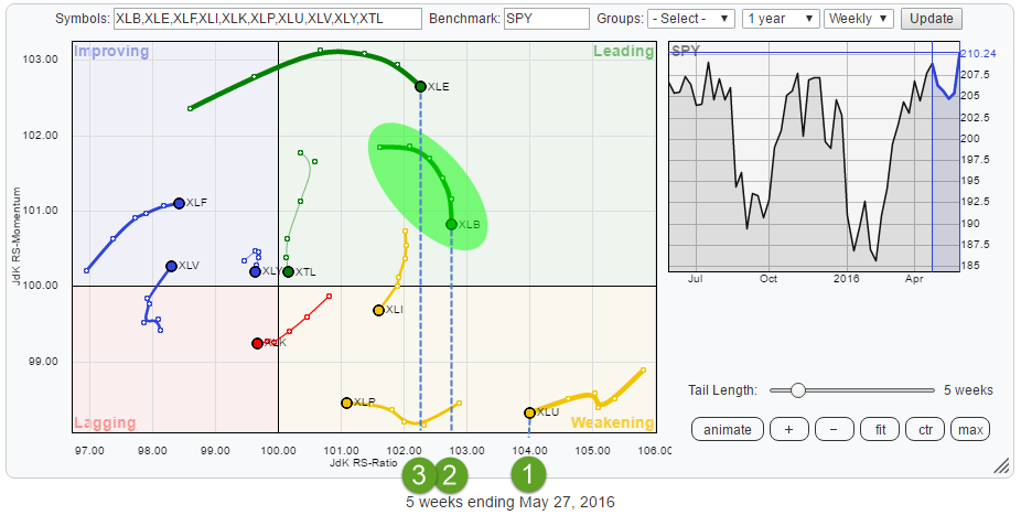 The RRG shows the current sector rotation for the US sectors inside the S&P 500 index. Despite the recent turn down on the JdK RS-Momentum scale, XLB is still the second strongest sector based on RS-Ratio. This means that the relative uptrend is still ongoing but going through a correction at the moment. The difficulty is to gauge when a "temporary" setback changes into a "change of trend". Unfortunately, I cannot give you any rules for that but given the position on the RRG I'd like to give XLB the benefit of the doubt for the time being.
Working on the assumption that XLB is still in a relative uptrend against SPY and the sector will eventually rotate back into the leading quadrant I will examine the Relative Rotation Graph of the members of XLB against XLB to see if there are any clear opportunities to discover.
Summary
- Despite the loss of relative momentum XLB still the second strongest sector based on JdK RS-Ratio
- FCX pulling in to get some fresh fuel to continue relative rally
- NEM seems ready to rotate back into leading quadrant
- Acceleration of relative downtrend in MOS expected
- WRK at risk to rotate back down to lagging quadrant again
- FMC rising on both axes and expected to push higher in relative strength
Quick scan
The first quick scan of the Relative Rotation Graph above learns us that FCX and NEM are way out to the right side of the plot with JdK RS-Ratio values above 120 which is really high and indicating strong relative trends for these stocks.
On the other side of the RRG, there are two stocks (MOS and CF) catching the eye which are heading back into the lagging quadrant, coming from improving. Such a rotational pattern indicates that a strong relative downtrend is in play which just went through a recovery but is now back on track for further underperformance.
Then there are three stocks, WRK, OI and MLM that are moving higher on the RS-Ratio scale at stable JdK RS-Momentum levels. If you compare Momentum to fuel, we need to examine if there is enough fuel left for, especially, WRK and OI to continue their rally or if they have to pull into a gas station to refuel.
As a few names are so far out on the plot, I have re-created the Relative Rotation Graph but zoomed in on the middle area to get a better view of what is going on there.
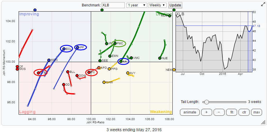 Inside this cluster of stocks, there are a few names that stand out. First, ECL and IFF are moving from the lagging quadrant into improving backed by long tails (means power). MON shows a similar tail but is still a bit far to the left which makes it (more) dangerous.
Inside the leading quadrant AA and FMC are showing contrarian moves. Especially AA needs attention as it has a very long and powerful tail which looks to be pushing the stock towards the lagging quadrant (through weakening) rapidly.
On the edge of weakening and lagging, PX is crossing over into the lagging quadrant at a negative angle. A bit deeper into the lagging quadrant is LYB. This stock rotated towards the improving quadrant over the past five to six weeks but was not able to cross over and turned back again, heading lower on both axes again.
Freeport-McMoran Inc - FCX
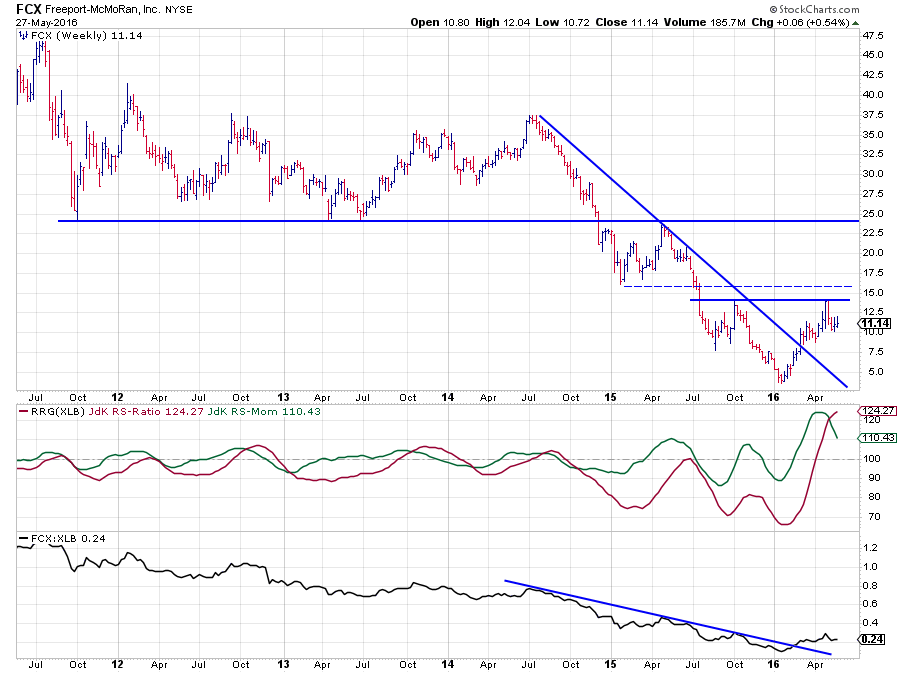 The above chart of FCX shows a bottoming process in progress on both fronts (price and relative). On the price chart, FCX broke falling resistance and subsequently rallied towards its previous high just below $ 15 which now acts as resistance. A break beyond this level will definitely improve the chart further.
A somewhat similar pattern is visible on the relative chart where the RS-line managed to break above the falling trendline that ran over the highs since mid-2014. A rhythm of higher highs and higher lows is slowly developing in the RS-line.
The RRG-lines are both comfortable above the 100-level indicating that a strong relative trend is in play. However, looking at the level of the JdK RS-Momentum line it can be seen that this line jumped way above the highest level we've seen over the past five years and started to turn back. This drop in relative momentum is now putting a drag on the further rise of the RS-Ratio line (i.e., the relative uptrend).
It looks as if FCX needs to get some fresh fuel to be able to continue the relative move. With RS-Ratio at 124 and RS-Momentum at 110, there seems to be plenty of room to refuel before the relative trend turns negative.
Newmont Mining Corp - NEM
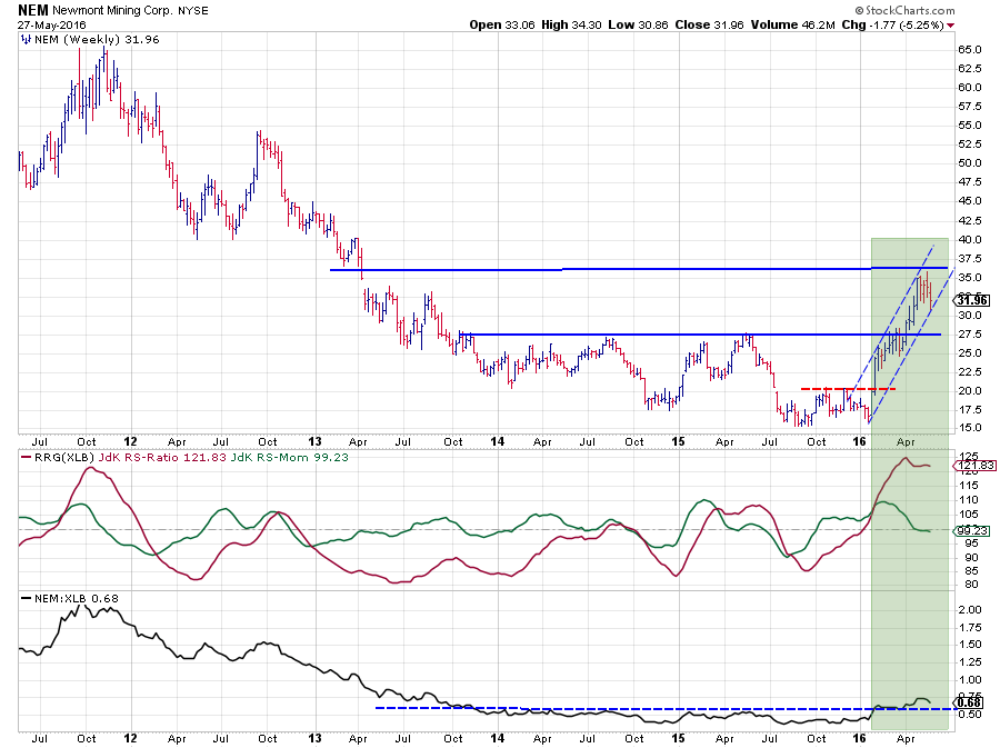 At the beginning of this year, the break beyond $ 20 on the price chart cleared the way for a re-test of the heavy resistance area around $ 27.50 which kept the stock from rising further since late 2013. Almost at the same time, the RS-line cleared its horizontal resistance level that had been in play for more than two years.
The rally that followed on the price chart briefly hesitated near $ 27.50 and broke that level in April to the way to the next barrier between $ 35 - 37.50. This price move helped the RS-Line to stay above its breakout level.
Given the weak performance of XLB in the beginning of this year, the RS-Ratio line could rise to very high levels. Don't be fooled by the, visually, small move in the RS-line. This "small" move took relative strength from levels around 0.44 to a recent high at 0.745; an almost 70% jump. It's these scissor moves where relative strength analysis can really excel.
Given its position on the RRG, it can be seen that NEM is already a bit ahead in its rotational pattern compared to FCX. The RS-Momentum line here has already started to level off near 100. A renewed improvement of relative strength of NEM within the sector will likely cause the stock to rotate back into the leading quadrant again and continue to lead the (outperformance of) Materials sector.
Mosaic Co. - MOS
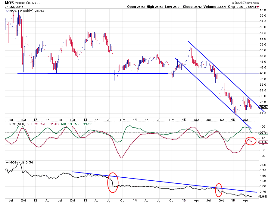 As highlighted in the quick scan MOS and CF are both showing a rotational pattern from improving back into lagging. Given their low levels on the RS-Ratio scale, they are both in strong relative downtrends. As MOS has the highest RS-Ratio of the two I decided to pull up its chart for further inspection as it, most likely, carries more downside risk (relative-) than CF.
After breaking below a major horizontal support level near $ 40, MOS started trading in a falling channel, most recently setting a new low around $ 22. The relative strength of MOS vis-a-vis XLB has been predominantly down over the past five years with a few big drops after breaking from a consolidation area.
The recovery out of the recent low on the price chart took MOS towards the top of the channel and the decline in RS leveled off a little bit causing TS-Momentum and RS-Ratio to move higher. However, this recovery already seems to be coming to an end again as RS-Momentum is on the verge of breaking back below 100 again, signaling a new top in the RS-Ratio line which is still well below 100.
On the RRG this causes a rotational pattern on the negative, left-hand side of the graph and it suggests that a renewed acceleration of the relative downtrend is about to start.
WestRock Co. - WRK
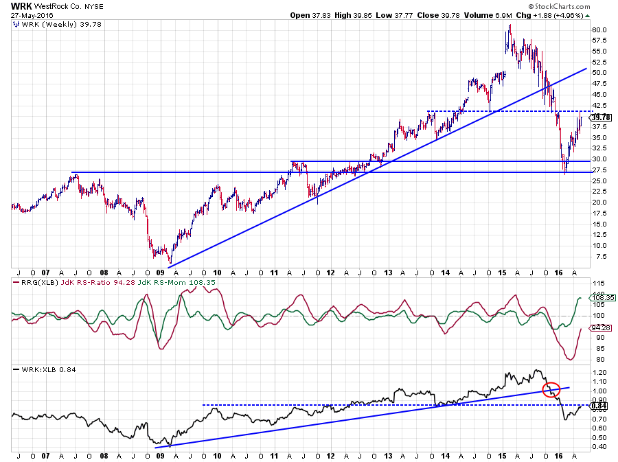 WRK, OI and MLM are the three stocks that have been gaining the fastest on the RS-Ratio scale while remaining at a stable RS-Momentum level. This causes their tails to move almost horizontally. In the case of MLM, this is strong as it is already well inside the leading quadrant. For WRK and OI it is a bit more questionable as OI has only just crossed over and WRK is still well within the boundaries of the improving quadrant.
While stable momentum is good inside the leading quadrant, as it indicates a stable trend. For the stocks inside the improving quadrant, I'd like to see a rising relative momentum as they need the power to really turn their negative relative trends around.
The chart above shows WRK in combination with the RRG Lines and relative strength against XLB. From the peak near $ 60, this stock halved in price in almost one straight line without any meaningful recovery over the past year. Along the way, some important support levels were broken and WRK only found support in the area between $ 27.50 - 30.00 which was the level of some important previous highs. The bounce out of this support area was equally strong but is now running into trouble near $ 40.
The relative strength line also broke its rising support line, followed by a break of horizontal support and is now in its first recovery since the relative peak of mid-2015. In order for the relative trend to turn around, a lot, more momentum is needed but it is questionable if such momentum will be there. The current level of RS-Momentum is around the extreme levels seen during the wide market swings in 2008-2009 and way higher than what is "normal" for WRK vs XLB.
This positioning of RS-Momentum and RS-Ratio carries significant risk for a turn back lower and a continuation of the relative downtrend. This will show up on the RRG as a rotational pattern through improving and back to lagging.
FMC Corp. - FMC
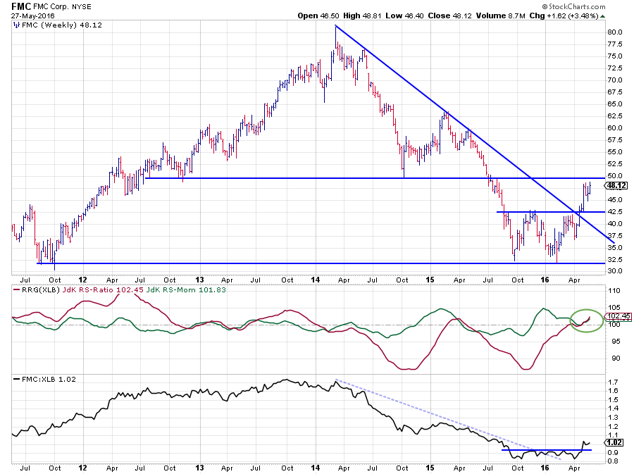
FMC is a stock that shows an almost perfect example of why you would want to analyze stock price patterns ad trade off of them... Buyers (and holding their position) around the lows in 2011 would have doubled their money in 2014 and then lost it all again back to a new low at 2011 levels again in the 2015-16 transition. Both moves, the up-leg 2011-2014, and the down-leg 2014-2016 are showing very well-defined trends. Getting in somewhere in 2012 when the uptrend started to emerge and getting out, or maybe even short, somewhere in 2014 when the uptrend ended would have yielded a very nice return.
The good news is that a new move higher seems to be in the making. On the price chart, the downtrend has ended when FMC managed to complete the double bottom at $ 42.50 while at the same time breaking the falling resistance line.
The improvement in relative strength kicked in a bit earlier when the RS-line broke above its falling resistance and JdK RS-Momentum started to pull RS-Ratio higher. In the first few months of this year, RS-Momentum peaked at 105 and moved lower, basically refueling for the next move up, while RS-Ratio rose further at a slower speed. The refueling is now complete and relative momentum is on the rise again, after the raw RS-Line completed its bottom formation. Since a few weeks, JdK RS-Ratio and RS-Momentum are rising at a similar pace causing the tail to head deeper into the leading quadrant at an almost perfect 45-degree angle.
On the price chart, the downside is well protected by support at $ 42.50. Resistance comes in around $ 50.00. A break above this barrier will very like cause the rally to accelerate and improve the relative strength of FMC versus XLB even further.
Julius de Kempenaer | RRG Research
RRG, Relative Rotation Graphs, JdK RS-Ratio and JdK RS-Momentum are registered TradeMarks by RRG Research
Follow RRG Research on social media:
LinkedIn Facebook Twitter