The last RRG blog on US sector rotation dates back to late March, about six weeks ago. Since that post "Bad health (care) for XLV" some of the rotations in play continued while others were not able to maintain their expected rotational paths and moved the other way.
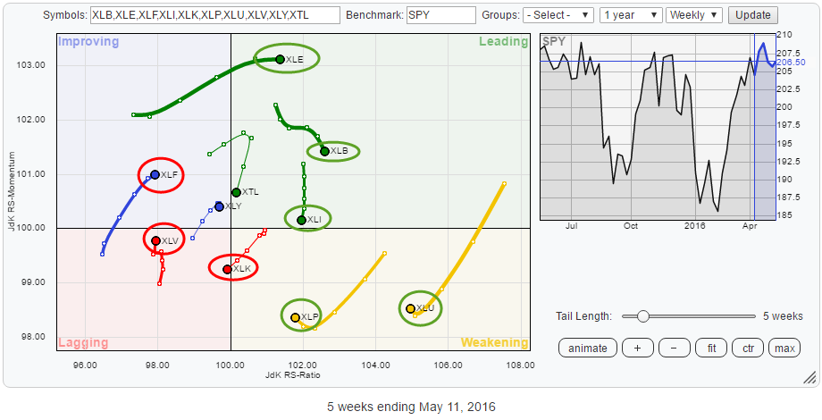
The Relative Rotation Graph below shows the current positions of the S&P sector ETFs vis-á-vis the S&P 500 index (SPY) and each other.
Summary
- XLF and XLV remain weak despite the rise of relative momentum
- XLK crossing over into lagging quadrant
- XLE pushing into leading quadrant at high relative momentum
- XLU and XLP stalling inside weakening quadrant and turning up
Quick scan
The quick scan of the Relative Rotation Graph above shows that the Energy sector (XLE) is pushing into the leading quadrant backed by the strongest relative momentum in this universe and a long tail, which is a sign of strength.
The other sectors inside the leading quadrant are Materials (XLB), Industrials (XLI) and Telecom (XTL). Materials and Industrials are still clearly in relative uptrends, given their position on the right side of the plot around 102-103 on the RS-Ratio scale. Telecom already turned lower on the RS-Ratio scale while losing relative momentum, at the moment the sector does not seem to offer a lot of opportunity for alpha.
In the weakening quadrant, Utilities (XLU) and Consumer Staples (XLP) are showing big rotational moves, coming from the leading quadrant, which are now slowing down again and seem to be turning upward again. These may be interesting sectors to have a closer look at.
Inside the lagging quadrant, Health Care (XLV) is showing some upward relative momentum over the past few weeks but remains far to the left, approximately at the same RS-Ratio level as Financials, and therefore one of the weaker sectors in this universe. Technology (XLK) is just crossing over into the lagging quadrant while heading lower on both axes. It looks like a downtrend in relative strength is starting build up for XLK.
The heavyweight sector Financials (XLF) is, still, the weakest sector measured by RS-Ratio, given its position on the RRG and the already stalling momentum, it looks like another turn back down towards the lagging quadrant and therefore a continuation of the relative downtrend is likely.
Financials - XLF
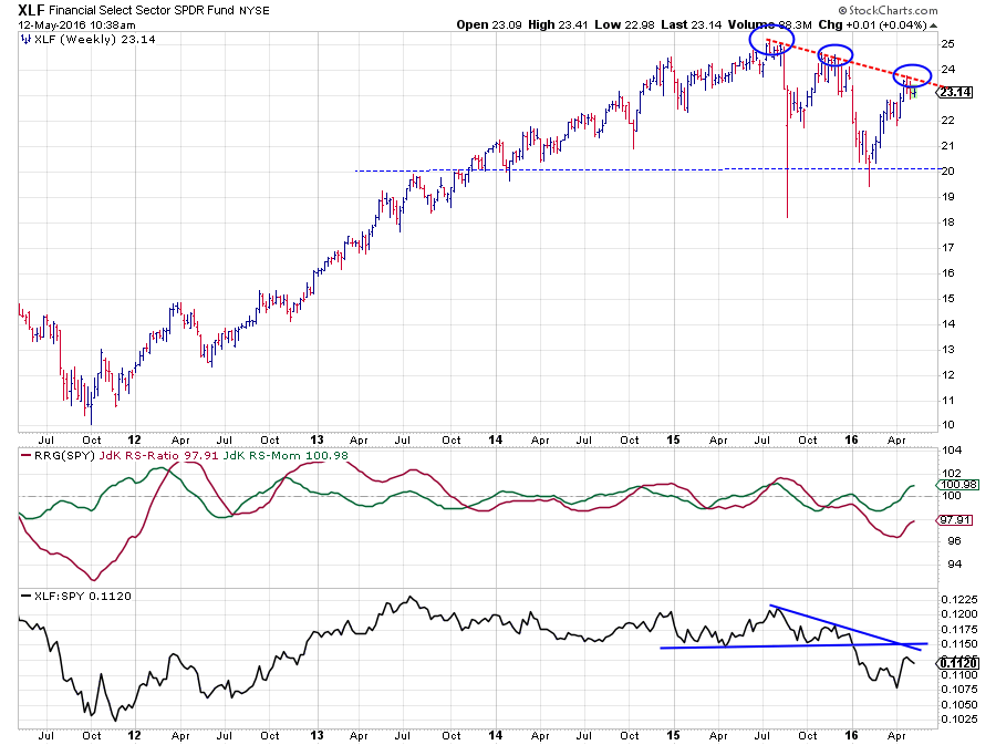
The Financials sector is the second biggest sector of the S&P 500 at 16.7% and therefore an important sector to keep an eye on as it will dictate 16.7% of the direction of the general market ($SPX).
A look at the price chart of XLF above shows that the recent rally has stalled again at a lower level. The market has now set three lower highs in the Financials sector and a falling trend line now connects three major peaks over the past year. This definitely has to be judged as a negative observation for the price development in XLF in coming weeks/months.
The corresponding moves in the XLF/SPY ratio (raw relative strength) are even more pronounced and the break below horizontal support in that chart at the beginning of the year already signaled relative weakness.
All in all, this causes the RS-Ratio line to remain well below the 100 level. The recent rise of the RS-Momentum line above 100 tracks the recovery in raw RS but does not look strong enough to be able to turn the tide. As long as the price of XLF remains below the falling resistance line it is unlikely that the trend in relative strength can turn upward again. A continuation of the (relative) downtrend in coming weeks/months seems likely.
Health Care - XLV
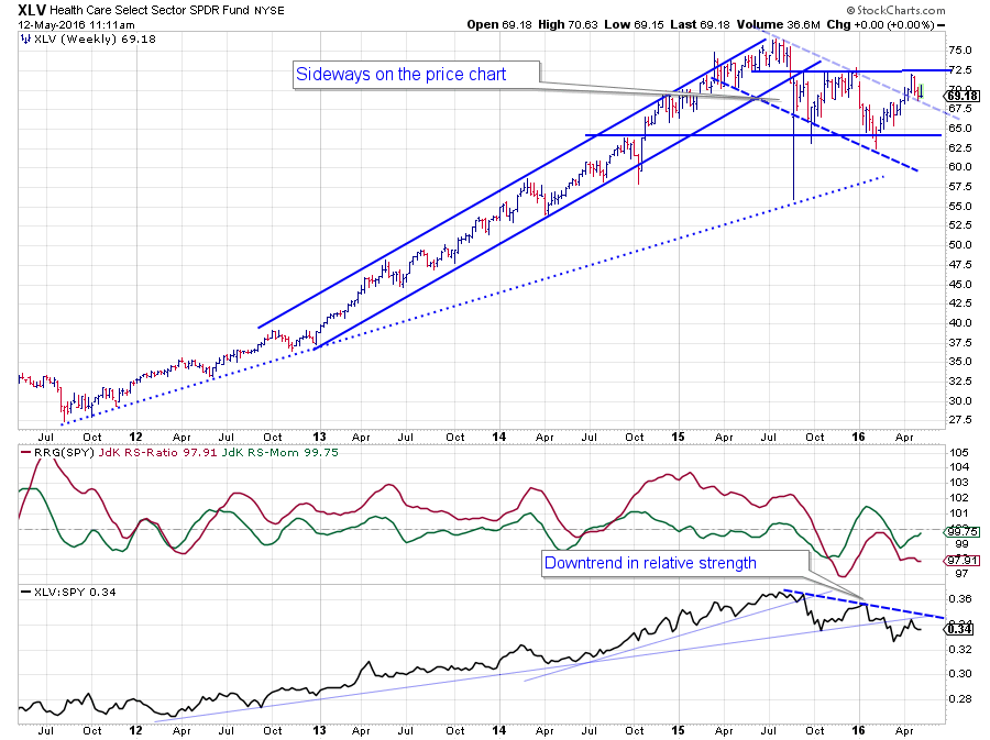 The chart of the Health Care sector is a little less convincing (in being negative) than Financials above. Since the previous note on sectors, the price of XLV actually managed to break above the (dashed) falling resistance line, thus shrugging off a bit of the weakness that was seen since mid-2015. However, a full-fledged rally did not materialize as the market quite rapidly bounced against the horizontal resistance level near $ 72.50. A trading range between $ 65 - $ 72.50 seems to develop.
Despite the rally and the break on the price chart, the sector has not been able to track the market higher all the way, resulting in a lower high being formed on the relative strength chart. As you can see this new lower high also keeps the RS-Ratio line well below the 100-level.
Although slightly later in its rotational pattern XLV is also not expected to complete the rotation towards the leading quadrant at this point in time. More (relative) weakness is expected when momentum definitely gives way and starts to pick up on the downside again.
Technology - XLK
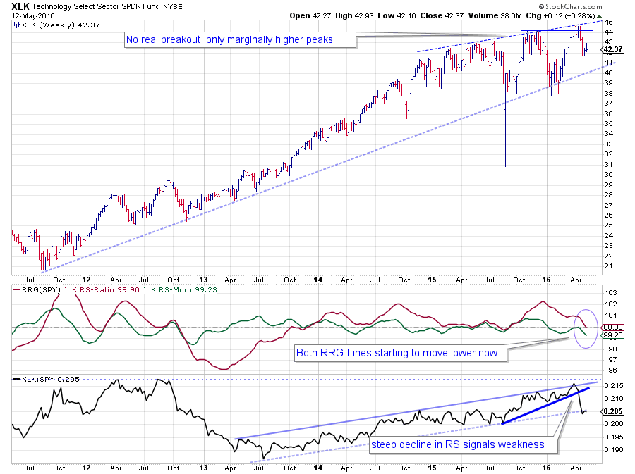 Where Financials is the second biggest sector in the S&P 500, Technology is the biggest sector at 19.7%. Another important sector to keep an eye on therefore with regard to getting a handle on the direction of the S&P 500 itself.
Where Financials set three consecutive lower highs on the price chart, the Technology sector managed to squeeze out three new highs, but they are only marginally new highs. The last two highs were set only just above their predecessors and did not lead to a (strong) follow through rally, which is what one would expect in case of a (strong) market rally. Also, the declines following these recent new highs easily dropped back below their breakout levels. In other words, previous resistance levels did not hold up as support after they were broken.
The relative strength of Technology against the S&P 500 managed to hold up fairly well until late March when the raw RS-Line steeple dropped from its recent high which was set closely to the relative highs formed in 2012. This move is now dragging both RRG-Lines lower while the RS-Momentum line had already dropped below 100 at the beginning of the year, pushing XLK into the lagging quadrant on the RRG.
As, together with Financials, Technology makes up >35% of the total market, a broad market rally without the participation of those two sectors is highly unlikely. All in all, not the strongest of pictures.
Energy - XLE
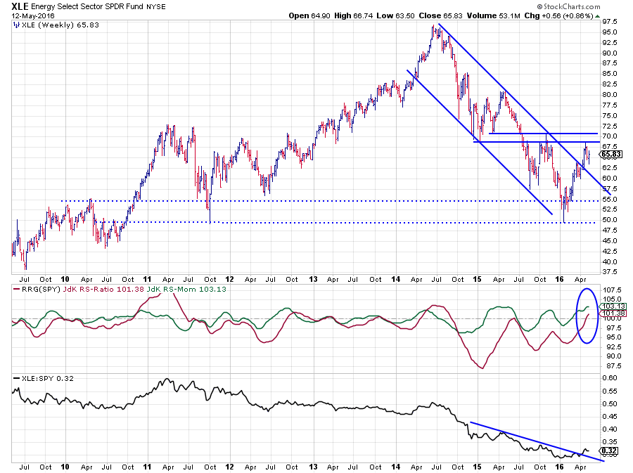 The Energy sector has been the worst-performing sector over the past two years, not only regarding price but certainly also regarding relative strength.
The PerfChart below shows the relative performance of the US sector ETFs against the S&P 500 index. As you can see Energy stands out in a negative way!
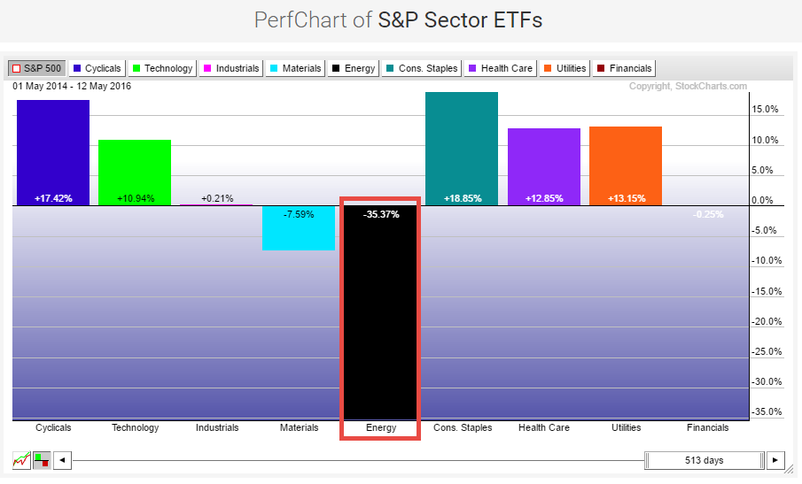 Given this strong underperformance, it will take a while of good performance before XLE will show up in the upper regions of tables like this and that is where the added value of analyzing "trends in relative strength" provides added value over just looking at a performance figure over a fixed period.
As you can see on the price chart of XLE in combination with the relative strength charts, the decline in the raw RS-Line has started to slow down and move more sideways. During this transition, a short-term falling resistance line has already been taken out, indicating some improvement. The fact that XLE has also broken above its falling resistance line on the price chart suggests that the weak performance of the past few years is coming to an end, or at least is slowing down.
The RS-Ratio line dropped below 100 back in September-October 2014, pushing XLE into the lagging quadrant on the Relative Rotation Graph. Since then the RS-Ratio line has remained below 100 while showing some high-low oscillations, causing some rotations to take place on the left-hand side of the RRG.
Just recently, following the improvement on the raw RS-Line, the RS-Ratio managed to cross above the 100 line again for the first time in almost 18 months. The combination with the position of the RS-Momentum line now makes that the Energy sector is pushing deeper into the leading quadrant, and it is doing so at the highest relative momentum level found in this universe.
Assuming a continuation of the current sector rotation we may expect Energy to remain ahead of the S&P 500 index in the coming period.
Inside the weakening quadrant
Over the past few weeks, two sectors (XLU and XLP) have been traveling through the weakening quadrant. Both sectors, however, are still pretty high (XLU even the highest) on the RS-Ratio scale. When sectors are far to the right but inside the weakening quadrant, it means that there is a good possibility that a rotation will take place on the right-hand side of the Relative Rotation Graph, indicating that we have a strong relative trend at work, especially when the negative momentum starts to slow down, while still at high RS-Ratio levels, which seems to be the case here as you can see on the chart below.
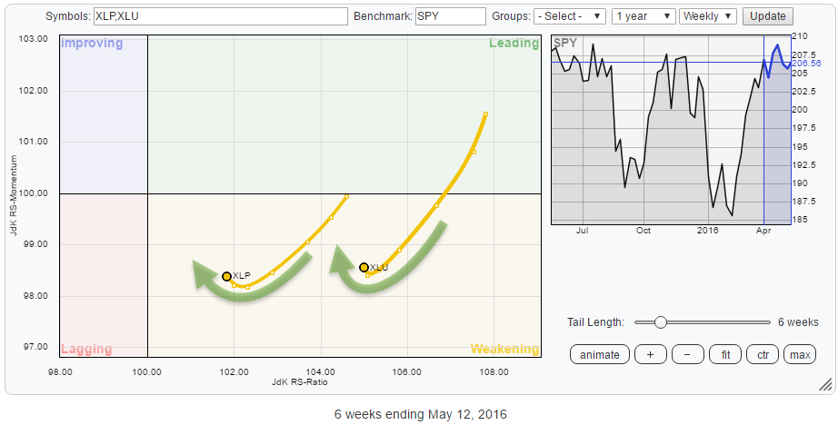
Consumer Staples - XLP
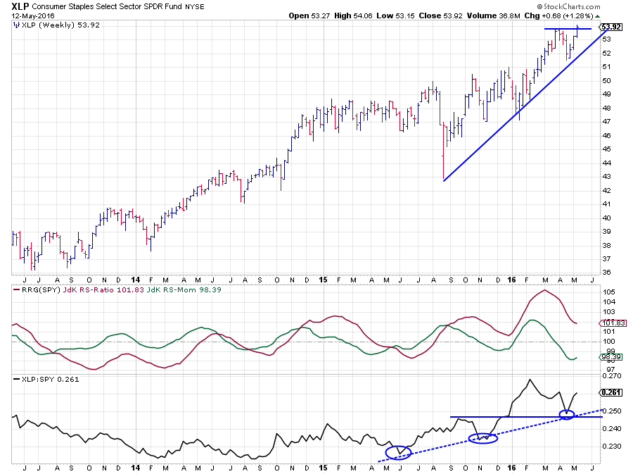 I picked the chart of the Consumer staples sector as it is closest to the 100-level on the RS-Ratio scale and should not continue much further to prevent a crossover into the lagging quadrant.
Looking at the chart above the odds for this sector to remain on the right-hand side of the RRG, and thus in a relative uptrend against SPY, seem to be stacking up in favor.
The raw RS-Line has corrected back to the breakout level where a previous high acted as support, causing a third higher low. Clearly a relative uptrend in play. This move had already translated into the RS-Ratio line moving above the 100-level since mid-2015. With the RS-Momentum line already starting to bottom out a resumption of the relative uptrend may be expected soon.
Switching to the price chart reveals that we already may have seen the catalyst for a continuation higher as XLE is about to break above its previous peak, which will unlock new upward potential.
The combination of two major sectors, XLK and XLF, showing weak relative strength on the left side of the Relative Rotation Graph while two "defensive" sectors like XLU and XLP are showing strong and, once again, improving relative strength on the right-hand side of the RRG does not match with an environment that supports a strong upwards move for the S&P 500 index.
Julius de Kempenaer | RRG Research
RRG, Relative Rotation Graphs, JdK RS-Ratio and JdK RS-Momentum are registered TradeMarks by RRG Research
Follow RRG Research on social media:
LinkedIn Facebook Twitter