RRG Charts July 24, 2016 at 05:13 PM
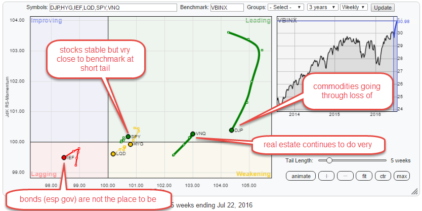
The Relative Rotation Graph below shows the rotation for various asset classes (through ETFs) against the Vanguard Balanced Index fund (VBINX) on a weekly basis. The picture is pretty conclusive for some asset classes but less so for others... Read More
RRG Charts July 11, 2016 at 09:06 AM
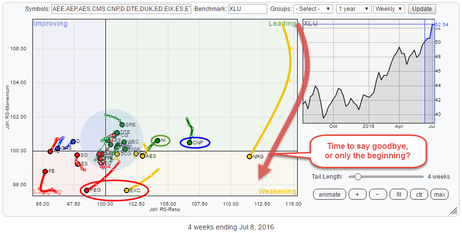
On the Relative Rotation Graph of the S&P economic sectors (GICS I), Utilities is one of the leading sectors as measured by the JdK RS-Ratio... Read More
RRG Charts July 03, 2016 at 05:21 PM
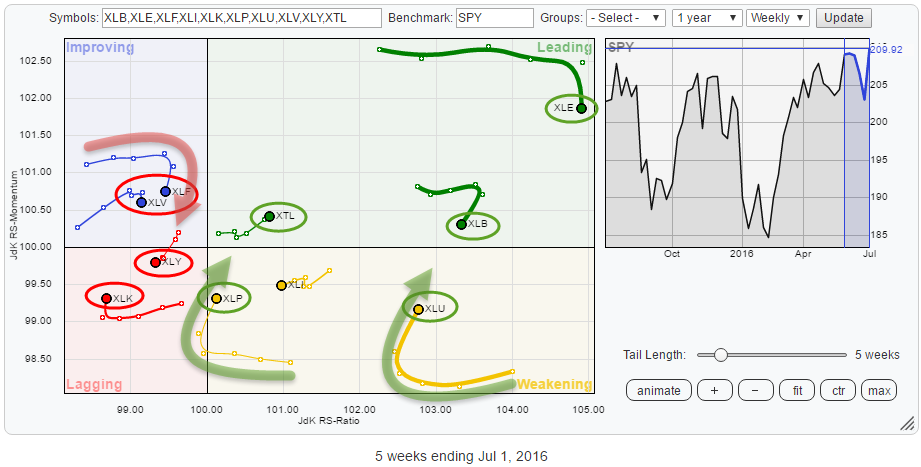
Over the past few weeks markets, in general, experienced a lot of volatility and a lot of comments have are focussing on the general state and direction of the broader market indices around the world... Read More