The Relative Rotation Graph below shows the rotation for various asset classes (through ETFs) against the Vanguard Balanced Index fund (VBINX) on a weekly basis.
The picture is pretty conclusive for some asset classes but less so for others. Zooming in on the daily time-frame, usually, helps to add a bit more info and color to the weekly reading of the RRG.
The RRG of international stock markets relative to the FTSE all world index also paints an interesting picture for US stocks. 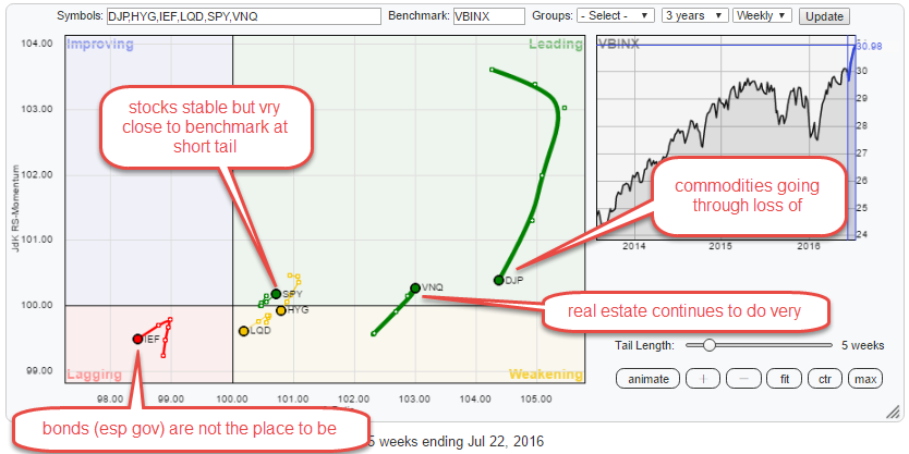
Summary
- Commodities are ready to move again
- Real Estate shining
- Avoid (Government) Bonds
- Stocks are a mixed bag but if you want some get American
Weekly Asset Class Rotation
The weekly RRG at the top of this article clearly shows the wide rotation for commodities (DJP). Based on the JdK RS-Ratio scale commodities is still the strongest asset class in this universe. The current drop on the JdK RS-Momentum scale should, therefore, be seen as a corrective move within the longer term rising relative trend.
The second tail that is interesting to monitor is the one of VNQ (Real Estate). High on the RS-Ratio scale dropping into the weakening quadrant and then a sharp snap back into leading again.
The fixed income related asset classes (IEF, HYG, LQD) and Stocks (SPY) are much closer to the benchmark (center) of the Relative Rotation Graph. Especially for SPY and IEF, this is to be expected as this is a, so called, open universe, and these two are the only markets included in the benchmark while the others are not which gives them more opportunity to move wide and far away from the center on the chart.
The fact that IEF is moving further away from the benchmark into the lagging quadrant while SPY is very close to the center and at a very short tail indicates that the Equity/Bond shift is more due to the weakness in bonds rather than the strength in stocks.
Daily Asset Class Rotation
If we take the same Relative Rotation Graph as above but switch to a daily time-frame, the picture changes quite a bit.
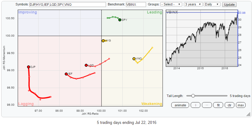 Starting with DJP again, we see that the drop on the JdK RS-Momentum scale on the weekly RRG has positioned DJP deep inside the lagging quadrant on the daily, but it has already started to move its way higher on the RS-Momentum axis here.
The position for VNQ is even more pronounced, on the weekly RRG it quickly rotated through weakening (from leading) back into leading, led by the rotation on the daily RRG and the same sort of rotation seems to be underway again on the daily now. This suggests that real estate (VNQ) will remain one of the strongest, if not the strongest, asset class in coming weeks.
The weakness of the three fixed income related asset classes is better visible on the daily RRG above. IEF and LQD are clearly inside the lagging quadrant while HYG is very close to the benchmark and as good as at the 100 level on the RS-Ratio scale.
Stocks (SPY), at the moment, is the only asset class inside the leading quadrant, but it is not very convincing.
Commodities - DJP
Weekly
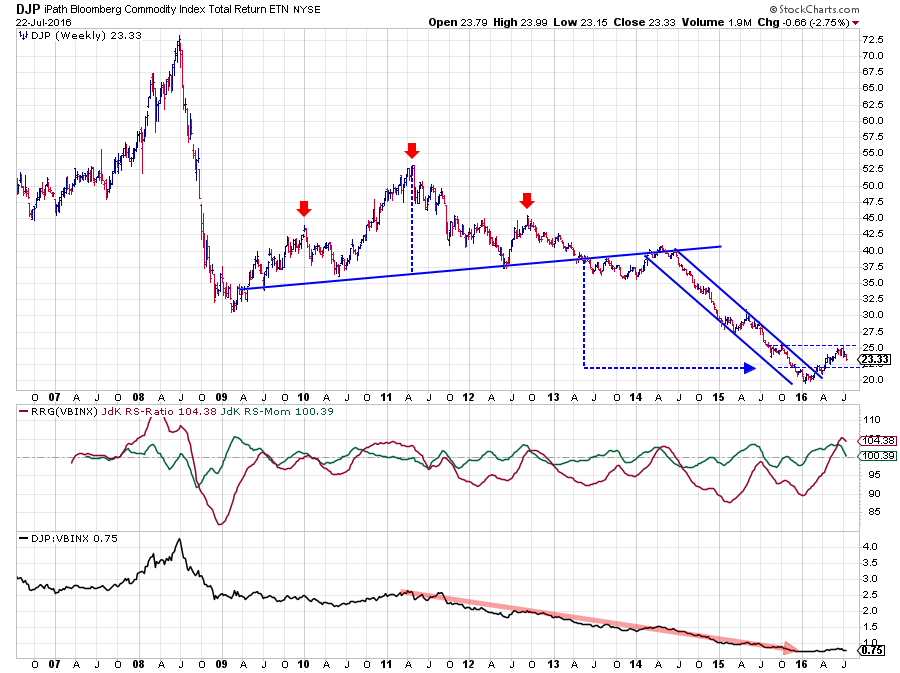 The chart above shows the long-term development for commodities (DJP). The break out of the falling channel, the emerging of a new uptrend in price combined with the improvement in relative strength which were highlighted a few times in previous articles are all still there.
As a matter of fact, the recent setback in price is barely visible on this long-term chart. On the relative charts, the JdK RS-Ratio has reached its highest level since 2008 while the raw RS-line is holding up well above its 2016 lows but going through some correction.
Daily
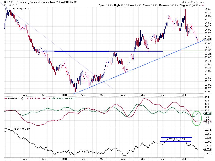 The daily chart above zooms in on the recent price action of DJP and shows the consolidation in April after the rally that started in January. The big outside (engulfing candle) bar on 5 July marks the end of the consolidation and leads into the corrective move we have seen since then.
Given the turnaround situation after the long downtrend on the weekly chart, I am looking for support levels on the daily chart as potential entry levels for the next up-leg.
The first level is the dashed, rising, support line which is being tested at this very moment. The second, more important level, is the former resistance level around $ 22.25 which should now start to act as support in case of a further decline.
If the dashed support line holds up and a new low is put into place there, the commodity rally may be expected to continue soon. If dashed support gives way, the market needs a bit more time to digest the recent rally and it will take a bit more time before the rally will continue.
Real Estate - VNQ
Weekly
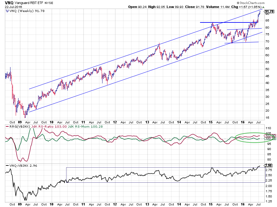 It ain't over until it's over ... At the beginning of the year, for a short while, it seemed as if the rally in real estate stocks was over when VNQ dropped below its long-term rising support line. However, support near $ 70 was able to catch the decline and turn it around again, eventually completing a double bottom pattern and bringing VNQ back into its rising channel and breaking to new all-time highs.
On the Relative Rotation Graph (weekly) and the RRG-Lines you can see that, even despite the short trip outside the rising channel, relative strength remained strong all the way through this corrective move in price. The combination of both RRG-Lines moving almost horizontally with JdK RS-Ratio well above 100 and JdK RS-Momentum around 100 signals a very steady uptrend in relative strength.
The recent move of raw RS to its highest level in almost ten years underscores the current strength in real estate stocks!
Daily
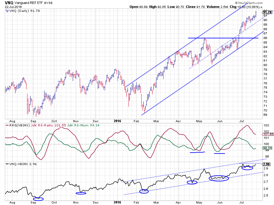 Zooming in on the daily VNQ chart, in combination with its relative strength charts, shows that the recent price move is an acceleration with the ability to push the market even higher in the near-term. As you can see on the RRG-Lines, the JdK RS-Momentum is already string to turn back up again with RS-Ratio well above 100.
If that rotation continues, and I see no reason why it could not do that, VNQ will rotate back up into the leading quadrant on the daily Relative Rotation Graph. When that happens, VNQ will be pushing deeper into the leading quadrant at angles around 45 degrees on both time-frames! It will not get any better than that!
Equities - SPY
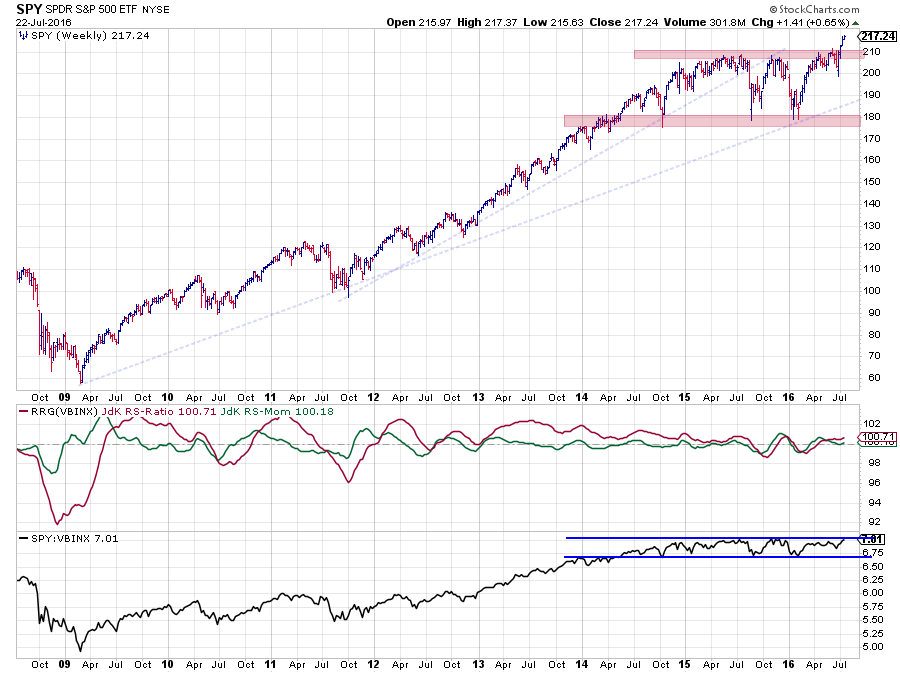 Equities and especially SPY is probably one of the most challenging markets to judge at the moment, at least IMHO.
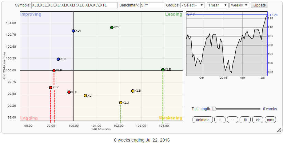
Quite frankly the recent strength in this market has surprised me, and it still does. I have argued a few times that the current state of (US) sector rotation does not support a broader market rally. And that situation has not changed yet. Especially the weak position for Financials and Consumer Staples in the rotational picture raises doubts.
 Nevertheless, it cannot be ignored that the market broke out to the upside and is setting new all-time highs week after week albeit at low and declining volumes and with a negative divergence between RS and price building up on the daily charts.
Looking at the relative strength of SPY against the VBINX benchmark shows that the RS line is now pushing against a major resistance level.
Overall, I still prefer to maintain some caution with regards to equities as there are too many "problem areas," for me at least, at the moment.
An international perspective
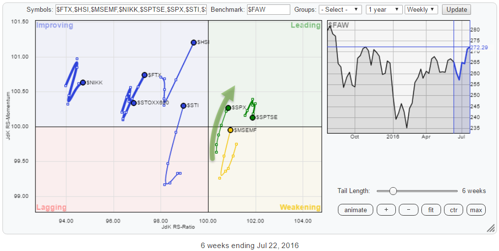 However, putting US equities against some international markets shows that they are leading the rest of the world, together with Emerging Markets and Canadian markets, although $SPTSE has just turned around is starting to lose some relative momentum.
European markets ($STOXX600) are moving more or less opposite to the US and from an asset allocation perspective should be avoided for now.
Hong Kong ($HSI), Singapore ($STI) and to a lesser extend China ($FTX) are starting to improve rapidly and are worth keeping an eye on.
The clearest picture to show the difference between the US and European equity market performance is to simply plot the two bar charts on top of each other.
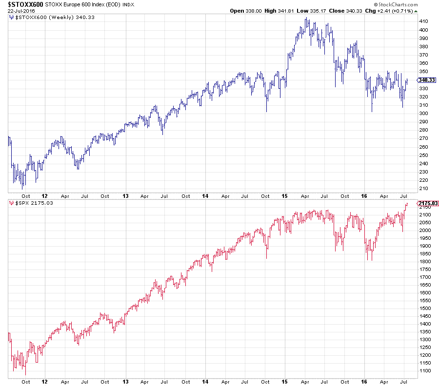 The top chart (Europe) is very clearly in a downtrend, still. While the bottom chart (USA) just broke to new highs. This makes the overall outlook for equities mixed, but any equity allocation within an international portfolio should be geared towards US equities.
Conclusion
So all in all, from an asset allocation perspective, commodities, and real estate are the preferred asset classes in this universe at the moment, likely with more relative potential than equities. On the other side of the spectrum, Government bonds are clearly the asset class to avoid. This leaves equities a bit in the middle and as argued above I still approach the move of SPY above its previous highs with a bit of caution. However, from an international perspective and
Julius de Kempenaer | RRG Research
RRG, Relative Rotation Graphs, JdK RS-Ratio and JdK RS-Momentum are registered TradeMarks by RRG Research
Follow RRG Research on social media:
LinkedIn Facebook Twitter