RRG Charts November 29, 2016 at 12:38 PM
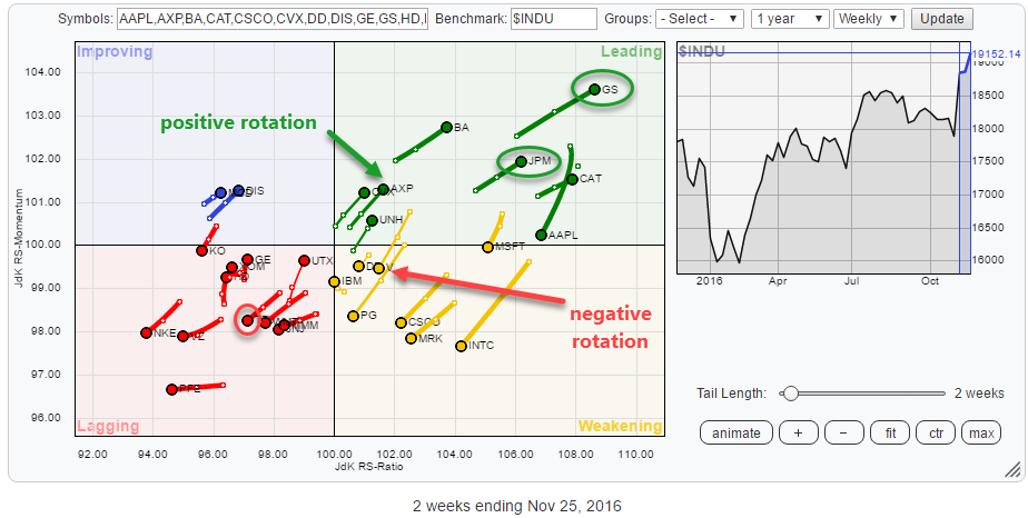
After the dust has settled, it is time to assess what is going on under the hood. The above Relative Rotation Graph holds the 30 Dow Jones Industrials components. As usual, they are fairly evenly spread out over the canvas of the RRG plot... Read More
RRG Charts November 19, 2016 at 07:55 AM

As (many of) you may know my fellow commentator Arthur Hill lives in Belgium. That makes him, geographically, my closest StockCharts.com colleague... Read More
RRG Charts November 05, 2016 at 10:55 AM
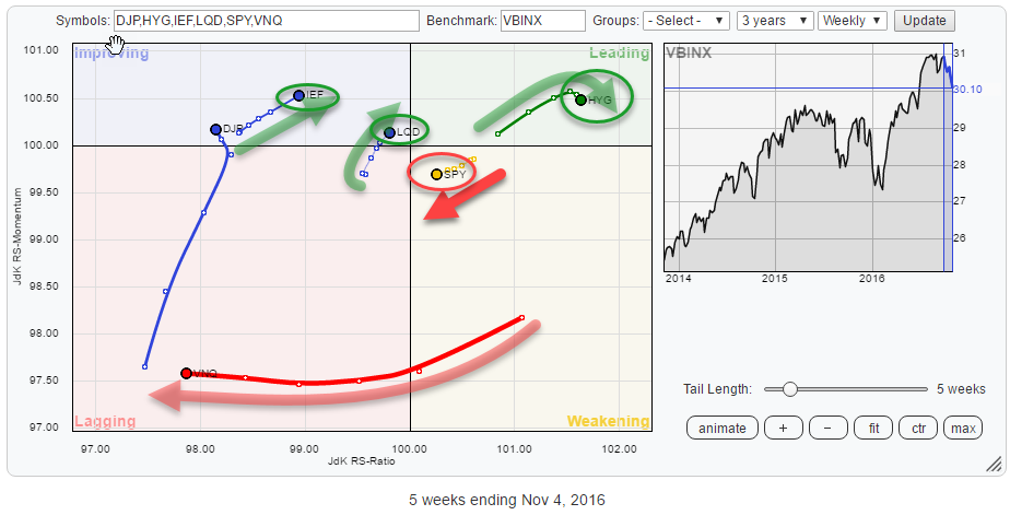
The Relative Rotation Graph above shows the rotation of various asset classes against VBINX, a balanced index fund holding 60% in equities and 40% in bonds. The current rotational picture is highlighting a pretty clear rotational picture for various (groups of) asset classes... Read More