RRG Charts January 29, 2017 at 07:13 AM
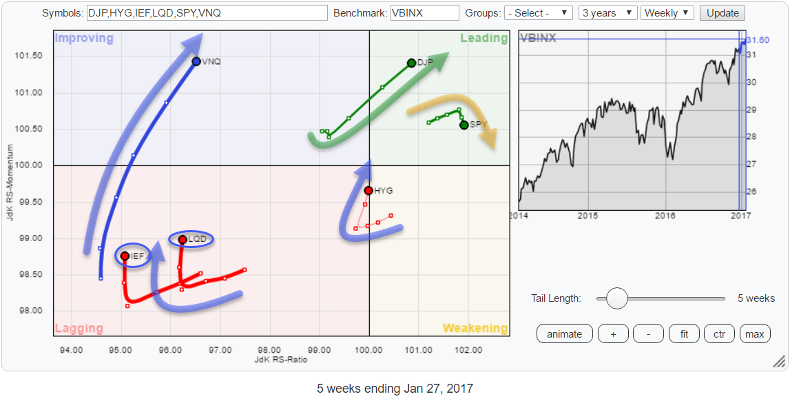
The Relative Rotation Graph holding a number of asset class ETFs is showing a strong push of commodities (DJP) into the leading quadrant. Together with Real Estate (VNQ), these two asset classes are showing the most powerful headings in combination with the longest tails... Read More
RRG Charts January 16, 2017 at 12:31 PM
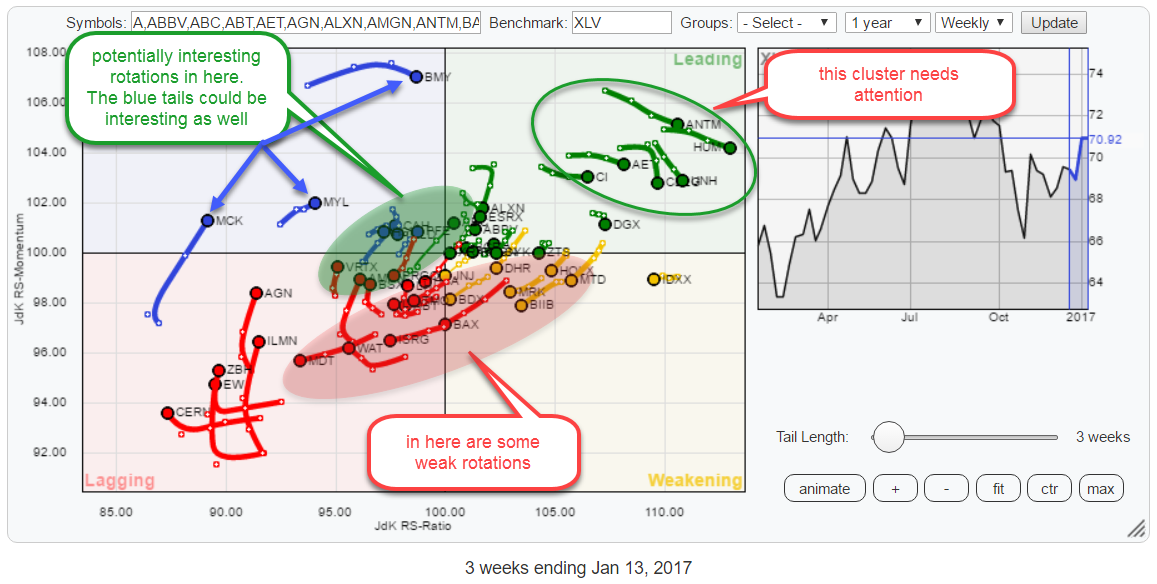
The Relative Rotation Graph above holds the constituents of the XLV (Health Care) ETF... Read More
RRG Charts January 09, 2017 at 06:15 AM
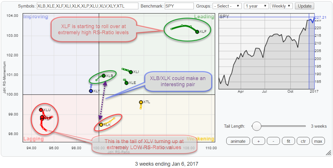
The Relative Rotation Graph below holds the sector ETFs that make up the S&P 500 universe and uses the S&P 500 index ETF (SPY) as its benchmark in the center of the graph. Four rotational patterns, two pairs, capture my attention when I look at this chart... Read More