 I like to keep an eye on what's going on in the world around us. That means also monitoring what's happening in markets that are maybe not directly of interest when it comes to trading or investing.
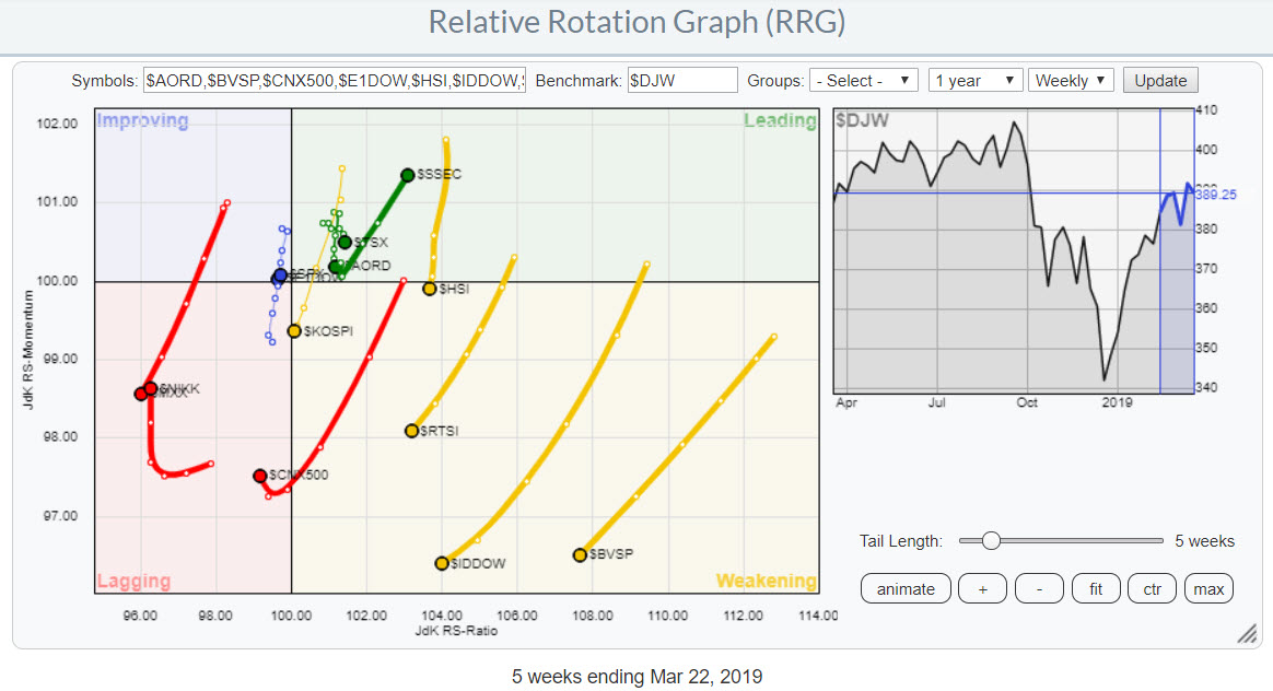
For stock markets around the world I like to use the pre-defined group "International Stockmarket Indexes" on the RRG page. The resulting Relative Rotation Graph populated with this group is shown above. The benchmark for this universe is the Dow Jones Global Index ($DJW).
At first glance we can see five markets rapidly moving lower on the Jdk RS-Momentum scale and at the same time losing strength on the JdK RS-Ratio scale.
In the lagging quadrant these are Mexico ($MXX) and India ($CNX500) and in the wekaning quadrant we see similar moves for Russia ($RTSI), Indonesia ($IDDOW), and Brazil ($BVSP).
Mexico is definitely a market to avoid as it rotated back into the lagging quadrant after a rotation through improving. India has just crossed over into lagging.
The three markets inside weakening still have the opportunity to rotate back up before hitting the lagging quadrant, the higher the RS-Ratio reading the better the odds for such a move.
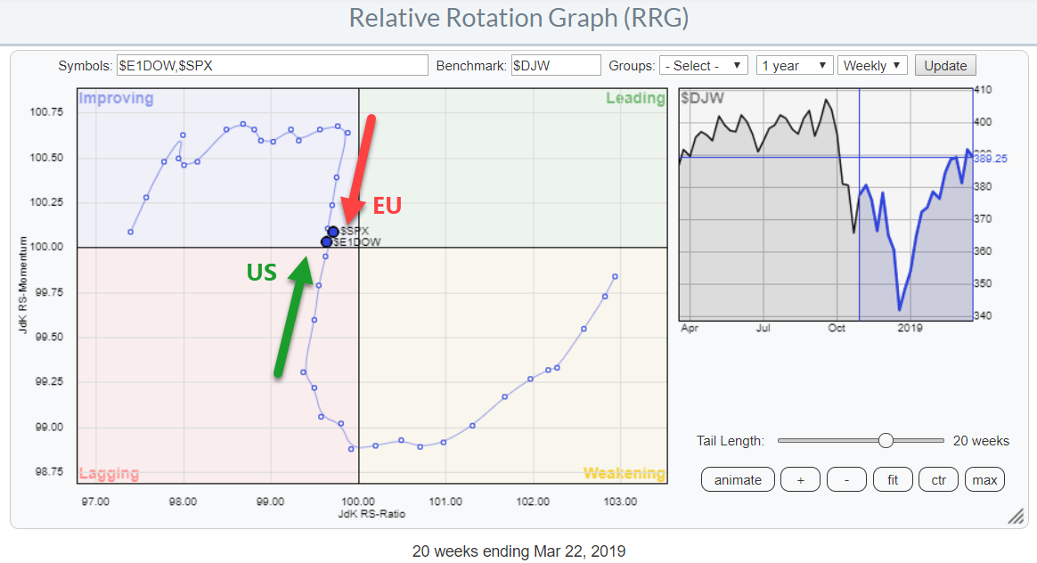
The RRG below zooms in on the cluster of markets that are closer near the benchmark (center of the chart).
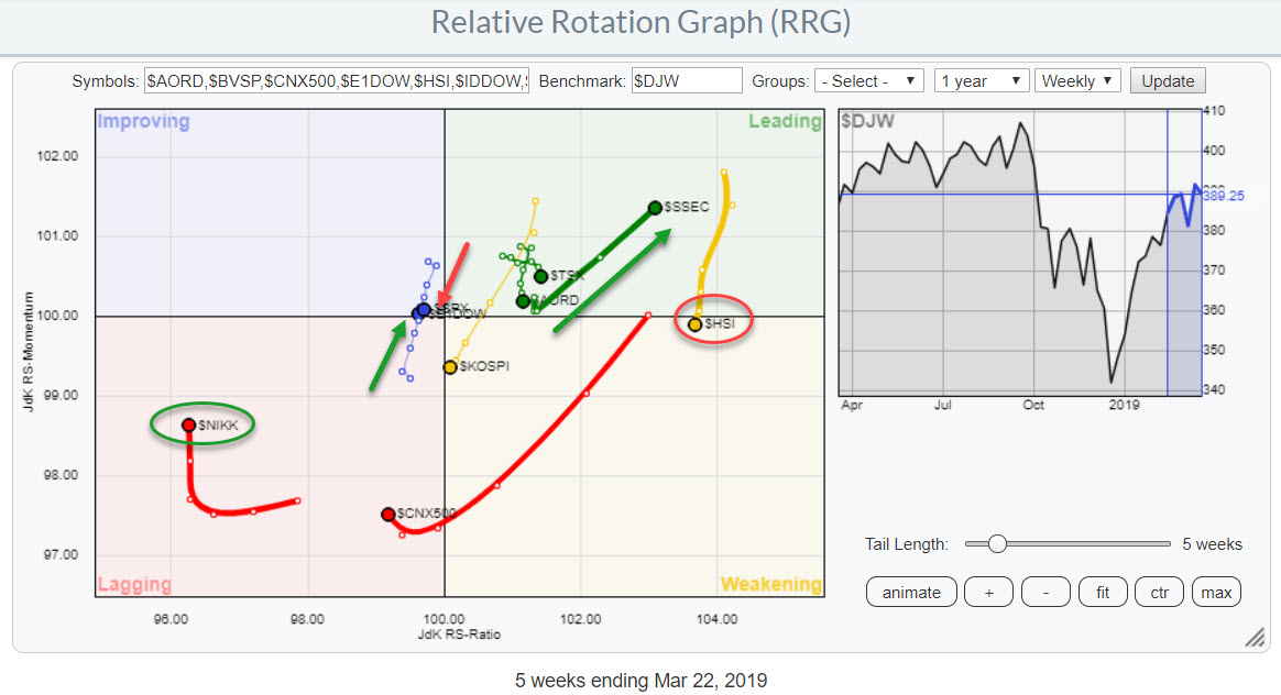 A few relationships that are catching attention here are Hong-Kong ($HSI) and Japan ($NIKK) on the far ends of the RS-Ratio scale. Europe ($E1DOW) and the US ($SPX) both inside the improving quadrant and China ($SSEC) in the leading quadrant.
Hong-Kong vs Japan
When you bring up the charts of these two markets, the differences are easy to spot.
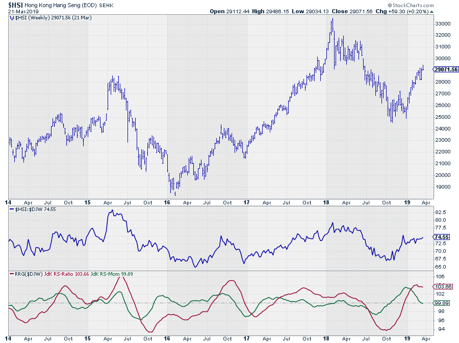 $HSI ended its downtrend of 2018 at a double bottom and rallied ever since but seems to be running into intermediate resistance now.
From a relative point of view, the relative line moved higher out of its October low and came to a rest at the start of 2019. The RS-Momentum line is about to cross below 100 pushing $HSI into the weakening quadrant.
The long-term (relative) picture for Hong-Kong is still strong but $HSI could be in for a temporary correction. 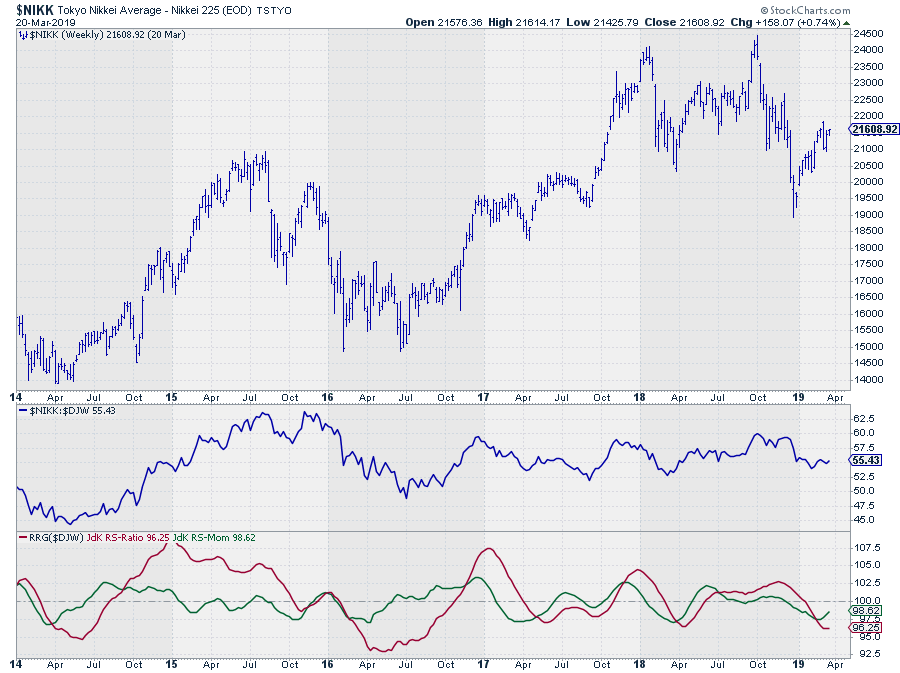
The $NIKK index in Japan moved lower since its high in 2018 and started a recovery rally out of the December low. The relative line completed a small double top and dropped to levels equal to the start of 2018.
Both RRG-Lines are well below 100 for a few months already, but RS-Momentum carefully started to curl upward over the last few weeks.
Despite the longer-term rotation for Japan being negative a short rally and a rotation from lagging towards and into improving on the RRG seems possible.
The combination of these tails, very wide apart on the RRG offer a very aggressive pair trading opportunity.
Paired
The final check for such a trade is to look at $NIIKK against $HSI directly. The chart below shows the daily $NIKK:$HSI relative (bar) chart with the MACD and RSI plotted below it.
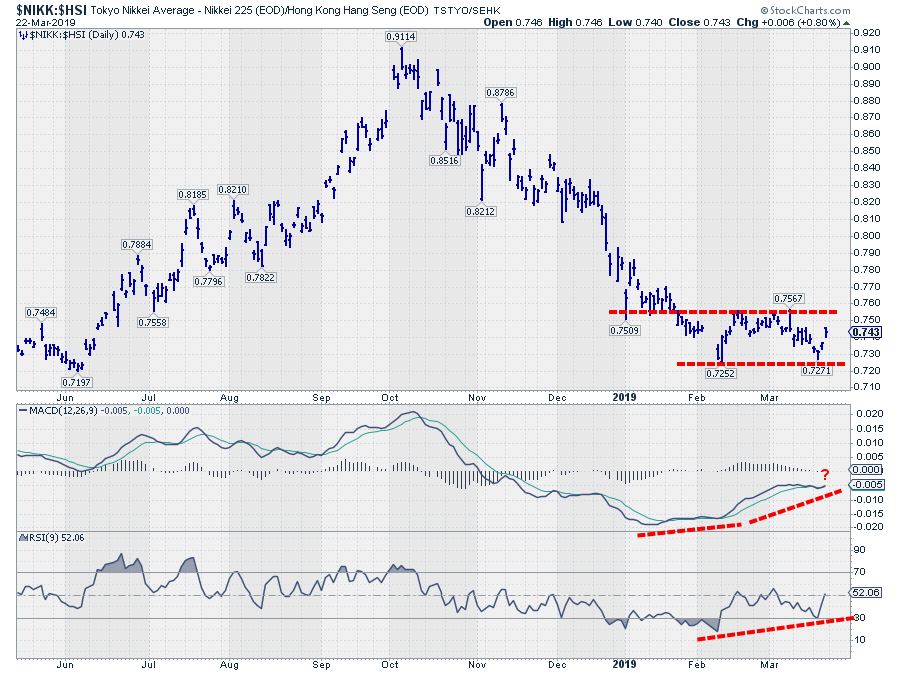 The relative chart shows a basing pattern after a sharp downtrend (where Hong-Kong strongly outperformed Japan). That base will be completed with an upward break after which a (recovery) rally may be expected.
The positive divergences that are building up between MACD/RSI and relative suggest that further upside movement is imminent. The rotation of the tails on the RRG-chart are picking up on this move and provide us with the situational awareness of these markets being at the far edges of the RRG, something you would not be able to tell from looking at this relative chart above.
As said this is a pretty aggressive idea, banking on the assumption that the relative line will break above 0.76.
A drop below the lower boundary of that trading range will kill this scenario and bring back this rotation to its long-term trend in favor of Hong-Kong vs Japan.
Europe - USA
 These weekly rotations above show the opposite rotational patterns that both sides of the ocean went through since November 2018 with the US losing relative strength against Europe. This changed at the start of February after $SPX had just entered the lagging quadrant but almost immediately started to move higher on the RS-Momentum scale and $E1DOW could not push into the leading quadrant and rolled over inside improving and started picking up downward momentum.
At the moment both markets are very close to the center of the chart which means that their (trend in) performance is very close to that of the benchmark (Dow Jones Global Index).
A quick look at both charts does not provide us with a lot of helpful clues, speaking for myself that is ....
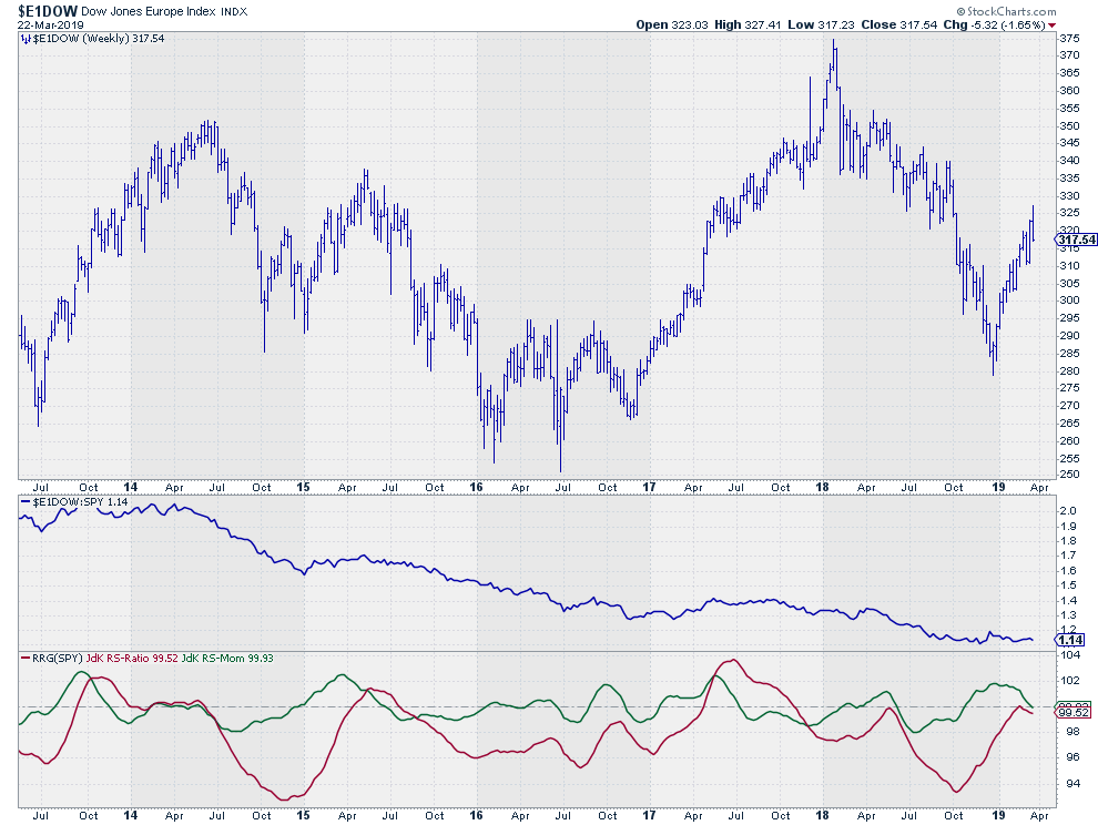 Europe ($E1DOW) had a very bad 2018 resulting in a significant underperformance against the US. The recent rally out of the December low recovered some of that underperformance but then started to fall flat and move sideways over the last weeks.
From a price perspective the series of lower highs and lower lows is still intact and if we are going to put in a new high around current levels anytime soon this market seems to be in for another leg down.
The RRG-Lines are picking up some weakness against other international stock markets as they are both heading lower and very close to crossing over into the lagging quadrant.
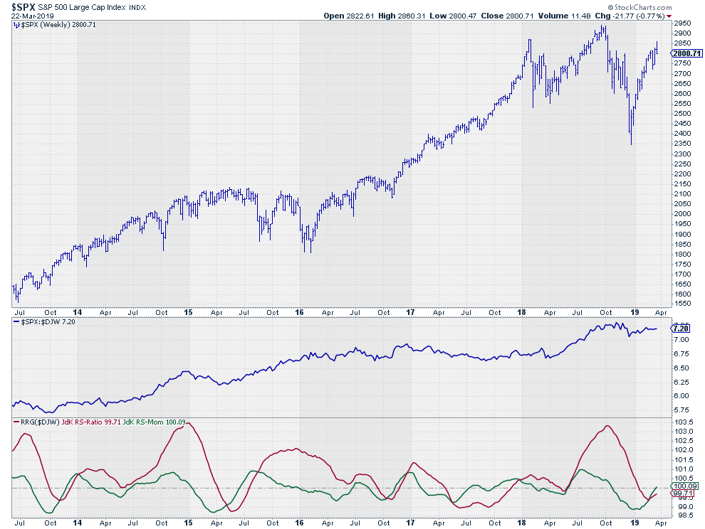 The S&P also had a weak 2018 but, unlike Europe, managed to put in a new all-time high before dropping sharply into year-end. This is where the US lost the relative battle vs Europe. At least for the time being.
That situation started to turn again with the rally out of the December low which was much stronger for the US than for Europe, bringing the RRG-lines back towards the 100-level where they now are and both are still moving higher with the raw relative strength moving flat, just like it does for Europe.
This combination of rotation on the tails very close to the benchmark suggests that the US continues to overtake Europe again in terms of relative performance but it does not give us much indication for the direction of the markets in general.
The good news is that Relative Rotation Graphs help us to get a broader perspective. And while keeping a close eye on the (relative) battle between Europe and the US which is taking place close to the center of the chart, another market really stands out inside the leading quadrant, screaming for attention....
And the winner is....
China - $SSEC
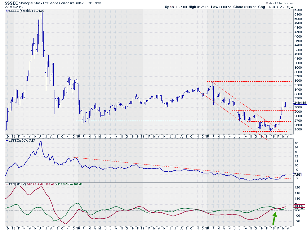
And the winner is China .... The position of $SSEC on the Relative Rotation Graph inside the leading quadrant and in comparison with the other markets calls for further investigation.
The chart above shows the underperformance of the Chinese market against the rest of the world since mid-2015. For the first time in three and a half years, the relative strength of $SSEC managed to take out a previous high and break the down-sloping resistance line which had been in play since late 2015.
The RRG-Lines have picked up the improvement of relative strength at the very end of December when the RS-Ratio lines joined RS-Momentum above the 100-level. This improvement recently got confirmed when RS-Momentum managed to bottom out above 100.
On the price chart, a double bottom marked the end of the down-trend that characterized 2018 and the rally out of that bottom formation shows strength. After breaking above 2700, $SSEC also managed to clear the next intermediate resistance level near 2900. That level will now very likely act as support going forward. On the upside, there are a few intermediate resistance levels coming from old highs but the real level to watch is 3600 which gives the Chinese market plenty of upside potential to work on and outperform other world stock markets.
Let me know what you think of this usage of RRG in the comments below. If you would like to receive a notification when a new RRG blog article is published, simply "Subscribe" with your email address using the form below.
Julius de Kempenaer | RRG Research
RRG, Relative Rotation Graphs, JdK RS-Ratio, and JdK RS-Momentum are registered TradeMarks ®; of RRG Research
Follow RRG Research on social media:
Feedback, comments or questions are welcome at Juliusdk@stockcharts.com. I cannot promise to respond to each and every message but I will certainly read them and where reasonably possible use the feedback and comments or answer questions.
If you want to discuss RRG with me on SCAN, please use my handle Julius_RRG so that I will get a notification.