Normally, I provide a daily blog article every day that the U.S. stock market is open. That eliminates Saturdays and Sundays. I'm making an exception today to share some historical information that I believe you'll find useful as you work your way through 2017. Also, the following historical information will be a perfect lead in to a special webinar series that will begin next Saturday, January 14, 2017. Greg Schnell and I will be co-hosting "2017 Stock Market Outlook" at 11am EST, providing some of our best ideas for 2017. It's the first of a monthly series throughout 2017 where we'll look to provide education, timely commentary and delve into many of the useful tools and features at StockCharts.com. It's a benefit we're providing to subscribers here at StockCharts. There will be no charge for StockCharts.com members.
This is a great time to join and check out the features and tools that we offer. By signing up for a 10 Day FREE Trial, you'll not only get to kick the tires of an award-winning service, but you'll be able to join me and Greg for next week's webinar, which I think you'll find very useful. If you're not currently a member of StockCharts, CLICK HERE to sign up for the FREE trial and join us next Saturday!
Lastly, remember that you can sign up for my blog (and other blog authors as well) for FREE by simply scrolling to the bottom of this article - or any article - and looking for the green "Notify Me" button. Type in your e-mail address in the area provided and click on that green button and VOILA! you'll receive all of my blog articles in your e-mail the moment they're published. And, of course, I thank you for subscription. :-)
Ok, let's take a look at a summary of how each sector ETF performs relative to the benchmark S&P 500 by calendar month. To highlight sectors of relative strength and weakness, the following spreadsheet is color coded. Have a look:
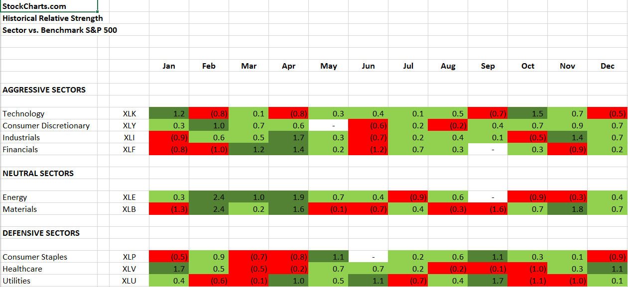 The numbers shown tell you whether a sector outperforms (green shaded) or underperforms (red shaded) the benchmark S&P 500 for that calendar month and by how much. For instance, on the top line the technology sector ETF (XLK) has outperformed the S&P 500 during January by an average of 1.2% over the last 20 years. Any monthly outperformance of 1.0% or greater has been shaded with dark green so that the very strong relative performance months really stand out. While I wouldn't necessarily use this to buy and sell ETFs throughout the year, I would use it as another indicator to determine which areas of the market I want to trade. As an example, healthcare (XLV) has its best relative months in December and January. Take a look at its performance over the past several weeks:
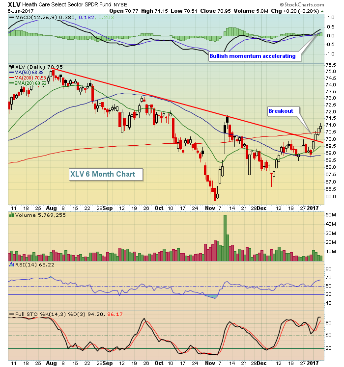 The strength since early December is obvious and now the XLV has made a nice trendline break to the upside. Technically, the sector appears much stronger and we know we're in a month where the XLV tends to outperform. Therefore, this is a space I'd look to for trading ideas. Biotechs ($DJUSBT) tend to be the best performing stocks within healthcare during January, so that's an area I'd consider.
Please don't forget to subscribe using the "Notify Me" button below. Thanks!
Happy trading!
Tom