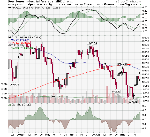
Since setting a new low of 9783 last Friday, the Dow moved higher during four of the last five days and is now approaching the 10203 peak that it set back at the start of August. This rally - and the successful IPO of Google - has greatly improved the general mood of the markets however resistance from the 50-day MA line - not to mention the rising price of oil - make it is likely that the Dow reverses before moving above that August peak. I'm looking for a retest of the 9783 low in the next couple of weeks.
While you wait to see what happens, why not kick back and enjoy this jammed-packed issue of ChartWatchers? After I continue my series on John Murphy's Ten Laws of Technical Trading, John looks at a little known ETF that is breaking out right now, Carl sees several Bullish signals on his S&P 500 chart, Richard sees a declining economy in 2005, and Arthur finds evidence of lower inflation expectations by bond traders.
LAW #5: DRAW THE LINE
Murphy's Law #5: Draw trend lines. Trend lines are one of the simplest and most effective charting tools. All you need is a straight edge and two points on the chart. Up trend lines are drawn along two successive lows. Down trend lines are drawn along two successive peaks. Prices will often pull back to trend lines before resuming their trend. The breaking of trend lines usually signals a change in trend. A valid trend line should be touched at least three times. The longer a trend line has been in effect, and the more times it has been tested, the more important it becomes. - John Murphy
It still amazes me how many people, when they first get into technical analysis, jump straight into indicators and oscillators without first learning the core concepts of support, resistance, and trend. Although I've said it many times before, I'll say it again here: At its core, Technical Analysis is about detecting stock trends in time to take advantage of them financially. Step one in that process is to look at the charts are draw trend lines. This is how smart ChartWatchers "pay their dues" and develop confidence in their projections. Its the basis for chart pattern analysis and it sets the stage for understanding indicators and oscillators. When in doubt, go back and redraw your trend lines. Properly created trendlines are always correct - the question is "Can you see what they are telling you?"
Trend lines aren't magic. They work for the same reason that support and resistance lines work. The majority of the people that are trading a giving stock feel that the intrinsic value of that stock has changed and that change is getting "priced into the stock". Why the value changed isn't important. How the majority came to their conclusion isn't important either. The job of trend line analysis is to detect that a change is underway and what its direction is.
As John indicates, drawing trend lines is all about finding "significant" peaks (AKA highs) and troughs (AKA lows) on a chart and then connecting the dots. It's actually harder than it sounds, but with a little practice, anyone can master it. One of the hardest things to learn is how to spot a real reversal - something that I wrote about last year. Now would be a great time to re-read that article (and bookmark it for later study!).
Another "gotcha" with trend lines is to forget to check the "Scale" setting for the chart you are looking at. Trend lines on logarithmic scale charts are very different from trend lines on arithmetic scale charts. Our ChartSchool article on Trendlines go into much more detail.
Creating your own trend lines at StockCharts.com couldn't be simpler. Just create a SharpChart for the stock that you are interested in and then click on the "Annotate" link located just below the chart. After our Java-based ChartNotes program loads, you can simply click and drag to create as many trendlines as you want. If you are a member of our Extra service, you can even save your annotated charts in your account and then see how your trendlines "hold up" over time.
You should also experiment with the "Zig-Zag" price overlay when learning about trend lines. While it has some significant limitations, it can help you spot significant peaks and troughs automatically. For more info, see this ChartSchool article.
Of course, there are several great books in our bookstore on trends. One of my favorite is "an oldie but a goodie" - William Jiller's "How Charts Can Help You in the Stock Market". Written in 1962, it shows the timelessness of these ideas in a clear, concise format that's MUCH less expensive ($14.45) than the Edwards & Magee book while covering much of the same ground. Of course, John's classic introduction book is similarly priced and similarly useful.
Can't wait for the next installment? Click here to see all of John's Ten Laws of Technical Trading.
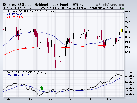
GOING FOR DIVIDENDS... A falling stock market -- along with falling bond yields -- should make dividend paying stocks more attractive. And that appears to be the case. Chart 1 plots the iShares Dow Jones Select Dividend Index Fund (DVY), which invests in large cap stocks that pay dividends. The Dividend ETF has acted much better than the rest of the market since last April as reflected in its rising relative strength line. Pricewise, the ETF hit a new four-month high earlier in the week. The two groups most heavily represented in the Dividend Fund are banks (38%) and electric utilities (19%). Other holdings include (in order of size) chemicals, tobacco, insurance, fixed line communications, and energy.
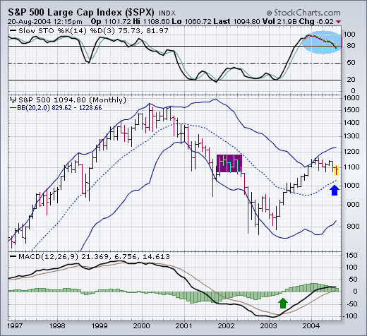
S&P MONTHLY BARS OVERBOUGHT BUT STILL IN LONG-TERM UPTREND... The monthly bars in Chart 2 carry good and bad news for the S&P 500. First the bad news. The monthly stochastic lines above the chart are still weakening from overbought territory above 80 (see circle). In addition, the price bars show that the S&P bull trend stopped at its early 2002 peak (see box) -- after recovering half of the 2000-2002 losses. The good news is that the S&P remains above its (dotted) 20-month moving average (see arrow) which qualifies the current price drop as a correction as opposed to a bear market. And, finally, the monthly MACD lines which turned positive at the start of 2003 (see arrow) are still positive.
The TIP/TLT price relative serves as a good proxy for inflationary fears or expectations. TIP is the iShares TIPS Bond (TIP), which is based on the US Treasury's inflation indexed bonds. TLT is the iShares 20+ Year Treasury Fund (TLT), which is not hedged against inflation.
Bonds loathe inflation and would decline in the face of increasing inflationary expectations. The TIP/TLT price relative takes this one step further by measuring the performance of inflation-hedged bonds against non-hedged bonds. This price relative rises when inflation expectations rise and falls when inflation expectations decline.
Looking at the TIP/TLT price relative for 2004, there are two distinct moves: an advance from mid March to mid May and a decline from mid May to mid August. The decline is still underway as the upper blue trendline has yet to be challenged and the price relative remains well below the late July high. As long as this downtrend continues, inflation remains at bay and bonds are unlikely to remain strong as inflation is not a concern.
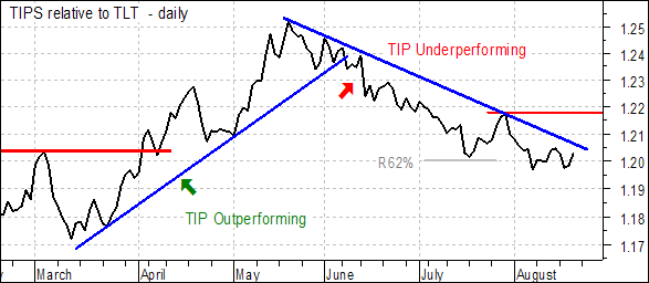
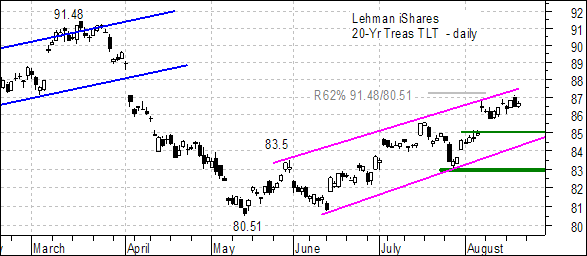
Also, notice that there is a good and inverse correlation between the TIP/TLT price relative and the actual performance of TLT. When inflationary expectations rose from mid March to mid May, TLT declined from 91.48 to 80.51. When inflationary expectations subsided from mid May to mid August, TLT advanced from 80.51 to 87.
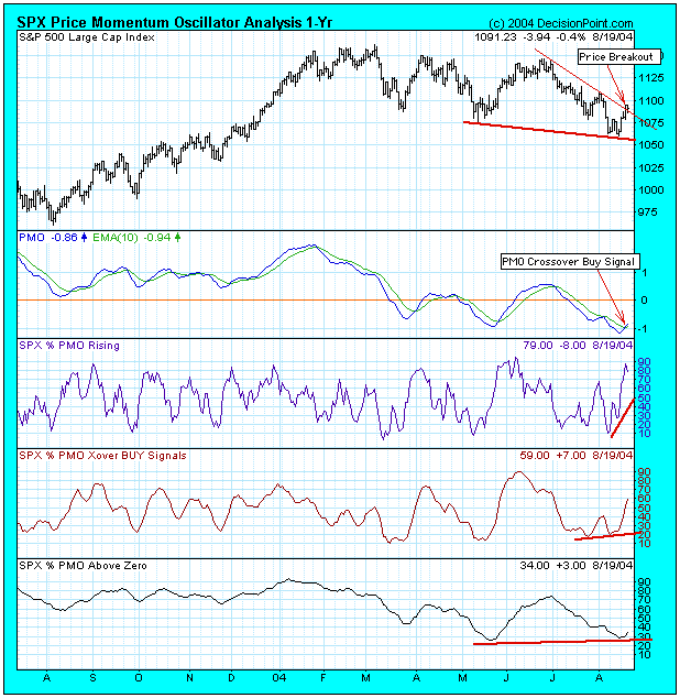
We can't know the full potential of this rally, but there is abundant evidence that we have a solid bottom, and that we are seeing a rally that has at least the potential to move back to the top of the trading range.
First, there are positive divergences on indicators in every time frame. A positive divergence is where price makes a lower low but indicators make a higher low. The dark red lines on the bottom three panels of the chart highlight the positive divergences. These indicators, by the way, summarize the status of the PMO (Price Momentum Oscillator) for each of the stocks in the S&P 500 Index.
Next, we can see prices breaking above a short-term declining tops line, and there is an important PMO buy signal, generated when the PMO crossed above its 10-EMA.
Finally, Percentage PMOs Rising shows a strong initial impulse with a surge to almost 90%.
It is not impossible for the rally to move prices higher than the March top, but, as with the two previous lows this year, the PMO bottom associated with the recent low was too shallow. It would have been better if it had dropped to around -2.0, creating a fairly solid oversold condition.
Overall, this is a pretty good looking chart, but the top of the trading range could easily be the limit of the rally.
This past week showed stocks higher; their largest weekly gain in nearly 10 months. And, it did so within the context of sharply higher oil prices. By and large, this has set the tone for stocks to potentially move to new highsor so we are to believe. In fact, there is always that probability; however, we accord it a very small one at that.
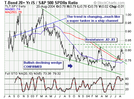
That said , we are specifically looking at the bond-stock asset rotation for clues towards the best relative performance. Our and our proxy is the Lehman 20+ yr Bond Fund vs. S&P Spyders (TLT: SPY); and very simply we see that bonds over the past 2 months have outperformed stocks in a large manner. We believe this bottoming formation argues for a continuation of bonds outperforming stocks over the intermediate-term, although the current sharp stock rally indicates a correction in the ratio is taking placeperhaps to the 250-dma at .76. At this point, it would be wise to consider exiting stocks in favor of bondsas stocks are likely to fall further and faster than the current consensus believeswhich argues for a sharply decelerating economy into 2005.