Thursday's big rally for the Dow Industrials was unexpected and significant. Check out the chart below and see if you can spot the reasons why:
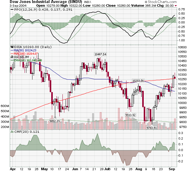
As anticipated, the Dow faltered after hitting its 50-day moving average line. That line was also at the 10,200 resistance level marked by the peak in late July and so the odds of a reversal there were pretty good. Sure enough, the Dow started moving lower on Monday, but rallies on Tuesday and Wednesday re-tested the resistance level and Thursday's big follow-up pushed things well clear. The MACD line moved into positive territory and the Chaikin Money Flow moved back into the green.
The Dow is now testing its 200-day MA and eyeing the next higher resistance area between 10,350 and 10,450. That's where it ran into problems back in June. In order to officially reverse the long-term downtrend that the Dow is in, it needs to move above the high of 10,487 set on June 25th. The next couple of weeks should be very interesting...
In the mean time, check out John Murphy's thoughts on the Telecomm sector, Richard Rhodes' look at Semiconductor stocks, Carl Swenlin's views of the Rydex Ratio and the next installment in my continuing tour of "Murphy's Laws".
LAW #6: FOLLOW THAT AVERAGE
Law #6: Follow moving averages. Moving averages provide objective buy and sell signals. They tell you if existing trend is still in motion and help confirm a trend change. Moving averages do not tell you in advance, however, that a trend change is imminent. A combination chart of two moving averages is the most popular way of finding trading signals. Some popular futures combinations are 4- and 9-day moving averages, 9- and 18-day, 5- and 20-day. Signals are given when the shorter average line crosses the longer. Price crossings above and below a 40-day moving average also provide good trading signals. Since moving average chart lines are trend-following indicators, they work best in a trending market. - John Murphy
A couple of weeks ago, we looked at trends and trendlines. We talked about how trendlines are line "non-horizontal" support/resistance levels. Well, think of moving average lines are like "flexible" trendlines. They help you see the trend that's "hidden" amongst all the noisy short-term price fluctuations.
Unfortunately, unlike trendlines and resistance levels, there are an unlimited variety of moving averages that you could look at. There's the 50-day MA, the 200-day MA, the 20-day MA, the 9-day MA, etc. Going beyond that, there are Simple Moving Averages (SMAs) and Exponential Moving Averages (EMAs) (and still others beyond those!). How do you choose?
The general rule is simple - the longer your time horizon, the longer the MA period you should use.
Are you a buy-and-hold investor? Use longer term MAs like the 50-day and 200-day ones that I like to write about. Are you a day trader? Use shorter term MAs like the 4-day and 9-day ones that John mentioned.
Note however that while longer-term investors can generally ignore short-term MAs , the reverse is not true. Even day-traders should be aware of where important long-term MA levels are. Resistance from the 200-day MA can impact day traders too.
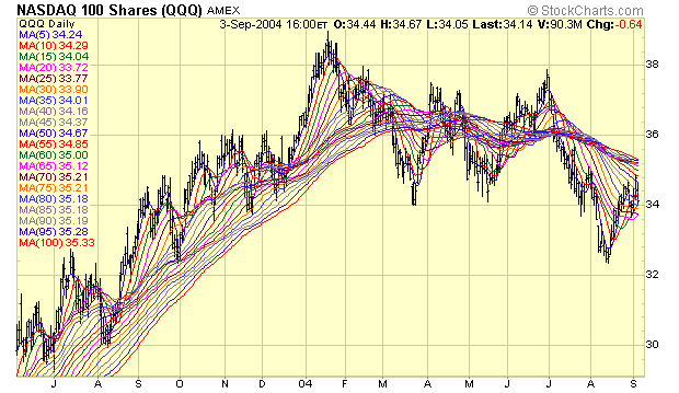
The help see how different MAs work, I often look at something I call an "MA Ribbon Chart". It contains a series of MAs - each with a slightly different period setting:
As John mentions in Law #6, MA Crossover signals can be very useful in trending markets. That where you focus on the points where two different MAs intersect. When the shorter MA moves above the longer MA, a "buy" signal is given. When the shorter MA moved below the longer MA, a "sell" signal is given. Here are some examples:
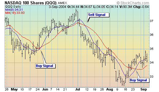
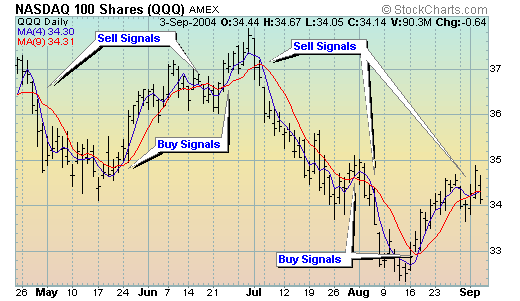
As you can see, shorter MAs periods lead to more signals. You'll need to take some initiative here and experiment to see what combination fits your trading goals and style. Fortunately, StockCharts.com makes it very easy to try whatever combinations you want.
Finally, don't forget to watch the 50 and 200-day MAs. Why? Because lots of other people watch them and thus, they often act like important support and resistance zones.
Next week: Law #7 - Learn the Turns
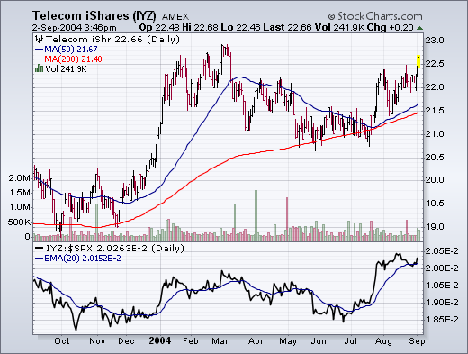
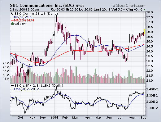
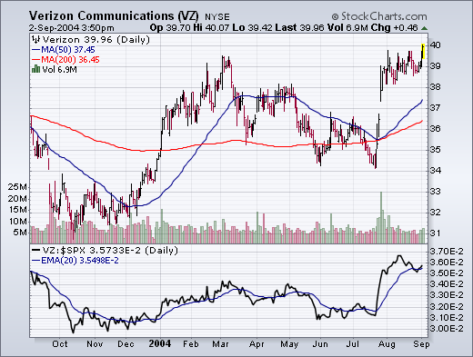
Telecom stocks had a good chart day. The AMEX Telecom iShares (IYZ) broke out to a new six-month high today. Its relative strength line has been rising since late June. Two of the biggest reasons for today's strength were SBC and Verizon Communications which are two of the biggest holdings in the ETF. SBC rose to the highest level in seven months. Verizon ended the day at a new 52-week high. Both relative strength lines have been jumping for the last two months.
The Rydex Asset Ratio has been around for eight or ten years, and it is a favorite among sentiment indicators because it is based, not upon opinion polls, but upon where people are actually putting their money. It is calculated by dividing total assets in bear index and money market funds by the total assets in bull index and sector funds.
Recently Decision Point introduced the Rydex Cash Flow Ratio. It uses the same basic formula, but, instead of total assets, it uses Cumulative Cash Flow (CCFL) totals for the same funds. To determine CCFL we calculate daily net cash flow, which is the actual cash entering and leaving each fund in the Rydex group of funds. This is done by calculating the amount that total assets in a fund should have changed based upon the percentage change of the net asset value (NAV) per share, assuming that no cash was added to or taken out of the fund. We then subtract this amount from the actual amount of total assets in the fund, and the result is the daily net cash flow. We keep a cumulative total of the daily net cash flow. Total asset value tells us how much money is in the fund. Cumulative Cash Flow tells us how much cash was actually moved in or out of the fund.
We think that the Rydex Cash Flow Ratio is a dramatic improvement over the Rydex Asset Ratio, because it uses an estimate of the amount of money that has been committed to bull and bear funds, making it a more accurate reflection of the actual underlying psychological forces that are affecting market participants.
On the chart below we can see that the Cash Flow Ratio shows more rational and consistent levels of support and resistance. And we can see that the Cash Flow Ratio is able to maintain a fairly well-defined trading range for extended periods.
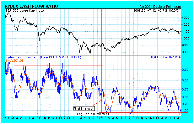
It is really striking how the Cash Flow Ratio has clearly detected the true state of sentiment during 2002 through 2004. For example, we can see a sharp rise in bullish sentiment coming off the March 2003 price lows. Then by May 2003 we can see sentiment peak and begin to turn bearish. I remember because I was there. People didn't believe that a bull market had begun. They became progressively more bearish in June and July, and, when the market had a small shakeout in August 2003, the Cash Flow Ratio was as bearish as it had been in March 2003. While that may not seem reasonable based upon price movement, I think it is an accurate expression of how sentiment "felt" at the time.
Also, note how the Ratio trading range shifts downward at the beginning of 2003. This was caused by a large chunk of money moving into bear funds as the market headed down into it's final low before the bull market launched. Bearishness reached a feverish pitch at that time and it permanently altered the trading range. This could happen again in either direction if sentiment is strong enough.
Finally, we can see that the recent levels of bearishness at the August 2004 price lows are the same as they were in March and August 2003. In my opinion, this is strong evidence that a medium-term price low was reached at that point.
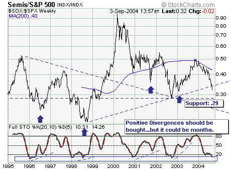
The recent carnage in the Semiconductor Index (SOX) moved to the forefront on Friday with INTC’s poor guidance moving forward. Thus, we must look at the SOX within the context of its relationship with the S&P 500 (SPX), and for this we use the ratio of the two Quite simply, we could very well see s a short-term bottom in the ratio in the days or weeks ahead – but it certainly isn’t within a historical context “the bottom” we would feel comfortable buying into on a longer-term basis. Our momentum indicators are now oversold, but it has paid to wait until a “positive divergence’ forms prior to becoming aggressively long this sector…which will require many months.
Bottom Line: We don’t expect the semiconductors to be “the leaders: on rallies as they once were.