Hello Fellow ChartWatchers!
Every week we hear about a couple of message board posts that have appeared on some website somewhere which essentially says "StockCharts.com is saying that this stock will rise (fall) dramatically!" Here's a screenshot from a recent example:

We said that? What? Huh?
First off, let me state for the record that StockCharts.com is not in the business of predicting stock movements. We never have been and we never will be. We provide tools that help anyone make their own predictions using any method that they feel comfortable with. If you ever think that we are recommending the purchase or sale of a particular stock, please think again and then re-read what we said.
OK now that that is out of the way, why the heck are these message board posters making the claims that they do? The first thing to understand is that ninety percent of these claims are made in "investment spam" messages. These messages are trying to trick people into buying (or selling) the stock in question without first doing due diligence. Hopefully I don't need to remind a fellow ChartWatcher like yourself of the need for lots of research prior to making buy/sell decisions.
That said, most of these messages also come with a link to a point and figure chart on our website - like this one - and, sure enough, that chart has a line on it that says (for example) "Bullish Price Obj. (Rev.): 38.5".
Here's what the spammers are trying to get you to do. They want you to think about things like this:
Wow, seems like StockCharts.com really is making a prediction about that stock. Seems like the good people at StockCharts think RMBS is about to tank big time. Ya know, John Murphy works with StockCharts.com and he's an expert. I think I better sell my shares!
Now, here's how you should be thinking:
What the heck is a "Price Objective" on a Point and Figure chart and what does it really mean?
Remember, just below every P&F chart is a link called "About Price Objectives". It leads to our ChartSchool article with all the gory details about how we calculated P&F Price Objectives and it contains numerous warnings about how they should be used. I urge everyone to read that page carefully but the bottom line is this: Price Objectives are simplistic and very unreliable. At best, they represent an upper (or lower) bound for the stock's next big movement. At worst, they are ammunition for scam artists.
So why have Price Objectives at all? Price Objectives hark back to the early days of Point and Figure charts when Technical Analysis was still in its infancy. Things like Bollinger Bands, MACDs, and MarketCarpets had not been invented then and Price Objectives were the best people had. Don't get me wrong, when properly understood, Price Objectives can be another useful tool for any chartist. Unfortunately, most people do not take the time to understand them and the scam artists count on that fact when posting their garbage.
Don't be fooled.
P.S. Happy Holidays everyone! Our next newsletter will go out in January.
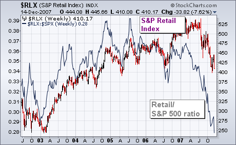
The two charts below demonstrate part of the reason why recent Fed moves haven't had much of a positive impact on the stock market. It has to do with negative fallout on retail spending resulting from the housing meltdown. The bars in Chart 1 plot the S&P 500 Retail Index, which has been one of the year's weakest groups. The RLX is on the verge of falling to a new three-year low. Its relative strength ratio (solid line) has already reached a five-year low. If the weak performance of retail stocks is a leading indicator of retail spending (which I believe it is), and if retail spending is 70% of the U.S. economy, then Chart 2 carries bad news for the U.S. economy and stock market. What's causing the retail breakdown? Chart 2 overlays the same Retail/S&P 500 ratio over a bar chart of the PHLX Housing Index. Notice the close correlation between the two lines. They both peaked in the middle of 2005 and have been falling together since then. In other words, the housing depression is closely tied to the retail breakdown. That suggests that there's a lot more to worry about than just subprime mortgages and liquidity problems. Which may also explain why recent Fed moves aren't helping much.

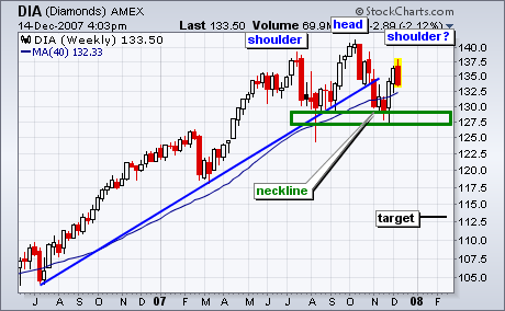
Is that a head-and-shoulders pattern taking shape in the Dow Industrials ETF (DIA)? While it has yet to be confirmed, traders and investors should keep a close eye on this chart in the coming weeks.
The potential head-and-shoulders pattern extends from June to December. The left shoulder formed in July, the head in October and the right shoulder is currently under construction. Notice that DIA opened strong on Monday and finished the week near its lows. In fact, DIA formed a bearish engulfing this week by opening above the prior week's close and closing below the prior week's open. This week's reversal opens the door to a reaction high around 137.5. A peak here and decline back to the support zone would complete the right shoulder. Neckline support rests around 127-129. A break below 127 would confirm this big reversal pattern and project further weakness towards 113.
Two weeks ago I stated that the rally off the November lows signaled that a bottoming process had begun, and that, after the short-term rally topped, we should expect a retest of the November lows. Last week the rally was still in progress, and I told Ike Iossif during our interview that I still expected a retest, but that I also feared that the rally would extend j-u-u-u-s-t far enough to trigger a Thrust/Trend Model buy signal before prices reversed downward. As you can see on the chart below, sure enough, the rally topped on Monday (generating a T/TM buy signal), and prices reversed on Tuesday, initiating what ought to be a retest.
I say "ought" to be a retest because so far, in spite of a lot of volatility, it isn't much of a retest in terms of magnitude. I would like to see prices drop to the area of 1425 â at that point I would consider that sufficient technical work has been done to provide a good base for the next rally. Of course we don't always get what we want from the market.
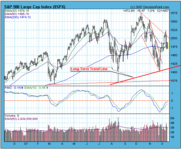
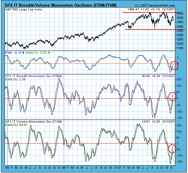
The next chart gives us a view of three medium-term indicators representing the condition of price, breadth, and volume. As you can see, all three indicators risen from very oversold levels and are in the neutral zone. While it is possible for the indicators to rise from oversold to overbought in a single, uninterrupted move, it is more usual for them to reverse once or twice as prices put in a bottom. If prices continue lower, we will see these indicators turning back down.
Another prominent feature on this chart is the trading range in which prices have been moving for most of this year. This is also called a "continuation pattern" â a consolidation that takes place before prices continue moving in the same direction they were moving before the consolidation began, in this case, up.
On the other hand, others may consider the formation to be a double top, which has bearish implications. While I can see the double top argument, we are still in a long-term bull market, and a new 9-Month Cycle is due to begin, so, at this point in time, I expect a bullish resolution.
Bottom Line: Odds are in favor of the retest moving lower, but my guess is that long-term support will hold, and that the retest will be successful.
Three consecutive economic reports have shown that inflation, after lying dormant for several years, has been rekindled. The Fed, surely armed with the economic data we've seen, decided to lower the fed funds and discount rates by another quarter point each. Slowing growth and a pick up in inflation is not what equity indices want or need. Is higher inflation here to stay or is it just temporary? Based on the Fed's action last week, the Fed likely believes this blip is temporary. They've said as much in previous meetings, acknowledging that commodity prices could continue to put upward pressure on inflation. However, they've also noted that they believe a slowing economy would curb demand for oil and other commodities.
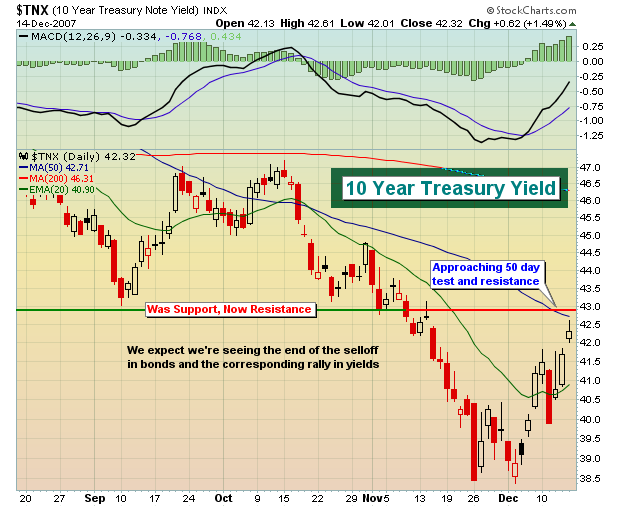
We're in the camp that expects inflation to moderate despite the recent upward pressure. Yields on the ten year treasury bond, while increasing lately, are acting in a normal technical fashion. We discussed a few weeks ago the likelihood that the yield would drop to the 3.80-4.00% support area. That's exactly what happened. The recent jump back up on the yield is a routine retest of the breakdown - very normal technical action. Take a look at the chart on the ten year treasury bond yield below.