Hello Fellow ChartWatchers!
A while back, demonstrated the concept of the Moving Average Ribbon here as a way for seeing the "waves and ripples" for any stock. The concept is simple - just plot lots of Moving Average overlays on the same chart but change the period for each MA by a fixed amount.
Many people really liked that concept and many people still use it in their daily analysis. Here's a different take on that same concept - the Displaced Moving Average Ribbon:

(StockCharts members can click the link above to see exactly how the chart was created.)
Just like the MA Ribbon, the Displaced MA Ribbon plots several Moving Average overlays on the same chart, only this time each MA has the same period BUT the offset for each MA is increased/decreased by a fixed amount. For those who aren't familiar with it, the Moving Average overlay on SharpCharts can take a second, optional parameter which represents the offset (positive or negative) for a moving average. For example, if you specify "50,5" as the parameters for a MA, SharpCharts will plot the 50-day Moving Average line and then shift it to the right by 5 periods. Similarly, "50,-5" shifts the MA line 5 periods to the left.
The Displaced MA Ribbon can help you see when a stock's current trend is "running out of steam" - if all of the lines are marching in step, things a great and the current trend should continue. When the lines start to get "tangled", it's time to re-evaluate things.
In the example above, I choose to use a Simple Moving Average with a 50-day period and displacement offsets of 5 periods. All of those things can be adjusted to suit your situation. You may find that a ribbon based on 20-day EMAs with 10-period offsets works better. That's great! Experimentation leads to familiarity and then to trust - and you need to trust an indicator before you can trade with it.
While I personally prefer the original MA Ribbon, the Displaced MA Ribbon can provide a different perspective on things and can help alert you to trend changes you might otherwise miss.
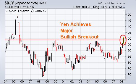
Last week I showed the Japanese Yen testing major chart resistance its 2000/2004 peaks. Today's 2% gain against the dollar put the yen over 100 for the first time in thirteen years (1995). While that's good for the yen, it's not necessarily good for global stocks which have been falling as the yen has been rising since last summer. Another low-yielding currency had a strong day today. The Swiss Franc gain of 1.5% made it the world's second strongest currency and pushed it to a new record high against the dollar. With the dollar and U.S. rates falling sharply today (along with stocks), gold and bonds had another strong day.
Technical analysis is a little art and a little science, which makes it subjective and open to interpretation. It is kind of like, gasp, economics. With a test of the January lows and a big surge on Tuesday, some pundits are talking double bottom. The interpretation of this double bottom depends on the charting style.
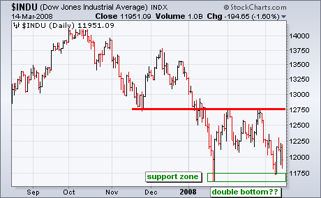

The two charts show the Dow with OHLC bars and with closing prices only. The bar chart sports a potential double bottom with two lows around 11750. In addition, the March low is actually above the February low. However, the close-only chart shows a clear downtrend with a lower (closing) low in March. The close-only chart looks more bearish than the bar chart. Before getting too excited about the double bottom chatter, I would keep in mind the clear downtrend on the close-only chart.
One of the reasons that Decision Point has spent so much time and money to create dozens of long-term historical chart series is that we must often compare current price and indicator behavior to prior periods where market action has been similar. For example, we are currently in a bear market, so, if we describe indicators as being oversold enough to hint that THE bottom is nearly in place, we need to look at prior bear markets to verify that assertion.
Currently, many analysts are claiming that deeply oversold long-term indicators are solid evidence that the bear market is nearly over. A good example is the chart of the Percent Buy Index (PBI) below. Clearly the PBI has reached its lowest level in three years, and the PMO (Price Momentum Oscillator) is also deeply oversold. Often a three-year history would be sufficient to make historical comparisons, but in this case it is woefully inadequate.
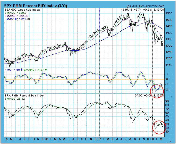
The next chart shows an eight-year history of the same indicators, encompassing the progress of the last bear market. Note that during that bear market the PBI first reached current levels at about the half-way point in the decline, and it reached the same or lower levels three more times before the bear market was finally over. Also, while the current PMO is very oversold compared to other low readings during the recent bull market, it has only gone half the distance to the lows set in 2001 and 2002.
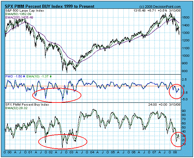
Bottom Line: Oversold conditions in a bear market can mean that the trouble is far from being over. In fact, when the PBI reached current levels in September 2001, it was 18 months before the new bull market began. It is a virtual certainty that the current bear market will not play out the same way as the last one did, but comparing today's market action to past bear markets gives us a genuine long-term perspective, and allows us to put today's market activity in the proper context. Don't be short-sighted when performing your chart research.
Bear market rules apply! The odds are that support levels will be violated, and, if against those odds the market manages to rally off support, odds are that the rally will fail before it can change the long-term trend.
It makes perfect sense that higher oil prices could derail (no pun intended) transports as the implications are clear. But the truth might surprise you. From Chart 1 below, you'll see that oil prices have been rising dramatically over the past 6 years. The price per oil was below $20 per barrel in 2002. That seems almost unfathomable as we contemplate $110 per barrel oil. That's nearly a six fold increase in the price of oil over a six year period. There's no possibility that transportations could thrive in that environment, correct? I mean, it just doesn't make any logical sense. Or does it? Supply and demand drives oil prices just as it does any other commodity or financial instrument, at least from an economic perspective. As the world economy was strengthening after our 2000-2002 bear market, oil prices naturally rose and they continued rising. Economic growth was sustained for a very long period and oil prices went along for the ride. Transports also benefit during economic expansion. So long as demand is at least partially responsible for higher oil prices, then transports can also thrive simultaneously. Now take another look at the Chart 1:
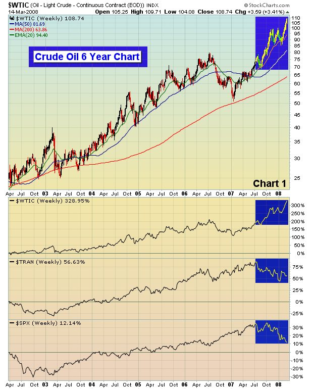
Crude oil rose dramatically during our economic expansion, but that expansion began to slow at the onset of credit issues relating to subprime loans that surfaced in July 2007. From the Chart 1, you can see that both crude oil and transports far outperformed the S&P 500 during the expansion period. But notice in Chart 2 the inverse relationship that's developed since July 2007:
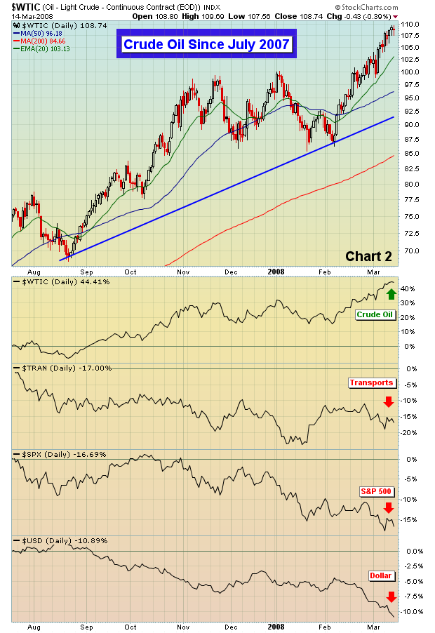
Crude oil definitely was rising from increased demand during global economic expansion. But it also was benefitting from the weak dollar. Since July the dollar index has tumbled, down another 10% in the last 8 months. It's the spiraling downward dollar that is fueling crude oil's continuing advance. It has been that same weak dollar that has helped to fuel other commodities like gold, silver and copper. I'm not saying it's solely responsible, but the extremely weak showing of the dollar is, at a minimum, aiding the commodity bulls. I believe the one event that could turn the tide on commodities is the lowering of interest rates by the European Central Bank (ECB). World markets are suggesting that the economic weakness felt here in the U.S. is not isolated. To date, the ECB has been adamant that inflation is the primary concern and rates abroad have remained elevated. The interest rates here in the U.S. are heading lower, so until the ECB changes its policy stance, commodity bulls will likely reap the rewards.
At the hint of an ECB rate cut, we'd lock in any and all commodity profits.
Happy trading!
From a broader market perspective, the S&P 500 continues to weaken after having violated the 1982-2000 bull market was violated two weeks ago at near 1310. This would suggest that further weakness is forthcoming and quite sharp weakness at that. But in any bear market - the rallies are sharper and more poignant, and give rise to the "hope" that a bottom is forged. Last week's "Bear Stearns" implosion is simply part and parcel of the credit unwinding that appears to have quite a bit of distance to go if we take the S&P 500 trendline breakdown into account. We have projections near 945, or a 343 point fall from Friday's close.
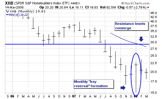
But having said this, we want to hone in on the Homebuilder indexes and the fact that in January of this year - they forged a rather bullish monthly "key reversal" pattern higher from major support levels. While that isn't clear on this Homebuilder ETF (XHB) chart given the short period of time it has been around - if one looks towards the S&P Homebuilding sub-industry - one would find the very same pattern and from major support levels forged in 2002. Thus, given this major technical bullish pattern - and the fact interest rates are likely to continue lower as the credit crisis unfolds - then perhaps traders will find the homebuilders a 'relatively safe' area to hide, for everyone anywhere and everywhere 'knows their fleas'. Certainly in regards to the XHB, we would very well see a sharp rally unfold upwards towards $27.50 to $30.00, which would represent a rough back of the envelope gains of +37% to +50%. The homebuilder stocks are over-subscribed in terms of short positions outstanding - which could provide the fuel necessary to get to these levels regardless of the economic backdrop. Hedge funds look for leverage, and in an era of deleveraging - certainly using the short outstanding positions to goose them higher seems reasonable. On Friday, we were buyers of XHB, Pulte Homes (PHM) and Hovnanian Enterprises (HOV).