This is the next part of a series of articles about Technical Analysis from a new course we're developing. If you are new to charting, these articles will give you the "big picture" behind the charts on our site. if you are an "old hand", these articles will help ensure you haven't "strayed too far" from the basics. Enjoy!
(Click here to see the entire series.)
Fibonacci Lines
How high is "too high?" How low is "too low?" Think back to any time that you've owned a stock and think about when you started to get worried about its performance. At what point did "your gut" start to tell you that you needed to sell? Chances are your gut started talking to you after the stock had moved up (or down) by 38.2%.
Wow, that's a really specific number - "38.2." It seems kind of arbitrary also. There's no way that could be correct, right? I mean, without knowing anything about the stock you were trading, or the amount of money involved, or the overall market conditions, or anything else - how can we stand here and tell you that you got nervous right at 38.2%?
The reason is because 38.2 appears to be programmed into the human psyche (as well as many other parts of nature). 38.2 is one of a set of numbers called "Fibonacci Percentages." They are derived from the "Fibonacci Sequence" which is a list of numbers where each number equals the sum of the previous two. i.e.,
1, 1, 2, 3, 5, 8, 13, 21, 34, 55, 89, 144, 233, 377, 610 etc.
The branching in trees, arrangement of leaves on a stem, the flowering of artichoke, an uncurling fern and the arrangement of a pine cone - all these things exhibit Fibonacci characteristics . In addition, if you take any large Fibonacci number and divide it by the previous number, you'll get something very close to 1.6180339887 (the larger the number, the closer you'll get). Now, 1.6180... has been known for centuries as "The Golden Ratio" - mostly because we humans tend to prefer things - art, sculptor, architecture, etc. - that have proportions that equal the Golden Ratio.
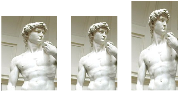
Which of these picture looks the most "natural" to you? The middle one has Golden Ratio proportions.
Getting back to stock charting, R.N. Elliott made the first well-known connection between price movements and the Golden Ratio. He noted that many reversals occurred around 61.8% or its compliment 38.2% (i.e., 100 - 61.8). Combined with 50% and 100%, they make up the standard set of Fibonacci Percentages.
Regardless of how the numbers were arrived at, chart analysts have observed that prices often will reverse after moving up (or down) by one of those percentages. Basically, those percentages are where something tells many people that it is time to take action - and thus prices reverse. Strange but true. Check it out:
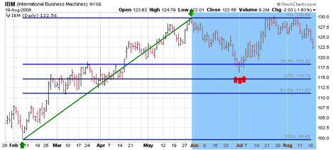
The Fibonacci Lines on this chart were created based on the move from Feb. 9th to May 30th - so just focus on the shaded blue area of the chart. Like a weatherman, the lines "forecast" that support for IBM would occur around 118.35 essentially because lots of people would probably feel that IBM had "fallen enough" and would start buying it again. That is precisely what happened at the end of June (red arrows).
Unfortunately many people have gone on to claim that Fibonacci lines (and their variants) have almost "magical powers" to predict price movements. Like most Technical Analysis tools, we think Fibonacci Lines are useful forecasting tools - but not magical.
You can add Fibonacci Lines to your charts using our ChartNotes annotation tool. To get started, simply click on the "Annotation" link below any SharpCharts.
Power Tip: If you hold down "CTRL" while drawing Fibonacci lines, we'll add the 23.6% and 161.8% lines as well.
Next time: Gaps!
While there has been a negative correlation between the Dollar and stocks
this year, there has been a positive correlation between the Dollar and
short-term interest rates. The chart below shows the US Dollar Index
($USD) with the 1-Year Treasury Yield ($UST1Y). Both rose in
January-February and then declined from March to October. Notice that
stocks declined when these two rose and advanced when these two
declined. While correlation is not the same as causation, there is
clearly some sort of connection here. Therefore, we should be watching
short-term rates for clues on the Dollar. A rise in short-term rates
would be positive for the Dollar. Should the negative correlation
between stocks and the Dollar hold, a rise in the Dollar would be
negative for stocks. Right now, however, both short-term rates and the
Dollar remain in clear downtrends, which is currently positive for
stocks.

Click this chart for details.
In my September 25 article I headlined the fact that the Oil ETF (USO)
had generated convincing sell signal, so I think it is appropriate to
report that the signal has recently turned to a buy. Below is the chart
from the 9/25 article showing the breakdown from the triangle formation
that accompanied the sell signal. It still looks good to me, but that
breakdown turned out to be a shakeout, a final decline clearing the
market of sellers and setting up another advance.

On the next chart you can see how the shakeout lows redefined
the lower limits and shape of the triangle. Prices rallied off the
shakeout base and broke through the top of the triangle. Prices have
also broken through the 200-EMA, so I think this move has a lot of
credibility. Of course, I also thought the sell signal was very
credible too, but we must change our opinion as the evidence demands.

Gold has also made a decisive break above important overhead
resistance. I have been concerned that gold would not be able to do
this because a rally in the dollar seemed imminent, but the dollar has
failed to rally, and gold has shown its strength. At this point I
wonder if the oversold condition of the dollar will lead it to decline
even further. The technical expectation for gold at this point is for a
pullback toward the recently penetrated resistance, now support.

Stock prices have continued to move higher in spite of broad
expectations for a decent correction. Looking at the weekly chart of
the S&P 500, we get a longer-term perspective. The price index is
headed into an apex where the long-term declining tops line and the top
of the ascending wedge pattern converge. It sure looks like a rally
stopper to me. The crystal ball says rally top should be in place
within a week or two.

Bottom Line: Breakouts in the prices of oil and gold indicate a
lack of confidence in the ability of the dollar to rally. Stock prices
are approaching long-term resistance, and there is a strong possibility
that the rally will finally end. That is not to say that the bull
market will be over at that point, but a healthy correction is overdue.
It's very easy to get caught up in the euphoria of
this market run. I'd be careful to do that. Invested Central turned
from aggressively optimistic to cautiously bullish in early May and we've
maintained that more cautious stance since. Call us conservative if you'd
like. We view it as a compliment. After all, if we don't protect our
capital, who will? Does anyone believe the folks on Wall Street have our
personal best interests in mind?
As I've mentioned in recent articles, price/volume
trends are bullish near-term. That can be all you need to forge to higher
levels. But we cannot ignore some of the risks associated with the
market. I like to follow the equity only put call ratio ("EOPCR") as an
indication of market sentiment. Currently, the 60 day moving average
of the EOPCR is at .59. Since the CBOE began providing the data, this
ratio's lowest 60 day level has been .56. Low levels mark investor
optimism and overconfidence and generally sends red flags flying high.
Take a look at the 6 year weekly chart of the S&P 500 (coming off of the
2000-2002 bear market). I've plotted the two .56 readings that have
occurred:

It's important to note that extreme levels of
investor optimism doesn't have to send the market plummetting. It USUALLY
suggests that we've simply come too far too soon and that the market could use a
pause, or breather if you will. Those last two readings of .56 that were
plotted above didn't have any long-term implications. Rather, the market
rested for awhile after complacency set in. Once complacency was no longer
an issue, the uptrend resumed. We're still relatively optimistic and
bullish the intermediate- to longer-term, though we have lines in the sand
should the market begin to fall again. Everyone should have their battle
lines drawn.
We're not to that .56 level just yet, but getting
closer. For only the second time since the CBOE has been providing the
equity only data, the DAILY equity only put call ratio has been at that .56
level for 10 consecutive days. I do want to point out that it may take a
few weeks of continued optimism for the equity only moving average to hit
.56. So we have to trade what we see. That means continue thinking
long for now with price/volume trends bullish. If you're nervous
about the market at current levels, taking a breather and sitting
in cash is not a bad option. The major point here and in my most
recent articles is that while the market remains on a buy signal, we need to
view the clouds on the horizon with caution. There may be a storm brewing
in the distance.
Happy trading!


