Hello Fellow ChartWatchers!
We get lots of great feedback from our users and I review much of it. Over the years, certain patterns emerge from the messages we get. Whenever possible we try to update our website to make things as easy to use as possible, but there are limits to what we can do. Here's a list (in no particular order) of ten things that our customer support team wants everyone to know:
1.) We aren't for commodity traders -
Sorry, you'll need to go elsewhere for real-time, intraday commodity charts. The commodity indexes that we have are End-of-Day only and are intended to give stock traders a sense of what the various commodity markets are doing.
2.) Sorry, but it's probably your browser -
It there is a sitewide problem that lots of people are seeing, we'll post a message about it on the home page and the support page and then we'll post a message about it in our Support Blog. Our Facebook and Twitter pages will also have information about it. If you don't see messages like that, then our website is probably working fine and you need to check your browser settings and/or internet connection. Unfortunately, there are tons of things that can go wrong and prevent people from accessing our website - we only have control over our servers. The rest of out of our control. We'd fix it if we could, but sometimes we can't.
3.) Don't forget to use your Loyalty coupon when renewing your account -
If you've been a member for more than a year, you have a loyalty coupon that you can use to save money when you renew BUT you have to enter it when placing your renewal order. We can't apply your loyalty coupon retroactively. If you forget, you'll have to wait until the next time you want to renew.
4.) Take advantage of our Specials -
Even if your account doesn't expire for a couple of months, consider placing a renewal order whenever we are running a special. You don't need to wait until your expire. We'll just add the additional time on to the end of your current time. We do not pre-announce our specials but historically they have happened in the spring and around the end of the year.
5.) The Market Message area is now open to ALL members -
Anyone who has an active StockCharts membership can access the Market Message area of the website. John Murphy and Arthur Hill write articles every day there than can help you make better investing decisions. Be sure to click the "Market Message" tab at least once every day.
6.) Renewing month-to-month is expensive in the long run -
Our monthly subscriptions are the most affordable ones we offer - in the short term. If you like our service, consider renewing for 6 or 12 months instead. You'll save a considerable amount of money over then month-to-month approach.
7.) Know the limitations of BATS real-time data -
BATS data might lag behind the NYSE/Nasdaq real-time data that our ExtraRT members get for thinly traded stocks. If you are day trading smaller, low volume stocks, you should probably upgrade to ExtraRT.
8.) Learning to write scans takes practice -
Lots of practice. And time. In the long run, it is totally worth it. But many people write us looking for the quick fix. Sorry, we can't learn how to write scans for you. The good news is that is it isn't hard if you just take some time and practice.
9.) We are a terrible source for historical trade data -
If you are looking to see what price you paid 2 years ago when you bought a particular stock, don't use us. In order to keep our technical indicators as accurate as possible, we adjust (i.e. change) our historic price data whenever there's a split, dividend or distribution. The best place to find out what you paid for a particular stock on some date in the past is your broker.
10.) Our Facebook page is great! -
The best way to stay on top of everything that is happening at StockCharts.com is to "Like" our Facebook page and visit it often. We have over 70,000 subscribers to this newsletter and only 1950 "Likes" - we really want to get that number higher so everyone stays as informed as possible.
- Chip
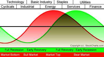
My Tuesday message talked about how sectors rotate near market tops. I explained that market leadership by materials and energy (which carries inflationary expectations) is often a sign of market that's in need of a correction or a consolidation. I also explained that money coming out of those two leading sectors usually rotates into defensive sectors like consumer staples and healthcare. Chart 1 is a visual representation of how that happens. The red line plots the stock market while the green line tracks the economy. Our main interest here is with sectors which are plotted along the top of the chart. You can see that Basic Industry (materials) and Energy are late cycle leaders. Tops in those two groups usually coincide with the start of a market correction or consolidation. When that happens, leadership swings to Staples and Services. [The Model is based on the work of Sam Stovall of Standard & Poors. In my 2009 book, The Visual Investor (Second Edition, p. 208), however, I changed Services to Healthcare which makes more sense]. As I explained on Tuesday, materials and energy were the two top sectors entering the month of April. Over the last week, energy and materials have reversed to the two weakest sectors. Right on cue, staples and healthcare have reversed to the two strongest. That doesn't necessarily mean that a major top is forming. It does suggest, however, that market sentiment has turned more defensive which usually suggests a market correction or a period of consolidation.
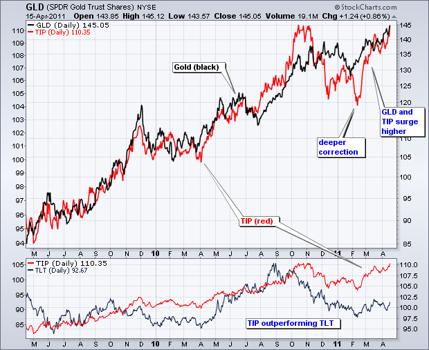
The positive relationship between the Inflation Indexed Bond ETF (TIP) and the Gold SPDR (GLD) went through a rough patch in December-January, but got back on track the last two month. First, note that both remain in clear uptrends. The chart below shows TIP (red) and GLD (black) surging to new 52-week highs in October-November. Both then underwent corrections the next few months. GLD traced out a flat correction and bottomed in late January. TIP underwent a deep correction with a dip below its December low in mid February. Both resumed their positive relationship with a surge over the last two months. GLD hit a new all time high. TIP is close to breaking above its October-November highs.
Click this image for a live chart
Strength in both suggests the presence of inflationary pressures in the market. GLD is viewed as a hedge against inflation. Even though bonds in general are not amenable to inflation, TIP provides a bond alternative that is hedged against inflation. The indicator window shows TIP (red) along with the 20+ year Bond ETF (TLT). Both put in lows in mid February, but TIP is already challenging its high and TLT remains well below its high. The inflation-indexed TIP is clearly outperforming non-hedged TLT.
It is a rule-of-thumb that the average bull/bear cycle lasts about four years trough to trough -- 2.5 years of bull market followed by 1.5 years of bear market. Like most of these kinds of rules, it is good to keep them in mind, but don't try to set your watch by them. For example, the last bull market lasted five years, and the bear market that preceded it lasted two years. As it so happens, the last bear market lasted almost 18 months, which makes it fit the template almost exactly.
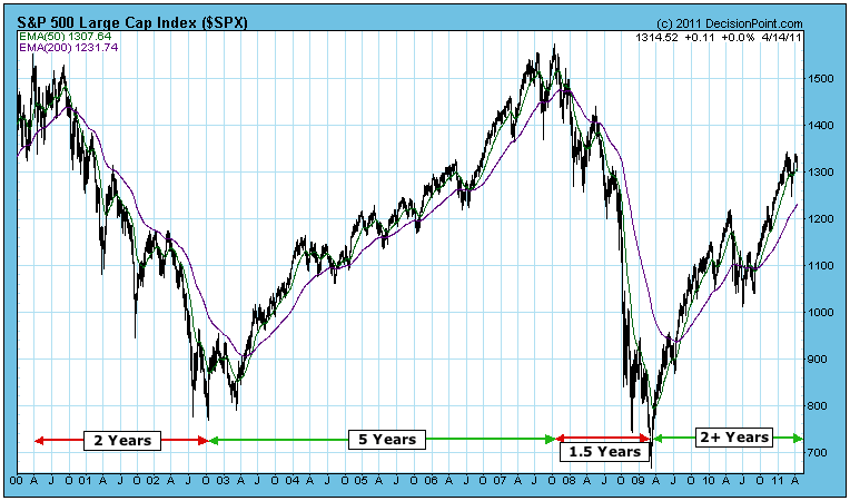
That doesn't mean the current bull market will also come in on the average, but we must take note that it is now two years and two months old, and is becoming vulnerable to the law of averages.
The market is also becoming vulnerable to the next six-month period of unfavorable seasonality, which begins at the end of this month.
Bottom Line: The current bull market is getting a bit long of tooth, and the specter of six months of negative seasonality lies just ahead. This is not a happy coincidence, especially combined with the fact that volume has been weak for many months. Our mechanical timing model has us on a buy signal for now, but I would take it quite seriously if that were to change.
If you plot the Percentage Price Oscillator (PPO - 12,26,9) on an index or individual stock chart next to the MACD (12,26,9), you'll find that they appear to be identical. Let's use Wynn Resorts (WYNN) as an example. Below I show how both the PPO and MACD are calculated:
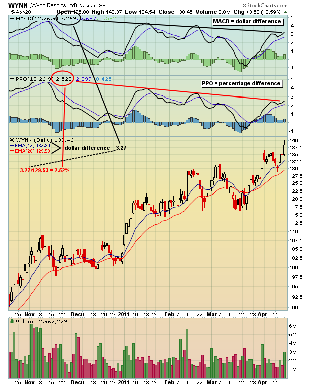
At first glance, both the MACD and PPO look the same. The primary difference in these two indicators is that the MACD is based on the difference between the 12 day EMA and the 26 day EMA expressed in DOLLARS, while the PPO expresses this difference in PERCENTAGES. It's impossible to compare the relative momentum of two stocks with varying prices using the MACD. Why? Because higher dollar stocks will have higher dollar differences between its 12 day EMA and 26 day EMA. The PPO, however, is perfect to make that comparison because it's based on percentages instead.
I find that using long-term positive and negative divergences on the MACD is a powerful tool to identify potential reversals in stocks and indices. But I do have exceptions to this general rule. When the MACD hits a certain percentage relative to the underlying price of the stock or index it's tracking, there is a mathematical certainty the MACD will reverse regardless of price action. The PPO helps you avoid such stocks because the momentum is expressed in percentages. Divergences that arise from this type of price action should be ignored in my opinion because it's not necessarily indicative of slowing momentum. Here's an example:
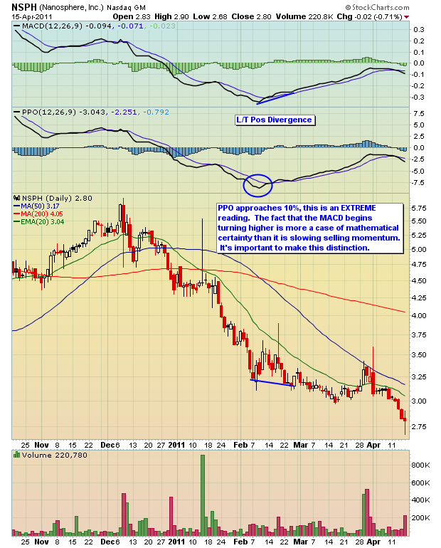
There's a lot of information on the PPO here at StockCharts that you should review. Be sure to check out the Chart School. The PPO is an excellent complement to the MACD if that's an indicator you frequently use. But you need to understand the subtle differences in order to apply it to your trading. At Invested Central, we regularly host a monthly educational webinar to discuss a trading topic. This month I will be discussing the PPO, including the combined use of the MACD and PPO to find trading candidates with slowing momentum. This is Invested Central's one year anniversary of our Online Traders Series and we're making a special offer for ChartWatchers' readers. CLICK HERE for more details.
For those wanting more information on various trading topics, we offer a FREE Boot Camp e-mail series. CLICK HERE for registration.
Happy trading!
The recent gold price rally to new highs has paled in comparison with silver's seemingly parabolic move higher. While many "johnny come latelys" play in the silver pit, we are rather interested in the manner in which the Gold Stocks ETF (GDX) has performed relative to Gold itself. And we what we see is that GDX has lagged the gold rally badly. However, we believe this is about to change and perhaps on a very material manner.
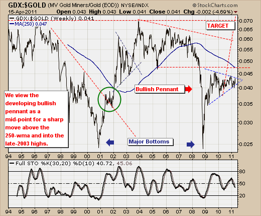
The GDX:GOLD ratio chart is very instructive, for this weekly chart shows a very well built and very bullish "pennant formation", which generally resolves itself in a sharp thrust higher. If this were to occur, then GDX could outperform GOLD by 2-times, which would be similar in nature to the move off the late-2008 lows into the late-2009 highs before the pennant began to take shape. Of course, this chart would resolve itself in the manner anticipated, with GDX moving lower, although not to the same extent as GOLD prices. So, while we do believe GDX is poised to move higher - it could simply consolidate lower as GOLD prices moved sharply lower.
Good luck and good trading,
Richard