Many months ago, we began a series of articles that we called "TA 101." The articles covered the basics of stock charting. The most recent article in the series was published in January of 2010. (If you have time on this long holiday weekend, I strongly urge you to read the entire series. Here's a link to all the articles - just scroll to the bottom to find the first one.) Well... after much delay, here's the next article in the series! - Chip
Comparison Charting
Comparison charting allows the analyst to study individual price performance and performance relative to other stocks. John Murphy, who provides expert market commentary on StockCharts.com, uses comparison charting extensively in his analysis of the market.
Individual Price Performance
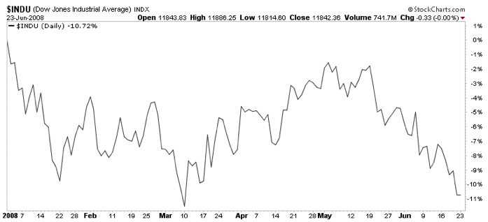
(Click the chart to see how it was created with the "Performance" chart type setting.)
The SharpChart above shows how the Performance plotting style can be used to monitor the year-to-date performance of the Dow Jones Industrial Average. Once this chart is generated, the page can be bookmarked as a favorite in your browser for quick access in the future.
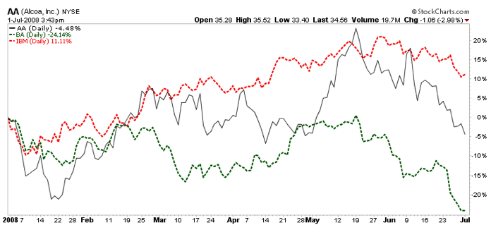
Multiple symbols can be plotted and compared in this manner by using the Price indicator and other ticker symbols as parameters with a Behind Price position setting. The SharpChart above shows the performance of AA compared with BA and IBM.
Relative Performance Comparison
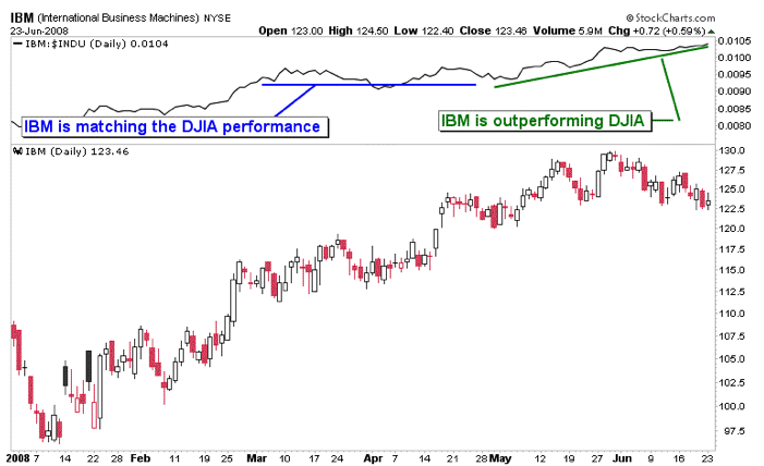
The SharpChart above illustrates how the performance between IBM and the Dow Jones Industrial Average (DJIA) index can be compared in the Indicator Panel above the Price Plot Area. The relative performance indicator is displayed by selecting Price as an indicator on the workbench and inserting IBM:$INDU as a parameter.
A positive slope of the indicator line shows that the first symbol in the ratio is outperforming the second symbol. A negative slope indicates the opposite; the first ticker symbol is underperforming the second ticker symbol. And a flat line indicates that both symbols have similar performance.
This information can be used in several ways. In the case of comparing a stock to a market index, the analyst can quickly determine whether or not a stock is outperforming the market. In the case of comparing two stocks, the analyst can easily determine how the stocks are performing relative to each other.
Next Time: Ratio Charting
It was a good week for commodities and an even better week for stocks. But it all started with the dollar. We explained earlier in the week that the Dollar Index (UUP) appeared to be in a bearish consolidation pattern within a major downtrend. That view favored a lower greenback and higher foreign currencies (along with higher commodities). Chart 1 shows the UUP ending the week on the downside. Dollar selling came just in time for commodities. Chart 2 shows the DB Commodities Tracking Fund (DBC) bouncing off its 200-day moving average from an oversold condition. The commodity gains would have looked even better except for heavy selling of grains on Thursday on a report of a near record corn crop. The best commodity performers were base metals like copper. Chart 3 shows copper hitting a new two-month high. Base metals are probably the most economically-sensitive commodities. As a result, their rally this week shows more optimism on the global economy and stocks.


The Finance SPDR (XLF) has been on a road to nowhere for almost two years now. After first moving above 15 in September 2009, the ETF embarked on a long trading range with support near 13 and resistance near 17. XLF has crossed the mid point (15) at least 10 times since September 2009. Even though the ETF closed below 15 at the beginning of June, a pair of indecisive candlesticks formed the next two weeks and the ETF bounced off support in late June. Support stems from broken resistance (yellow highlight).

Click this image for a live chart.
This could be a big moment for the beleaguered sector. XLF has been underperforming the S&P 500 since August 2009. The indicator window shows the Price Relative (XLF:SPY ratio) zigzagging lower with a new low recently. Relative weakness is not a good sign. Turning back to the chart, the ETF established short-term support at 14.50 over the last four weeks. This is the level that must hold. A break below 14.5 would open the door to support in the 13-13.50 area. On the upside, the February trendline and late May high mark an important resistance hurdle. A breakout here would be quite positive and open the door to an assault on the 2010-2011 highs.
QUESTION: Carl, is it okay to use the Trend Model on bond fund NAV's to manage risk, or is it inappropriate because you can't factor in monthly payouts? I own PTSAX, Bill Gross' total return investor class bond fund, and it looks like the 20-EMA is ready to cross down through the 50-EMA. I don't want to sell it if I can help, but I will if I have to. Gross is probably the best out there but the fund has been seeing some noticeable weakness of late.
ANSWER: Distributions occur with stocks and mutual funds, and it is important for investors to understand what they are and how they affect prices. When a company or mutual fund makes a distribution, they are transferring company/fund assets to shareholders, and prices need to be adjusted to reflect the fact that the company/fund no longer owns those assets. (Note: A dividend is a distribution.)
The distribution where this is most obvious is a stock split. In a 2 for 1 split the company distributes additional shares to shareholders so that they will own twice as many shares after the split. On the day of the split (the ex-distribution date) the price of the stock is halved, and historical prices are divided by two. If historical prices were not adjusted, the chart would be useless because on the day of the split it would show a 50% decline. Click here to learn more.
Our Trend Model is driven by exponential moving average (EMA) crossover, so it is important that the historical data of a given mutual fund is adjusted for distributions. As with most bond mutual funds, PTSAX makes small monthly distributions and PTSAX historical data are adjusted each time by StockCharts.com, whose data we use.
As for applying the Trend Model to a particular price index, we would want to select a low volatility index. PTSAX certainly fills the bill in that regard. It "tends to trend" rather than jump all over the place. In the case of a mutual fund we cannot sell it short, so we are only concerned with 20-EMA and 50-EMA crossovers. When the 20-EMA crosses up through the 50-EMA, it is a buy signal. When the 20-EMA crosses down through the 50-EMA, it s a signal to exit the position.

These rules do not work perfectly, but they are designed to keep us invested when the trend is favorable, and to eliminate exposure when prices have exhibited sufficient weakness to cause concern.
Bottom Line: Historical prices must be adjusted for distributions or they will be useless for purposes of technical analysis. This is not a recommendation for you to take any specific action, but I believe that our Trend Model is suitable for use with PTSAX, and that it will help you sleep at night knowing that buy and sell decisions are guided by an objective timing tool.
I was certainly looking for a bounce last week, but if I'm being honest, I wasn't looking for THAT kind of bounce. Our major indices all gained over 5% in just one week. That's not a bad return for a YEAR!!!
There were definitely signs of a bounce on the horizon. We approached or tested critical price support on the S&P 500, NASDAQ and Russell 2000 at a time when pessimism - as I measure it - was OFF THE CHARTS! I favored shorts in the first half of June, but it became clear to me that the risk of being on the short side simply became too great.
When the market is driven in one direction for too long, as it was in the first half of June, and relative pessimism soars, the risks of remaining short grow exponentially. Unfortunately, that's when the emotional trades begin for many traders and they jump in on the short side just as the southbound train reverses direction and heads north again. Or worse yet, they let a great short call turn sour by holding profitable short positions way too long.
Let's take a look at what the market was up against in mid-June:

The EOPCR (equity only put call ratio) is my favorite sentiment indicator. It's a gauge of the pendulum effect in the stock market when emotions run too high in either direction. I look at a short-term moving average of the EOPCR and compare it to a longer-term moving average. As the relationship swings, it identifies mood swings of traders and has a very strong track record in calling for reversals, which are absolutely critical in trading. The extreme pessimism readings we witnessed in mid-June were record-breaking, only four months after we saw record-breaking relative optimism in February. To summarize, this market is NUTS!
While the rally last week felt great, I'm not convinced just yet the intermediate-term selling is done. The NASDAQ, in particular, is still showing a rather bearish head & shoulders pattern in play where the recent bounce may have been a nasty right shoulder - and on lesser volume. Check this out:

There was one other indicator flashing HUGE bullish signs last week - The Bowley Trend - my own historical indicator. Prior to last week, I had mentioned to all of our subscribers that the upcoming week (June 27th through July 1st) had produced annualized returns since 1950 that were TRIPLE the average annual return of the S&P 500. The rally was RIGHT ON CUE.
If you want to take on Wall Street and WIN, you'd better be armed with all the knowledge and tricks you can muster. Otherwise, you're going to war with a water pistol. For the July 4th holiday, I'm offering a special bonus to all ChartWatchers' readers. I wrote a piece entitled "The 4 Historical Rules EVERY Trader and Investor Should Know". It's yours ABSOLUTELY FREE!! Simply CLICK HERE.
Have a great July 4th holiday weekend with family and friends and....
Happy Trading!


