Hello Fellow ChartWatchers!
The stock market moved higher this week on good earnings news - but it is too early to conclude that the Bull are firmly back in charge. Why? One word - breadth. Breadth and momentum. OK, sorry, two, two words - breadth, momentum and seasonality. THREE! Three words - breadth, momentum and seasonality. There. Phew. (If you don't get that Monty Python reference, click here.)
But seriously, there are still big concerns about the internal strength of the markets right now including those three factors. (and sector rotation. "Four!!") The good news is that we covered all of those reasons in great detail on this weekend's "ChartWatchers LIVE!" webinar. Instead of rehashing all of that content in this article, I'm just going to give you a link to the free webinar recording and strongly encourage you to check it out. Here's the video:
(If the embedded video player doesn't appear above, just click here. Make sure the "HD" button in the lower right corner is colored blue - if not, click it.)
Now, is watching this webinar really worth your time? Why is this webinar special? Instead of me answering that question directly, let me show you what the viewers of the live webinar said after watching:
How did we do? Was the webinar worthwhile for you?
- Absolutely. The first part was more important to me, but the entire seminar was very educational.
- I participate in at least 4 webinars a week and wonder how it can get any better - today's exceeded all those in the past. Clear, concise and exceedingly helpful in depth orientation and familiarization of technical features which makes StockCharts so valuable. Bills' indicator section was excellent and very helpful as well as Chip's wide swath of indicators.
- No
- Wow! What a complete review of Market, Sectors, Stocks, breadth and depth. Have learned so much from the Chart Watcher Saturday sessions. "I Didn't Know StockCharts Did That!"
- 5 STARS!
- YES VERY INTERESTING A LITTLE TO FAST FOR ME. BUT GOOD IDEAS FOR ME TO FOLLOW UP ON
- Excellent as usual and learned a few things that "I did no know stockcharts could do that"
- Good content. Bill's presentation on Invisible setting on the NYSE index vs volume was really interesting!
- Great. Really liked the indicator comparison discussion
- Breath and seasonality were especially interesting and always great when you do a scan. you both were informative.
- It's a really helpful current market analysis, and good teaching/illustration about scan and chart settings. Thanks a million!
- Great session I always learn something new I am very grateful that you have this business. It has changed how I trade and I can't imagine ever trading again without StockCharts!
- Great. Bill connected the dots on the apparent declining participation. Chip's explanation on using the comparative window on seasonality was good.
- Very interesting... Although a bit long...
- Yes it was worthwhile, because it showed me a new method of finding "what's new in a sector. thanks
- BEST show of the year! More time on fewer subjects was the key from my perspective. I particularly liked Bill's breadth presentation and Chip's indicator comparisons.
- Excellent seminar. Keep up the big picture approach and the market recap. Avoid some of the earlier type programs that focused on very narrow topics.
- Really well! The invisible charts, line view on the seasonality chart and some of the breadth indicators were new to me. Love the Saturday blog- keep up the good work!
- First webinar at StockCharts for me. I am always looking for insight and the logic behind it. I found your summation on dimminishing market participation enlightening. I will be back.
- Yes, the more knowledge of the use of technical indicators the better!
- Great. A little monotone but was good.
- I thought this was an excellent webinar. I especially like the market recap. Bill's market breath indicators were very interesting. I also liked the review of the indicators at the end of the program.
- Some of the Saturday programs have been on esoteric subjects, which few of us might be interested in, but this week was great.
Now, if you are like me, you immediately look for the negative reviews - and yes we had one "no", one "monotone" and one "too long" - but in general those are few and far between (Phew!). So if you haven't seen one our webinars before, find some time to review this week's episode and see what you think. Feel free to skip over the parts you find uninteresting - we don't mind. Hopefully, you'll come away with several useful pieces of information.
Enjoy!
- Chip
(Note: This article was originally published Thursday afternoon.)
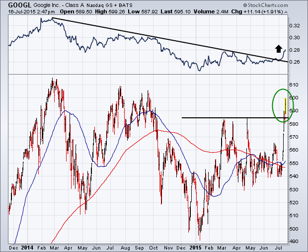
The Internet group has been leading the technology sector higher this week. The standout performer in that group is Google. The chart below shows Google (GOOGL) surging through its spring high to the highest level since last October. Interesingly, the stock has been a relative underperformer, as shown its falling relative strength line (above chart). The good news is that the stock's RS line has just broken a falling resistance line extending back to February 2014. Good absolute performance by the stock (upside breakout), combined with a relative strength line just starting to turn up, is a healthy combination.
- John
(Note: Click here to watch John's interview during last weekend's ChartWatchers webinar.)
Google broke out to new all time highs this morning after announcing earnings yesterday. The real problem for investors is after a huge move, what should investors do?
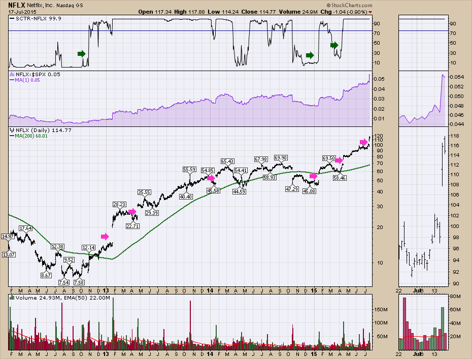
I want to look at previous examples and end the article with the Google chart. Let's look at Netflix (NFLX). All of the gaps up after earnings are marked in pink. This chart is particularly volatile. But you can also see on the SCTR when it surges to become a top performer, it usually hangs in there for a while.
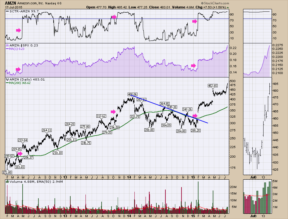
Amazon (AMZN) had been losing its ability to hâÂÂave the stock run up without big earnings. So they had to start showing results on the earnings report. In January they posted a positive change in their earnings reports. Lets look at the chart. From January 2015 after AMZN moved up $50 on earnings, it is up another $125 in 6 months. You can also see in April 2012 Amazon hit the gas pedal to breakout. That April 2012 gap move higher was very big. However, the stock pulled back offering an attractive entry. Holding these volatile stocks is a ride both ways, but these huge earnings gaps where the SCTR jumps up to the top of the range is a good clue something is changing. Especially in the large caps, it needs institutional power to get onboard the stock.
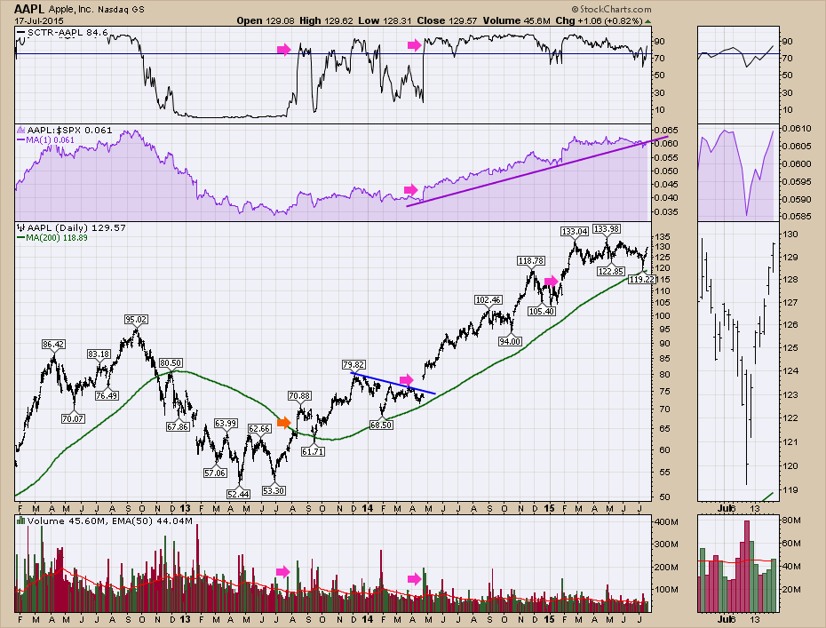
Below is Apple (AAPL). Apple gapped on Earnings in July 2013 below the Pink arrow to lift the SCTR off the floor. Then Apple pushed higher where the orange arrow is and stalled. In April 2014, Apple gapped again. In both cases the gap to break out of the consolidation range were big clues of better things to come.
Here is Google (GOOGL). We can see a couple of earnings periods where Google gapped higher and the SCTR surged quickly to the top of the range on huge volume. Looking below at the previous examples as well as the same bullet like moves on the charts of Tech horsemen shown above, it looks to me that investors should try to find a place to enter the stock after a big move up. If institutions are moving in on huge volume, it looks like a great clue that they are optimistic.
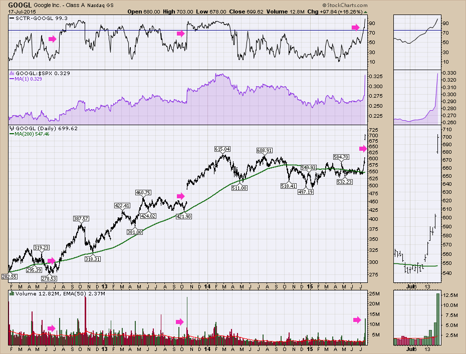
With Google's huge surge in volume, the breakout above previous resistance and an SCTR jumping to 99, the story looks to be repeating when the big-cap-techs-gap-big on earnings.
Good trading,
Greg Schnell, CMT
 If you've ever practiced archery, you know that your ultimate objective is to put the arrow in the bulls-eye, but just putting it on the target still feels pretty good. While we aim at perfection, we'll happily settle for competence. If you are good enough to stay on the target, you'll score some points, and the odds are good that you'll even hit some bulls-eyes.
When I was just beginning my studies in technical analysis, a friend and I were working independently to develop a magic bullet for investing. I had come up with an indicator that I believed predicted the direction and duration of market moves. At one time the indicator predicted an up move of several weeks, so on paper I picked 25 stocks to go long (out of the over 100 stocks we were charting by hand, by hand mind you!). After a few weeks, 23 of the 25 stocks I had chosen were winners. My friend in exasperation asked, "How did you do that?!" Of course, I thought I knew the answer.
Ultimately, I learned that my magic indicator didn't really predict market movement after all. But a valuable lesson I did learn was that, if you invest with the direction of the market, you will greatly improve your odds of winning, even if you are picking stocks by throwing darts at the stock listings in the newspaper. No, I don't encourage such foolishness, but I do encourage you to find a method of determining where to market is likely headed, and another method for choosing stocks that have a good chance of exploiting the market tide.
At this point I would be derelict in my duty if I didn't mention the DecisionPoint Alert Daily Report, available to StockCharts.com Basic subscribers. In that report we present tools, evidence, and interpretation thereof, to help determine market direction. Our motto: "Technical analysis is a windsock, not a crystal ball." We look to see in which direction the windsock is pointing, as well as try to determine if there are storms in the vicinity that might cause the wind direction to change.
As for the current market direction, I didn't think it was an ideal time to go long. The Trend Model was on a Neutral signal, and my opinion was (and is) that the market is topping. But our Long-Term Trend Model is still on a BUY, so for the sake of the game, I decided to go long.
After deciding upon market direction, how do we find stocks that might benefit from that environment? One group of our DecisionPoint publications is spreadsheets, and one of those spreadsheets is called SPX - PLUS. This spreadsheet contains 564 large-cap stocks representing about 80% of the total U.S. market capitalization. They are the stocks which compose the S&P 500, S&P 100, Dow 65 (the 30 Industrials, 20 Transports, and 15 Utilities), and the Nasdaq 100. The "plus" part is that we include a couple of dozen larger-cap S&P 400 stocks to fill in the remaining slots. There are over 45 columns of data, much of it unique. The benefit of a spreadsheet is that you can sort on the various fields and arrange the stocks in groups that help you focus on certain areas. Here's how I used this spreadsheet recently.
I was asked to help test an online trading game. This involved picking about ten stocks for the game, which was to run for the month of July. Okay, it's a game, so I don't want to spend an inordinate amount of time picking the stocks. I downloaded our SPX - PLUS spreadsheet, and sorted it so that new PMO Crossover BUY signals sorted to the top. The PMO section of the spreadsheet is highlighted in the graphic below. (I have closed many of the columns to simplify, and this is from July 16, not the one I used at the beginning of July.)
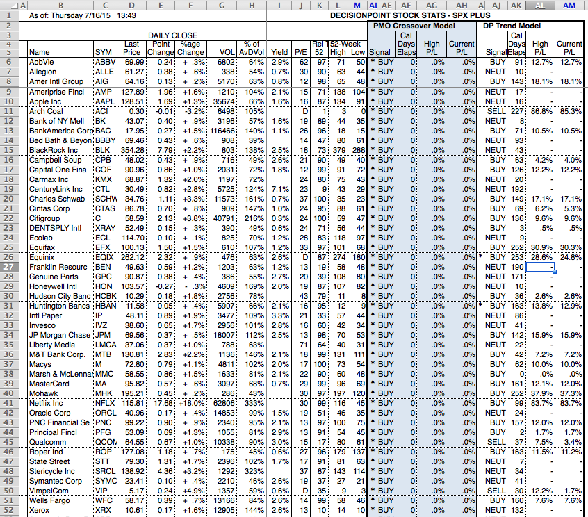
Next, I went through the list, checking the chart for each one in order to find the best looking PMO configurations. Here is an example of one I like. There has been a substantial price correction, the PMO has had a relatively smooth decline into oversold territory, and has formed a smooth clean bottom.
Now here is the kind of chart that I would shy away from. Price is advancing at a labored pace, which is reflected in the flat, jittery PMO movement. The PMO bottom in not at all impressive, except under the magnification of the thumbnail chart.
Using this technique I selected eight stocks for my game portfolio. it took about 30 minutes or less. So far this month my portfolio has been a winner by about two to three percentage points, so I'm hitting the target, but no bulls-eye because I've mostly hung around the fourth rank.
I should emphasize, these are examples of my process, not recommendations. Also, for the purpose of emphasizing the key points of this article, part of the process that I haven't mentioned is that, in addition to determining the trend, we also need to determine the condition of the market. Is it overbought or oversold? For example, in a bull market the trend will most often overcome errors in judgment, but it is usually best to wait for a pullback before opening new longs.
CONCLUSION: It is possible to bet against the trend and win, but the odds increase significantly if we bet with the trend. The DecisionPoint Alert Daily Report can help determine the trend and condition of the market so we know in which direction the market tide is flowing. Then our spreadsheets provide data that can be manipulated in various ways, so as to help us select the best candidates for exploiting the trend.
Technical analysis is a windsock, not a crystal ball.
Happy charting,
Carl
There's a reason we watch chart patterns. Earlier this week in a DITC blog article, the internet index ($DJUSNS) finally cleared 900 resistance after failing at that level on a few occasions the past 18 months. This latest attempt was different, however. Many times it gets quite frustrating as continuation patterns develop. The "I need to make money right now" crowd gets very impatient and loses faith in sectors or industry groups as they underperform for periods of time as money rotates within the market. Those who use technical patterns simply bide their time. What is lost is that the DJUSNS had a parabolic move higher BEFORE the consolidation pattern took place. Check out the chart for this group:
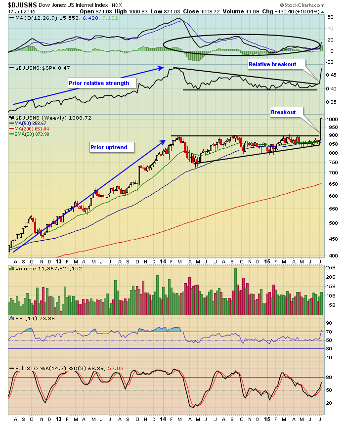
There are a few points to be made here. First, note that the breakout above 900 actually took place earlier in the week BEFORE Google's (GOOGL) big earnings report on Thursday after the bell. Technical analysis provides us clues in many cases and this certainly was one of those cases. Second, look at how long the DJUSNS consolidated in that ascending triangle pattern. Third, we always have to be mindful of parabolic rises because they are often followed by continuation patterns that can take many months to take shape - just as the DJUSNS did. Fourth, check out the relative strength of the DJUSNS vs. the S&P 500 during that 18 month consolidation period. While the DJUSNS remained in a bullish continuation pattern, it was NOT where you wanted your money to be as we awaited confirmation of the pattern. Finally, all of that consolidation enabled the weekly MACD (black circle) to move back to its centerline support. Now the move higher is likely to be supported by moving averages during any period of selling. I look for the DJUSNS to remain in favor for several months with pullbacks representing opportunities for entry along the way.
Happy trading!
Tom
As traders, all of us hope that each new position we take on becomes a winner. Realistically, we all know that some trades will turn out to be losers. In fact, one could argue that there are really three things that are certain in life; death, taxes and losing trades!
There are way too many reasons to list why some trades turn into losses but a few of the most common include:
-Improper analysis
-Unexpected events
-Missed earnings
-Sudden downgrades
-Failure to take profits
In looking at those above it's hard to fault someone for an out of the blue event or a sudden analyst downgrade. But misreading a chart, holding a stock into its earnings report and not taking a profit are all fixable.
Since we're right in the middle of earnings season it's a good time to remind everyone that holding a stock into an earning's report is a very risky proposition. In fact it's an unnecessary risk because there is no way of knowing how the market will respond to an earnings report. This makes it a 50-50 gamble at best, not very good odds when your capital is at risk.
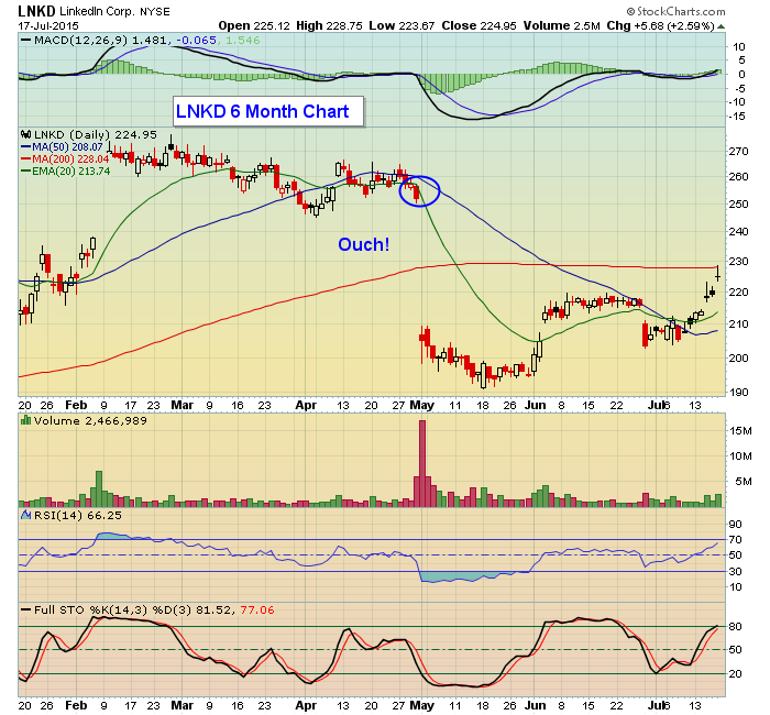
In fact, to illustrate, I went back to last quarter as I vividly remember when LinkedIn reported its numbers and it missed badly. You can see from the chart below how much the stock fell when it opened for business on May 1, and how much it has continued to struggle since that big miss.
One of the reasons we've fine tuned our service at Invested Central is to avoid unnecessary risks as much as possible. It's why we've adopted our EarningsBeats.com model where we scan the market for stocks that beat earnings plus have strong charts. This way the earnings event is already out of the way and then it becomes a matter of being patient as we watch market reaction to the numbers and seek optimal entry points. There must be something to it as we've kept track of performance for several quarters now and the numbers don't lie. If you want to see for yourself just click here and I will send you full results. In the meantime, make sure you are doing everything possible to reduce your risks as a trader, including moving aside at the right times instead of standing in front of a possible train wreck.
At your service,
John Hopkins
President
Invested Central/EarningsBeats.com


 If you've ever practiced archery, you know that your ultimate objective is to put the arrow in the bulls-eye, but just putting it on the target still feels pretty good. While we aim at perfection, we'll happily settle for competence. If you are good enough to stay on the target, you'll score some points, and the odds are good that you'll even hit some bulls-eyes.


 Many investors would be shocked to learn that what they thought was their prudent well-diversified portfolio of five different asset classes might be effectively no different than owning the same car in five different colors. If you fail to understand asset correlations, most of your portfolio could be essentially the identical make, model and year of car, just appearing different in five...