This week was a little hard on the commodities. In general, almost everything went down with the exception of Gold and Silver. I outlined areas of support for Crude Oil around $41. Corn and Wheat had awful weeks, and Soybeans is looking toppy. The big story this week are the bonds, and the webinar talked a lot about the setup for the second half of the year.
Commodities Countdown LIVE! with Greg Schnell - 2016-07-07 17:00 from StockCharts.com on Vimeo.
Webinar // Commodities - CRB Components review 0:00 // Energy - Oil, Natgas, Uranium 15:00 // Industrial Metals 20:00 // Gold and Silver 24:00 // Agriculture 28:00 // Bonds - Don't Miss This 33:00 // Second Half 2016 Charts to Watch 42:00 //
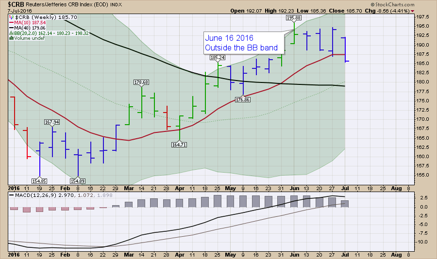
The $CRB had two outside weeks in a row, usually indicating indecision. Well, this week it decided lower was better. We can see the red line is the 10 Week MA (WMA), which has been great support for the Index. If we close here on Friday, this will be the first close below since February.
 Looking at the $CRB over a longer period, it looks like a cement truck just pouring it out in a trough to a lower level. Looking at the black moving average, we can see the $CRB has not been above it for years. Recently, we moved above it, but this looks very similar to the seasonality of the 2014 surge.
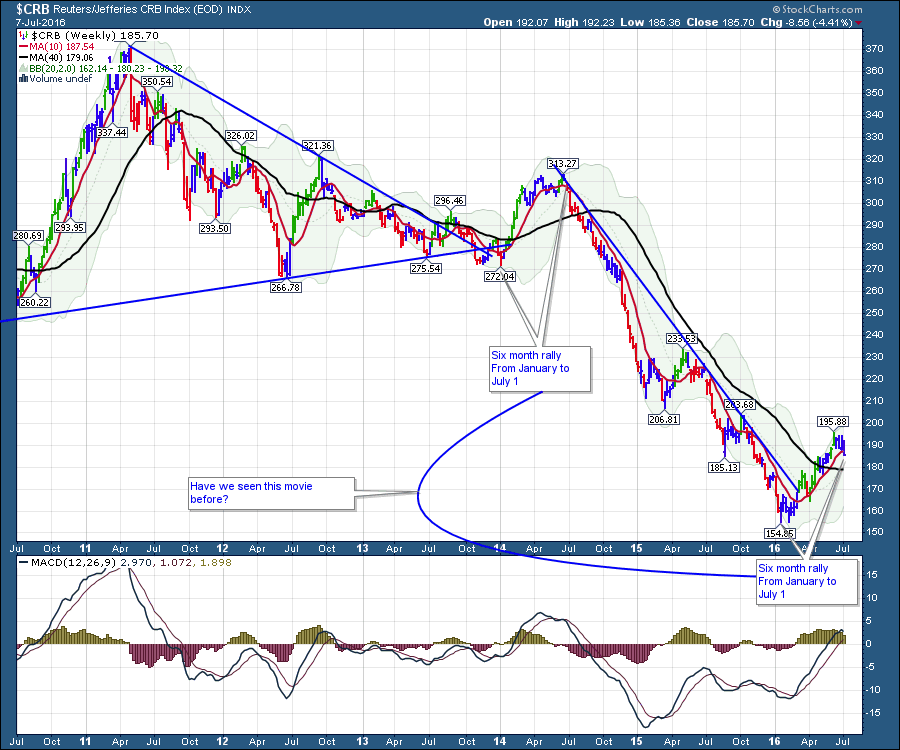 The bottom line, commodities look like they will pull back a little here. Support at the 40 WMA would be good. A five-year bear market has been excruciatingly long, but irrational price moves can continue. Best to recognize what this is, and so far it's just a bear market rally. If it can find support at the 40 WMA and bounce from there, that would probably confirm a longer-term bull market. We have no divergence on the MACD, So that is a positive for higher prices after this settles in.
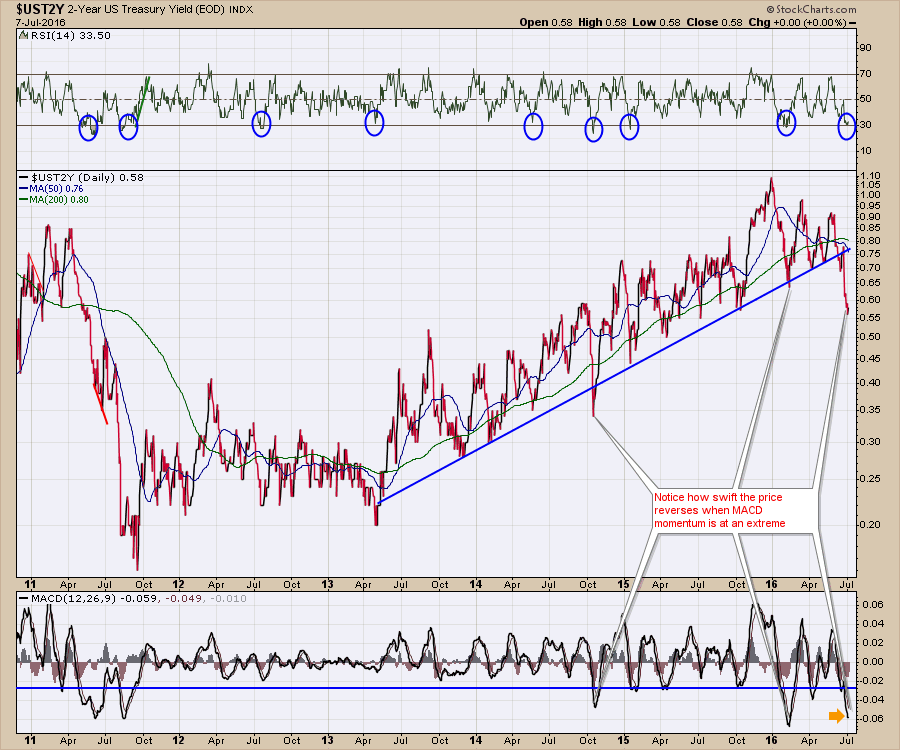
I don't cover bonds every week, but I had to this week. The bonds are "Screaming" caution here. I would encourage you to watch the video. I laid out how extreme the momentum is and how rarely it gets there across the bond curve. It is not about the actual ownership of bonds, it about the whole bond area of the market and the dividend yield extremes for Utilities as well.
Starting at the two-year, the Momentum and the RSI are both at extremes. Look how fast price reverses when the momentum is so weak.
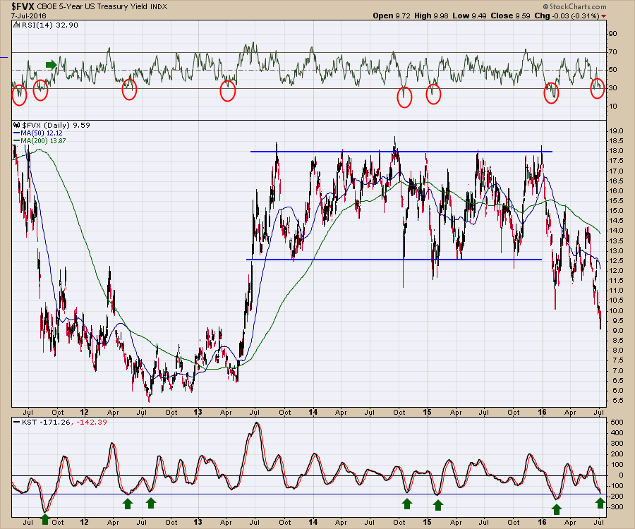
Moving out to the five-year note, the same condition exists.
 Here is the 10-Year. We made new lows on this monthly chart. The Monthly RSI has about ten touches at this level in 30 years. The PPO has 6 arrows and one sagging low in 2012. Monthly is not very good for timing a reversal, but the news from this chart suggests an opportunity that comes once every 3-5 years.
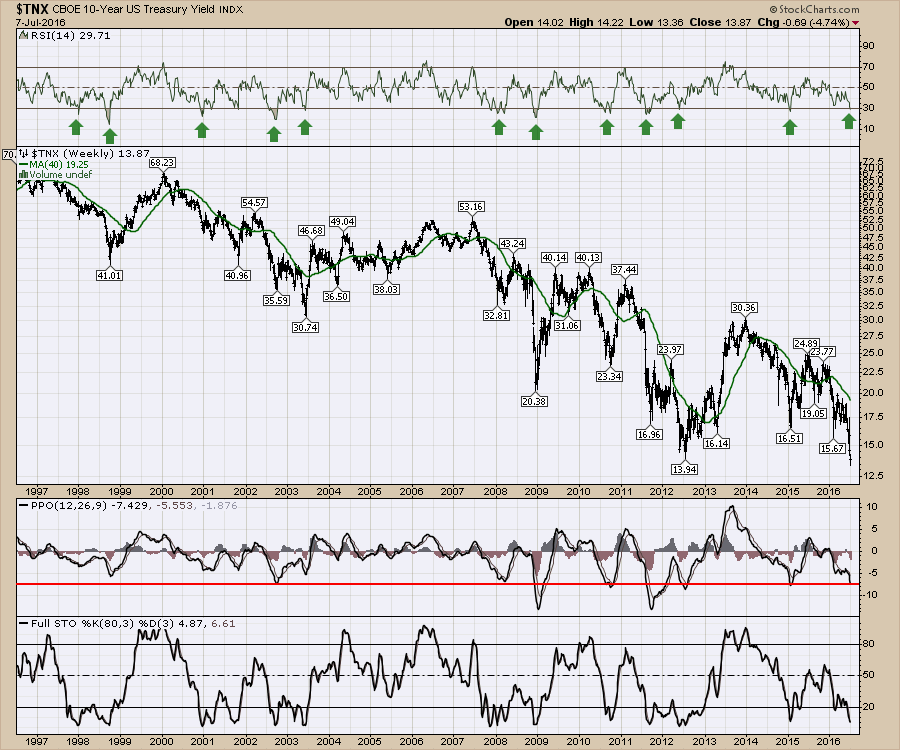
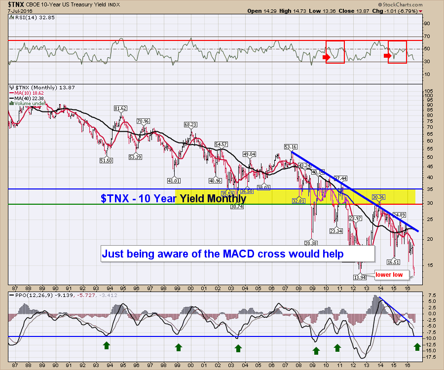 Looking at the $TNX on a weekly, we can look for better timing signals. This chart suggests an RSI of 30 is an excellent place to watch for a trend change. This generates a signal once every two years typically. The PPO fires off signals more infrequently, but we are pretty much there. I added a long cycle Stochastic, but it just confirms what we already know.
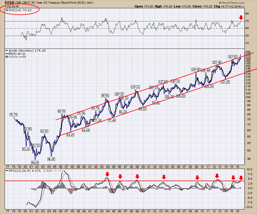
 Finally the granddaddy of the bond market, the 30-year. This is showing price, not yields so the price is rising. Just looking at price extremes on the massive bond run, we are there again. Outside the long term channel (REALLY!). The channel line break has to be considered as a massive potential for reversion to the mean. The RSI is at this level for only the 8th time in a 40 year chart. The PPO is also saying this is done. All that is on a MONTHLY chart for a 30-year bond.
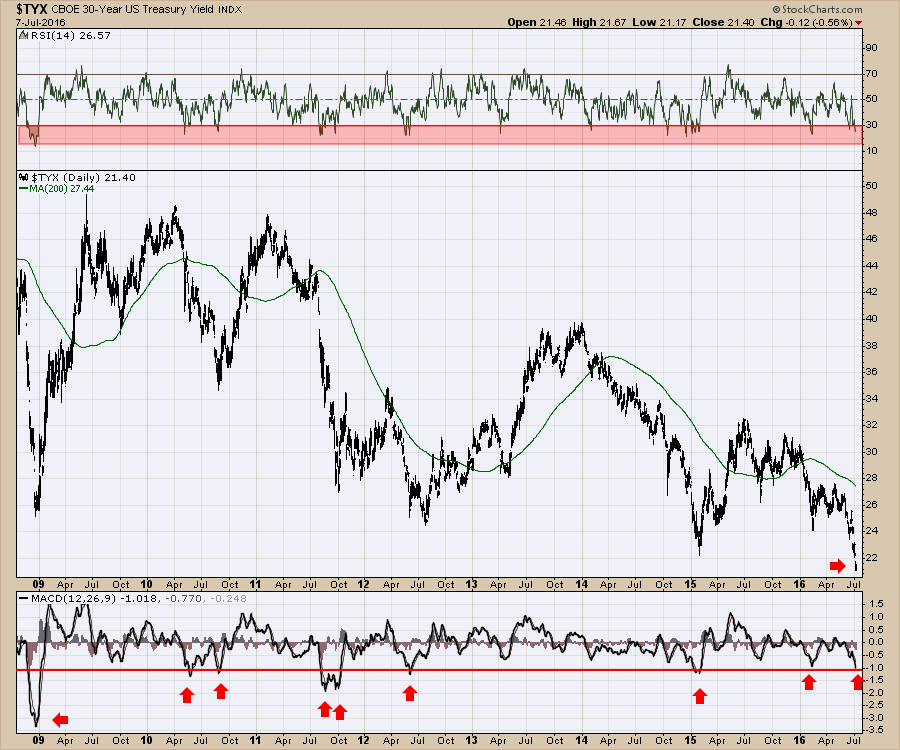
 Going to a shorter time frame like the daily on the yield (rather than price shown above) chart for the 30-year, the extremes are there.
 So, yelling from the rooftop, every chart on the bond curve is at an extreme. The monthly, the weekly, and the daily charts all scream extreme. When these reverse, the moves can be severe. I talked about how to play this on the webinar and this brief write up here introduces the conversation, but more ideas on the trend change signals are on the webinar. Commodities Countdown 2016-07-07.
I pointed out three charts that were growth oriented ETF's that are starting to behave differently. They are not bullish yet, but they are on the verge of breaking out. The last few minutes of the webinar lays out why this could be the big trade for the second half. Sell defensive and buy growth.
If you enjoyed this blog, please pass it on to your family and friends. If you would like to comment below, please do. To receive these blogs directly to your email, please click on the Yes button below for 1-2 a week. You can follow me on Twitter for a very short article (!) on something interesting @Schnellinvestor. You can also find me at LinkedIn.
Arthur Hill and some of Tom Bowley's webinars are going to be member only viewing shortly. I encourage you to stay in touch with these articles by becoming a StockCharts.com subscriber. There are lots of good trades presented every week across the webinar bundle, so hopefully these are helping your trading income.
Good trading,
Greg Schnell, CMT, MFTA