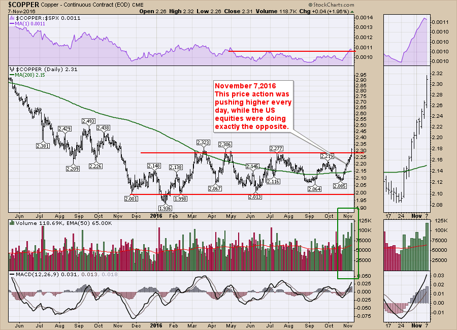
Copper has been frustratingly resilient to any of the 2016 bullish sentiment since the US Equity markets bottomed in January / February. Monday marked a new shine for $COPPER as it finally moved above the base.
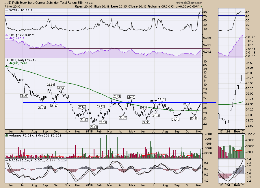
A few things have been working on this chart. The price action shows Copper pushing higher each day of the last 10 with steadily increasing volume. The Relative Strength line in purple broke to fresh 6-month highs. That definitely makes it more interesting. As a footnote, the MACD is not really showing us anything that jumps out as extremely bullish yet. However, a more engaged look will see a series of higher lows on the MACD with this recent bottom being very close to zero. If momentum can start oscillating above zero, expect a steady rise to continue. We can see the 200 DMA in green finally turned up creating a positive upsloping long term trend. This is also a nice example of a base being built and breaking out this week. We can see how the price action is changing relative to the long term moving average in green. It used to be below it, now it is mostly above it.
JJC is an ETF that tracks Copper's movements. I have inserted just a few of the trend lines that get broken as the base is being formed. First, the green downtrend is broken. Second, the orange trendline is broken as Copper retested the 200 DMA, but then in April Copper broke above the orange trendline again, pulled back to the 200 DMA, retested the highs (short red line there as well) and then fell all the way down to the bottom of the base. Over time, Copper ended up building out this blue triangle. A couple of weeks ago, Copper actually made a false breakout below the base, gapped up to get inside the triangle and has now broken out on the top side of the triangle. Emotional termoil for a technician.
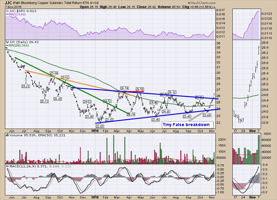 The difference for this breakout this week is it comes at an interesting inflection point relative to the equity markets. While the $SPX 500 had a losing streak 9 days in a row, Copper was climbing every day instead. If the breakout holds, there are a couple of clues that make this breakout different than all the previous trend line breaks. The 6-month high in Relative Strength (purple area chart above) is usually a clue that this is marking a longer term trend change. If we scan our eyes to the left we can also see that $26 was a support level on the way down. A cleaner chart could be created reflecting Copper's new found strength.
The chart below represents why relative strength is so important for new investors to learn. While Copper was trending lower in Relative Strength, it is helpful to see how this might continue and an investor should be cautious. When the Relative Strength starts to turn up, a 3-month relative strength high is a good clue. The next typical clue on RS would be 6-month highs and then the 12-month RS highs make us see the trend change.
 So is $COPPER guaranteed to go higher? No. But as $COPPER continues to outperform the $SPX, it draws other investors that are trying to outperform the market to it as well. This change in price behavior, relative to the $SPX is particularly important when the $SPX is headed down. If everything is going down and something continually climbs opposite to the $SPX, it is more likely that there might be something changing in the copper market.
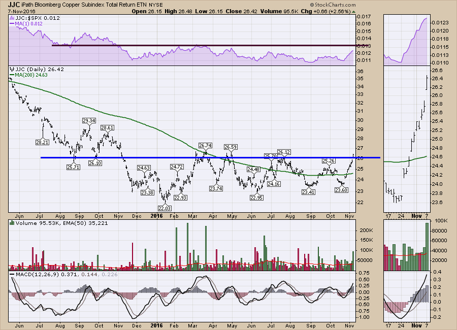
So which chart should we use above to base our RS conclusions on? Either the $COPPER chart or the JJC chart both show a similar change in RS. The tracking error of the ETF shows up a little bit more over a longer peiod. However, if $COPPER breaks to a new 12-month RS high, it looks like it will also break to a new 12-month price high which does not have to happen at the same time.
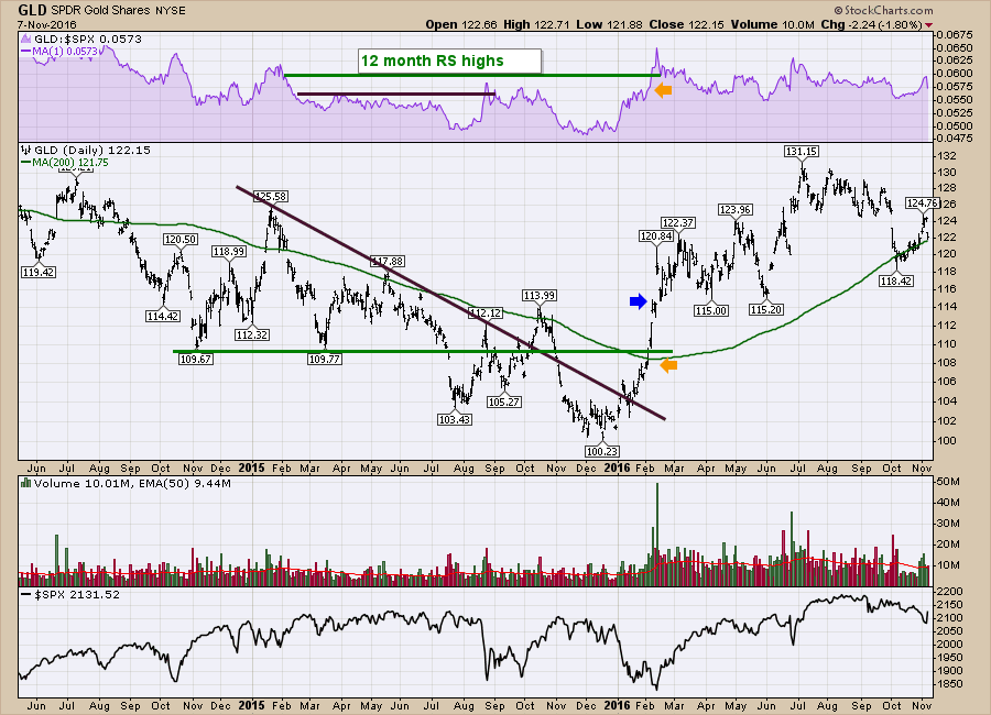
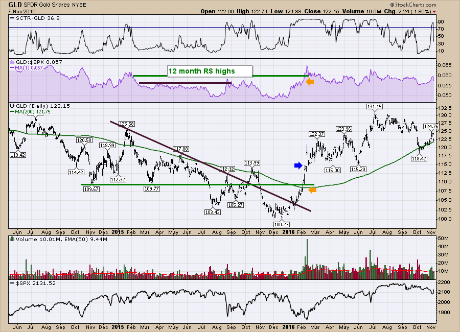
If we compare the GLD chart below, let's look at the technical differences on the RS information. I had to extend the time range of the chart below to 30 months to show the end of the downtrend so the horizontal scale is different than the Copper charts above.
The first 6-month RS high happened in the last week of August 2015, As the $SPX dropped (bottom panel) and GLD rose, the RS in purple soared to new 6-month highs for the first time in a while. I placed a brown line on the RS at that level. Looking at the price of GLD, it was not breaking the brown downtrend line and it was only at 1-month highs. GLD rallied above the trend line in October 2015, but the $SPX was rallying just as fast so the RS was not improving. Then in November GLD underperformed the $SPX so it broke down again. At the beginning of January 2016, the $SPX was in a big pullback, but GLD was rising above a 2-month base. As the $SPX dropped into February 10th, the orange arrows show GLD improving to 6-month RS highs but the price was only at 2-month highs. All of a sudden GLD jumped to 12-month RS highs, and the price was only at 3-month highs. Gold suddenly surged by 10% as investors flocked to something outperforming. As the RS continued higher, GLD finally broke above $114 at the blue arrow, marking 6-month highs in price. Not long after, it started making new 52-week highs.
So the point I want to make is that RS can help investors find new opportunities. Let me take it one step further. The natural question for a reader at this point is how can I look for strong relative strength? What tools do I have available? Do I need to write bunch of scans?
Actually the SCTR line does a really good job of pointing you to strong RS stocks and ETF's. I have shown it on the top of the GLD chart below. I like to add a line at 75 on the SCTR. I'll point out that GLD was just at 10 and soared to 90 in the past week. That makes it interesting. Just one number can help draw attention to what is working. So if you follow stocks and ETF's with a strong SCTR, it allows you to quickly see what is working. In GLD, the SCTR suddenly dropped yesterday but the RS is up near 3-month highs. Every trade needs to be managed, including those with strong SCTR's.
 Let's go full circle back to look at the JJC chart with the SCTR line. It is drawing your attention as it is above 75 for the first time since this whole base started. That makes it worthy of a second look.
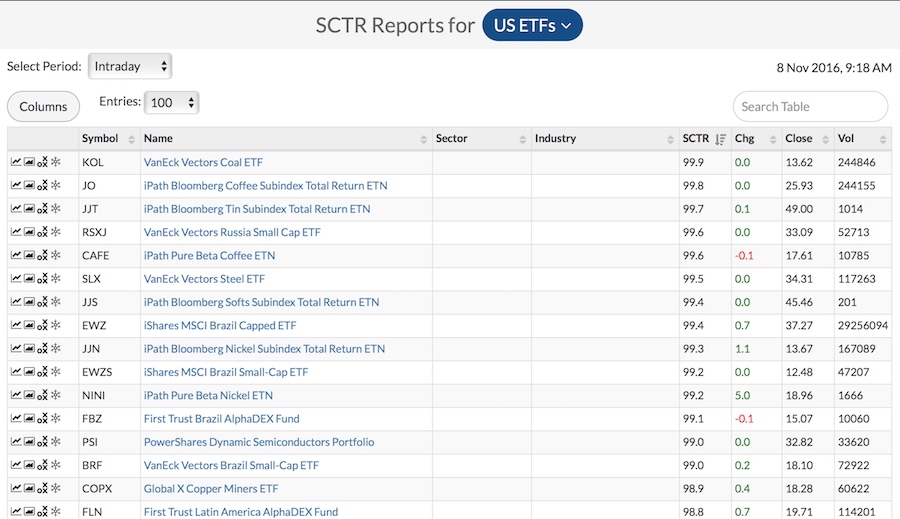
 So where can you find a list of top performing stocks and ETF's? On StockCharts new look SCTR table. Select ETF's from the big blue dropdown at the very top of the screen. The ETF's are ranked in order and a lot of the industrial metals are showing up near the top of the list.
Lastly, Julius de Kempenaar, President of RRG charts, created a beautiful graphical way to represent the improvement in relative strength. RRG Chart. Click on the link, one the right-hand-side, click on 'max' and then click animate. This shows you the leading edge on the blue box in the upper right corner. The moving blue pane shows the tail length for the last ten weeks. It is a great graphical representation of the improvement in momentum and relative strength. I would strongly encourage you to read the ChartSchool article RRG as well as use Julius's blog for using the RRG. RRG Blog.
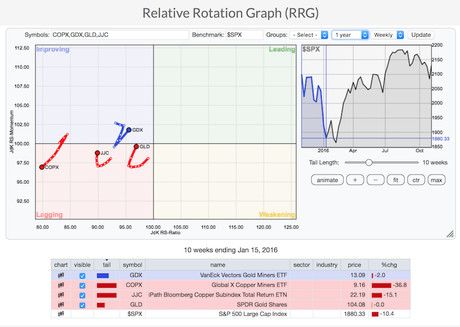
Hopefully I have explained the concept of relative strength. I am still of the opinion that the $USD is going to start trending higher. That makes this copper trade complicated because commodities usually go down when the $USD goes up. But that's tomorrow's battle. At this point the industrial metals are pushing higher and Copper is one of them. I used JJC, but we can see the Copper miners ETF COPX is already at 98.9. That is a strong level to help us know where to look to at least start rolling through these charts.
I'll be hosting a webinar with Martin Pring this afternoon. Martin is currently more bullish than I am on the big picture. I would encourage you tohear what he has prepared. You can listen in by following this link. Martin Pring's Market Roundup 2016-11-08. I'll be hosting a Commodities Countdown webinar on Thursday after the election results are tabulated and a few days trading have passed. It should be an important time in the markets. Commodities Countdown 2016-11-10.
Good trading,
Greg Schnell, CMT, MFTA.