 Market action has been volatile but sideways. It's killing our shorter-term indicators and timing models. The DecisionPoint Trend Model generates BUY/SELL/Neutral signals based on the position of the 5/20/50/200-EMAs. When the EMAs have a thin margin between each other, the STTM, and even ITTM, will experience numerous signal changes in a short period of time. The Price Momentum Oscillator (PMO) during sideways price movement or steady movement in one direction or the other, will flatten it and cause it to fold in on its 10-EMA signal line which will also generate too many noisy signals. How do you turn down the noise? How can you evaluate an index or sector when timing models seem to be failing you? DecisionPoint has market indicators that you may not be aware of that provide a good solution. I think the best way to proceed is to use an example and run through the analysis process I use to help clear some of the confusion.
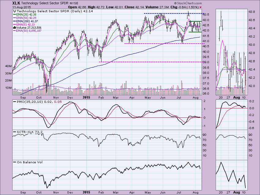
One of the best examples I can use right now is the Technology SPDR ETF (XLK). This ETF on its own has had the following signal changes this week alone:
Short-Term Trend Model
8/4 - Neutral
8/10 - BUY
8/11 - SELL
Intermediate-Term Trend Model
8/6 - BUY
8/7 - Neutral
8/10 - BUY
8/11 - Neutral
Short-Term Price Momentum Oscillator (PMO) Signals
8/4 - BUY
8/6 - SELL
8/10 - BUY
8/11 - SELL
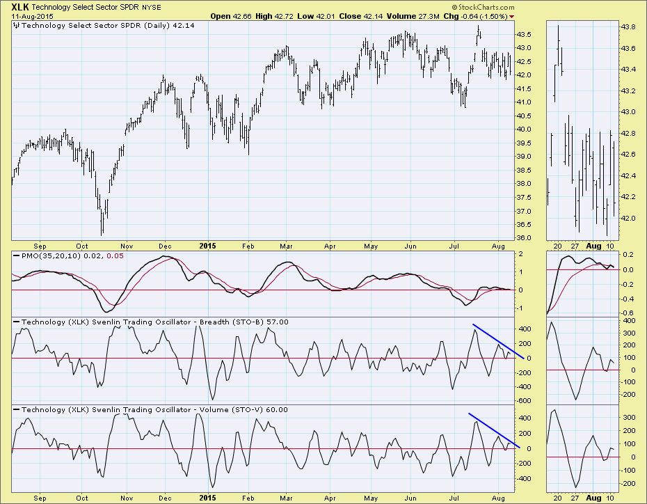
When you look at the daily chart, you can really only see the signal changes listed above by squinting at the thumbnail. The concentration of price into such a small trading range is what has wreaked havoc with the Trend Models on XLK. The EMAs are separated by mere one hundredths of a point. The PMO is noisy and flat, even in the thumbnail. There are negatives like OBV leaning toward higher volume on down days and current signals (today) are on SELL signals. Yet yesterday, all of these were mostly positive. Help is needed.
To find indicator charts to decipher XLK and the technology sector, you'll need to get the DecisionPoint Straight Shots ChartPack**. (Information on how to download a DecisionPoint ChartPack is here). Here is a snapshot of the ChartLists within that ChartPack. Notice that there are indicator charts for all of the indexes and sectors that DecisionPoint covers. Within each of these ChartLists are indicator charts that pertain to the index or sector that you select. (** Note: You must be at least an XTRA member to access ChartPacks)
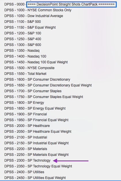
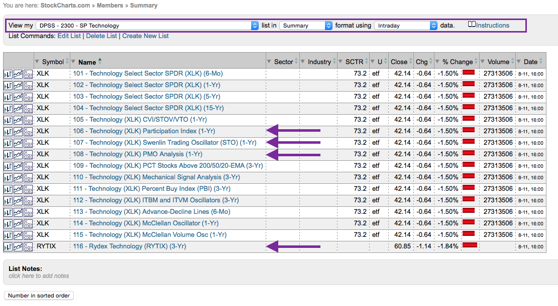
Once you've selected the ChartList, you'll see the following charts within, plus or minus depending on the available data that we have. I've highlighted the charts that I'm going to explore further.
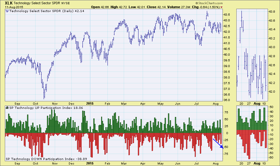
For information on the calculation of these indicators, please refer to ChartSchool and do a search on the term. The Participation Index - UP and DOWN basically measure how many issues participated in the price move. Notice that Participation Index - DOWN is expanding over time. This indicates a bearish bias.
The Swenlin Trading Oscillators (STOs) also appear to be leaning bearish. The lines I've drawn on these oscillators are to demonstrate direction, not resistance. The point is that these indicators have been trending lower and readings are not able to establish a clear up trend. Note also that both of these indicators are falling, another bearish sign.
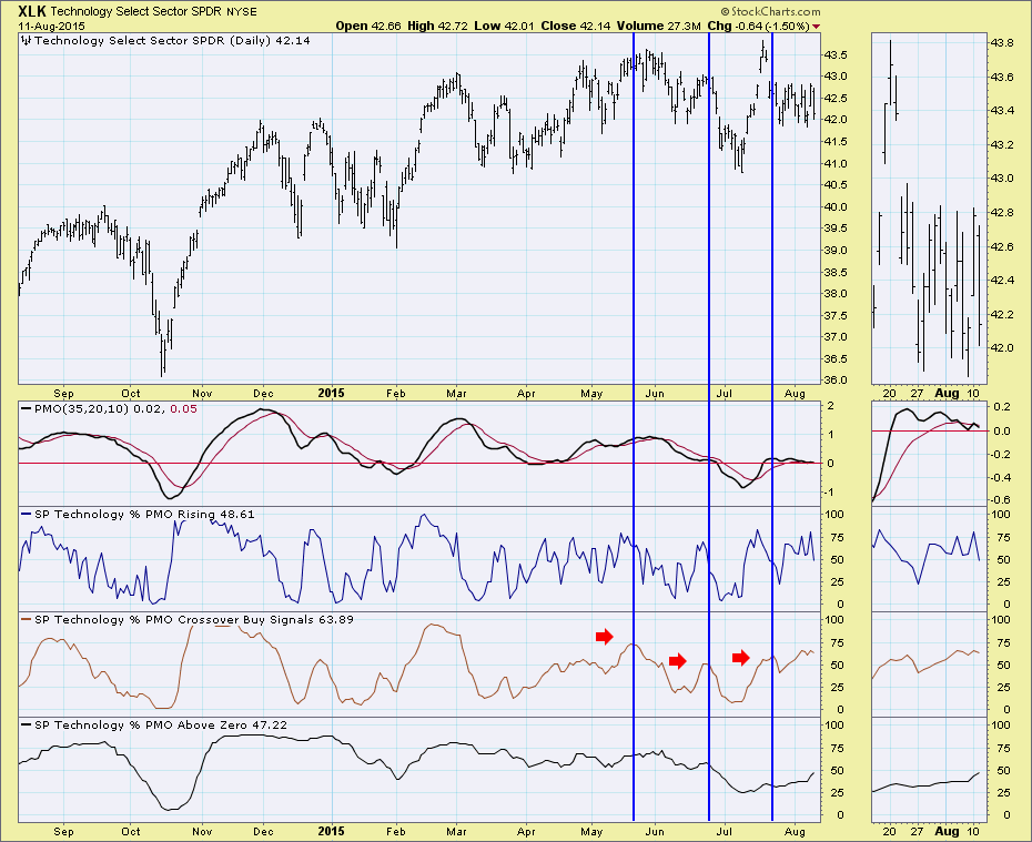
The Price Momentum Oscillator (PMO) Analysis chart shows three time frames. The first indicator under the PMO measures the percentage of stocks within this sector that have PMOs that are rising...the percentage that have positive momentum. This is a short-term measure. The percentage of stocks on crossover BUY signals is a medium-term indicator that tells us how many stocks have a PMO value greater than its signal line. The final indicator window is a longer-term measure. The percentage of stocks that have a PMO value greater than zero demonstrates how many stocks have been enjoying positive momentum long enough to move the PMO into positive territory. The peaks and troughs of these indicators are generally very helpful. The indicator of interest to me is the %PMO on BUY signals. Notice that when this indicator peaks, price tends to join. It appears this indicator may be topping.
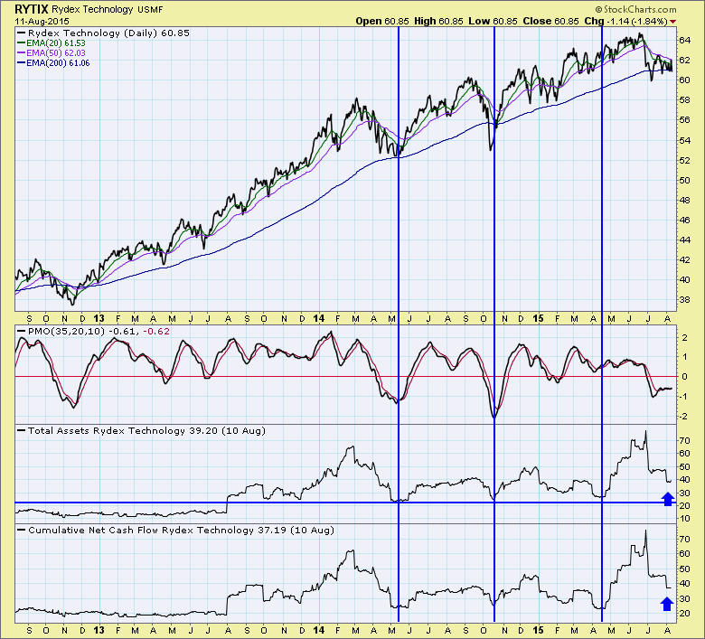
The final chart is particularly unique to DecisionPoint. We track the amount of assets every night of the major Rydex mutual funds. This chart shows when money is accumulating or flowing into this fund (and consequently sector). Notice that money is clearly leaving this sector right now, not a good sign.
Conclusion: You can still rely on the Trend Model and PMO to give an overall context to what the bull or bear bias is currently on a sector or index. However, when numerous signals seem to be popping up on the Trend Models or PMO, you can use the other DecisionPoint market indicators available in the DecisionPoint Straight Shots ChartPack to provide more direction. For information on how to download a DecisionPoint ChartPack, you can read this instructional article.