Despite wide swings in the US equity market the Relative Rotation Graph of sector ETFs will help you keep an eye on current sector rotation and point to favourable and less favourable sectors for the coming period.
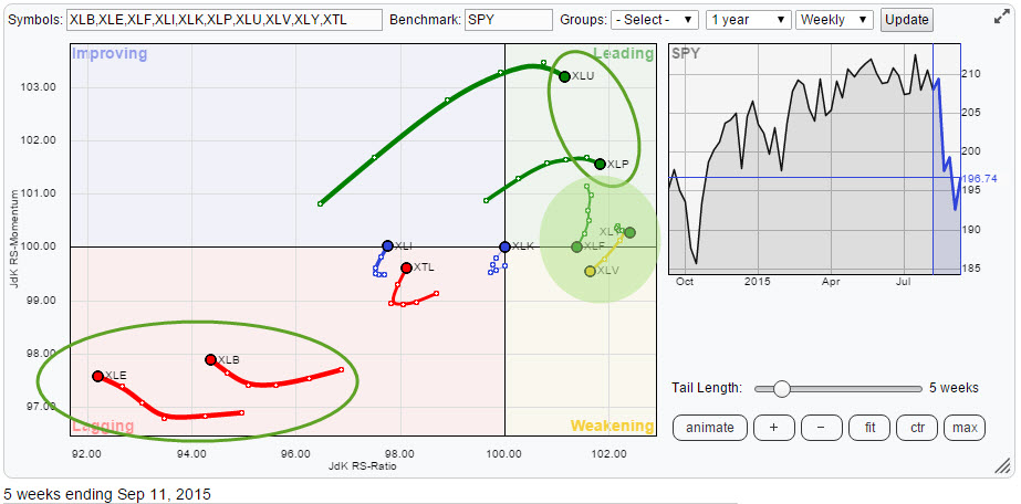
Initial observations
A quick scan of the above Relative Rotation Graph immediately reveals a few sectors that deserve some (extra) attention.
Standing out most, are the two sectors in the bottom left corner, XLE and XLB. Opposite in the leading quadrant, XLU and XLP are away from the crowd and demanding a little love for their charts. Finally there are a few sectors in the green shaded area on the right hand side of the RRG and close to the 100-level on the JdK RS-Momentum axis.
XLK, the Technology sector is positioned right in the centre of the chart with a very short trail which means that its performance is pretty much in line with the benchmark, in this case the S&P 500 index (ETF). XLI (Industrials) and XTL (Telecom) are 'hooking' upward which signals some improvement, but they are still pretty much inside the lagging qudrant and relatively far away from the 100-mark on the JdK RS-Ratio axis.
XLE - Energy Select Sector SPDR
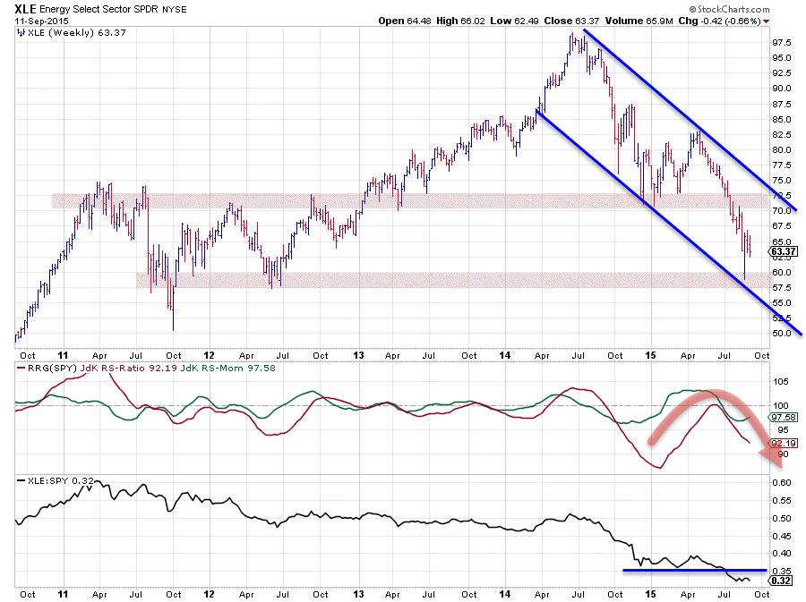
In the previous blog on US sectors XLE was still hovering above or inside the support zone (red shaded area on the chart) between $ 70 - 72.50. After the downward break of that level the decline started to accelerate and briefly the price even dipped below $ 60. During the decline we have seen a few up-ticks but they have not been material enough to turn the chart around again. As a matter of fact the down-trend in the energy sector has once again been confirmed.
The relative strength, tracked by the RRG-lines in the middle pane and the raw Relative Strength line in the lower pane, are not showing a much better picture. The positioning of the RRG-Lines, both below 100, positions the Energy sector inside the lagging quadrant on the RRG. Inspection of the sector on the Relative Rotation Graph itself even shows that Energy is the sector furthest to the left, lowest on the JdK RS-Ratio axis, which makes it the weakest sector in the universe at this point in time.
The fact that the trail is still moving left (lower on the RS-Ratio axis) indicates that money is still rotating out of this sector and it's better avoided for the time being.
XLB - Materials Select Sector SPDR
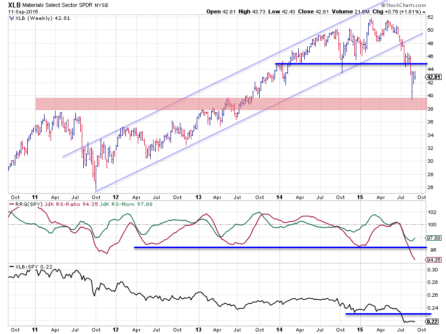
Just like XLE, following the previous blog on US sectors, the Materials sector (XLB) nose dived after breaking horizontal support in the $ 45 area. The downward acceleration triggered by the break even took the price below $ 40 for a brief period of time. The recovery out of this low did not even manage to crawl all the way back to the breakout level where we now may expect (major) resistance to kick in. This indicates that some serious selling pressure is available even at lower levels than $ 45.
The relative strength charts are showing a very weak picture. The RRG lines are both below 100 positioning XLB well inside the lagging quadrant and still heading deeper into it. The raw RS-Line dropped to the lowest level of the past five years (visible on this chart) but a longer-term version of this chart reveals that we even have to go back to the 2004 - 2006 period to find RS levels this low.
Some serious damage has been done to this chart and even if we get some upside price movement in coming weeks the $ 45 resistance level is expected to be a very heavy hurdle to take which means that upside potential will be (very) limited. Serious support which should be able to hold any further declines for now is found in the red shaded area between $ 38 - 40 which comes down to 7-12% downside risk with only around 5% upward potential. Definitely not a favourable risk/reward ratio.
A similar picture is visible in the raw-RS chart. The horizontal support level which was broken downward is expected to show up as resistance in case of any relative improvement while support is far away. Just like Energy, money is still rotating out of the materials sector.
XLU - Select Sector Utilities SPDR
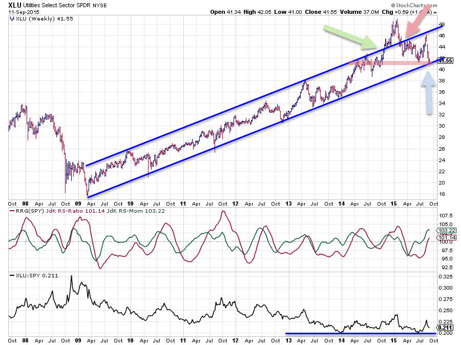
The chart above shows the complete up-trend in XLU since it started back in 2009. As you can see the rising channel is still intact with support being tested at the moment.
I have added a few arrows in the price chart to highlight a situation that often occurs. After having travelled its way higher within the boundaries of the rising channel XLU breaks above the already rising resistance line, near the green arrow. This type of break-out is usually a very strong sign and often leads to an even faster acceleration. This happened here too towards the end of 2014. Within a few weeks the price of XLU rallied almost 10%. After having set the high near $ 49 price starts to fall back towards the former rising resistance line which is then expected to act as support. As you can see that did not work very well and price dropped back into the channel. Such a drop back into the former rising channel usually leads to a further drop towards the lower boundary of the channel. This happened in late June for XLU when a low was set near $ 41, not quite AT the lower boundary but close. The next rally then behaved itself properly again by setting a new high against the rising resistance line, respecting the boundaries of the channel.
The recent decline and the fact that price once again reached the lower boundary of the channel is important now. Given the strength of the trend we should expect that another new low at the rising support line is in the making and that XLU will continue its way higher inside the channel. But keep in the back of your mind that "as-if-and-when" this rising support level breaks, it will be an important signal. Just to keep on the safe side I am watching $ 40 as support.
From a relative perspective Utilities are doing really well. In an environment where the S&P 500 dropped like a stone this sector held up well which immediately translates into a relative improvement. The raw RS-line is still hovering above a horizontal support level but the RRG-Lines indicate an underlying strength as both the JdK RS-Ratio line and the JdK RS-Momentum line are now above the 100-level and both are pushing higher suggesting that a relative up-trend is under way. This sector clearly benefited from the sector rotation out of energy and materials and can be expected to do so going forward.
XLP - Select Sector Consumer Staples SPDR
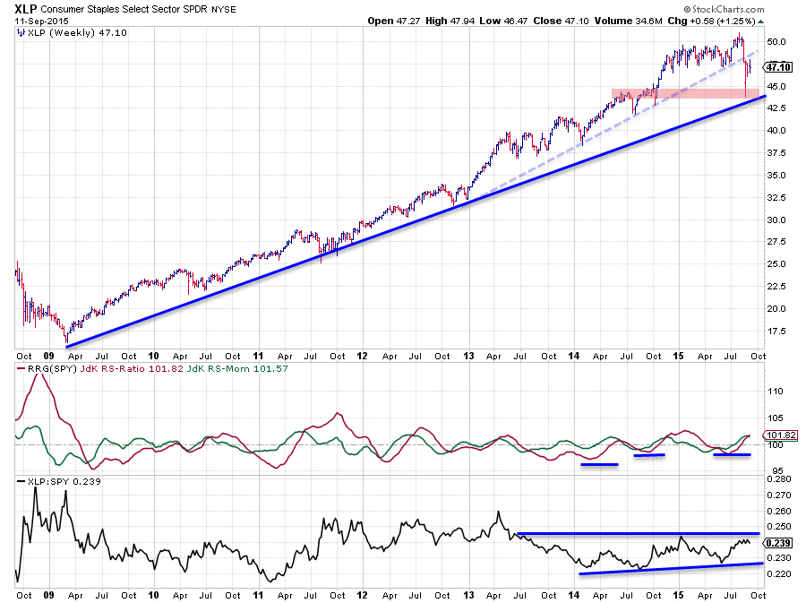
Depending on what investment horizon you are looking at the Consumer Staples sector (XLP) either just broke support (dashed light-blue line) or just tested support (solid dark blue line). However, either interpretation easily wins the "better chart" contest with the sectors we saw inside the lagging quadrant (XLE and XLB). This becomes visible when we look at the RRG-Lines and the raw RS-Line.
The RRG-Lines are both comfortable above the 100-level and thus positioning Staples well within the leading quadrant and still heading further right (up-trend in relative strength). The raw RS-line improved over the past few weeks but now needs to take the hurdle offered by the last peak that was set very early in 2015. Once that happens we can expect a rapid further improvement of the relative outlook for Consumer Staples.
The biggest problem for XLP at the moment is the fact that it just broke horizontal support around $ 47.50 which level is now starting to act as resistance and capping upward potential. This should not be a problem when the general market (i.e. S&P 500) continues to show weakness and XLP can manage to hold up above rising support in which case relative strength will continue to improve. Wait and see but for the time being Staples are steady inside the leading quadrant.
Further investigation of sector rotation
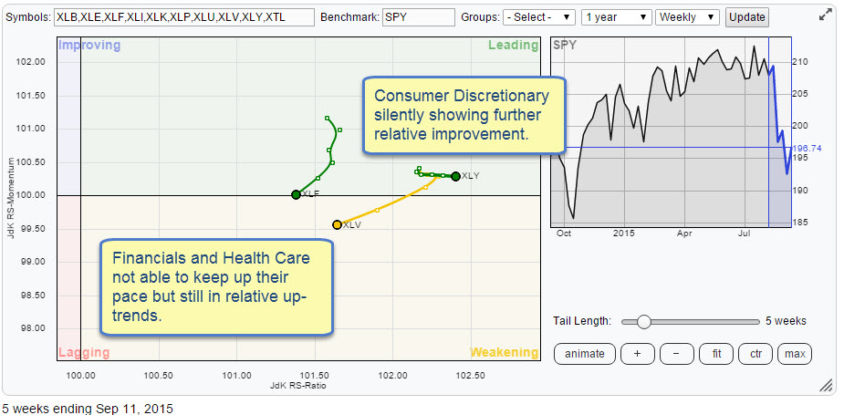
As I mentioned in the intro of this article I wanted to have a closer look at what's going on on the right hand side of the RRG (inside the green shaded circle). The RRG above zooms in on that area and shows the sector rotation of those sectors in more detail. As you can now, more clearly, see, the sectors in play here are Financials, Health Care and Consumer Discretionary.
A quick inspection of the XLF and XLV charts in combination with their relative strength charts reveals that the price charts have been damaged but their relative trends are, at least for the time being, still positive but losing relative momentum, JdK RS-Momentum falling and pushing the two sectors into the weakening quadrant. As these two sectors together represent around 30% of the total market cap of the S&P 500 this is a move you may want to watch. A continuation of this weakness will undoubtedly have an effect on the direction of the S&P 500 index itself.
XLY - Select Sector Consumer Discretionary SPDR
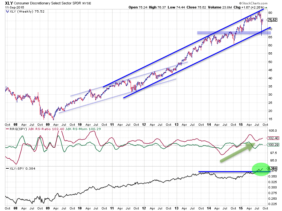
On the first Relative Rotation Graph, at the top of this article, the Consumer Discretionary sector was hardly visible. The reason for that is that it is showing a very short trail, in comparison with the other sectors, over the past five weeks. A short trail indentifies a stable position / move. And in this case it is a stable move inside the leading quadrant. The zoomed in RRG reveals what we already could imagine from the complete RRG, XLY is the sector with the highest JdK RS-Ratio reading!
The price chart above tells the story of its current trend, which is an interesting one. Most of the trends in the sector SPDRs evolve out of that 2009 low and work their way higher in a channel, more or less pronounced depending on the sector.
XLY also formed its bottom in early 2009 but the ensuing trend channel took some different routes since then. Initially in 2009 it was a clear up-trend following the definition "higher lows followed by higher highs" but getting a clear channel was difficult. It wasn't until 2010-2011 before some sort of a channel could be identified. XLY respected these boundaries, and worked its way higher, until late 2013 when the sector broke the already rising resistance line, just as we saw in XLU. Here also the sector accelerated higher but never dropped back into the boundaries of the "old" channel. Instead a new channel was formed running at a steeper angle and XLY is respecting this channel until this very day.
As you can see the sector is well above the rising support line marking the lower boundary which gives confidence as this trend is unlikely to be damaged by a few bad days or even weeks. All this price strength translates into the best relative strength line of all sectors against the S&P 500. As you remember we have seen a few RS-lines that are dropping to multi year lows, some even as far back as 2004-2005. XLY, however, is pushing to new highs and is doing so with confidence. The RS-Ratio line, already moving above 100 since late 2014 and currently still at the highest level in this universe, is expected to maintain its position in the weeks to come. For the time being any loss of relative momentum is expected to cause a rotation on the right hand side of the chart keeping the relative up-trend intact.
Conclusion
- Energy and Materials continue their weak relative trend deepr into the lagging quadrant
- Utilities and Consumer Staples moving in leading quadrant at a stable pace
- Consumer Discretionary silently moving higher on RS-Ratio axis and pushing to new relative highs making it strongest sector in the universe
Julius de Kempenaer | RRG Research
RRG, Relative Rotation Graphs, JdK RS-Ratio and JdK RS_Momentum are registered TradeMarks by RRG Research