Starting with the $BPCOMPQ chart, This chart pattern is currently mapping the same as the 2007 market top. Both the $BPCOMPQ presented in blue and the % of stocks above the 200 DMA ($NAA200R) look similar. We can see another 10% of the stocks fell below the 200 DMA from yesterday to today. The lime green line was based on Wednesday's close for the % of stocks above the 200 DMA. It has now been updated on all the charts for Thursday's close. Here is the link to the webinar. Commodities Countdown 20151112.

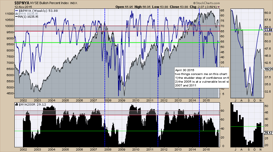
Here is the broad $BPNYA. This one looks even weaker and is similar to the May 2008 rally. As we can see, the $NYA200R looks very similar to the bear market periods.
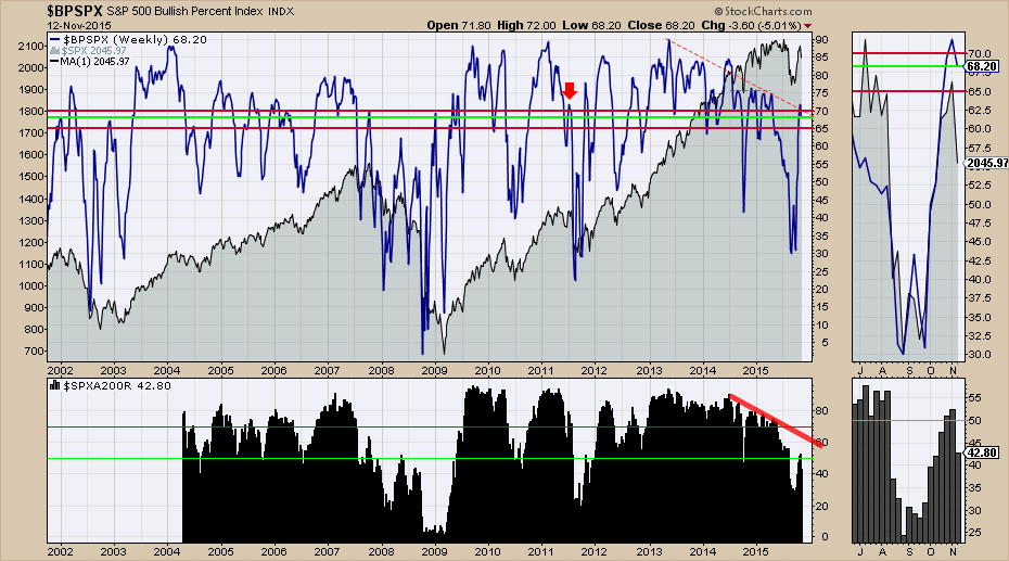
Here is the $BPSPX chart. It also looks similar to the October 2007 signals. This topped out at 70% on the $BPSPX in 2007 and seems to have topped out there currently. We can see the % of stocks above the 200 ($SPXA200R) is even weaker than 2007.
In tandem with the charts I posted in my article on Thursday, this information looks very similar with how the market topped in 2007. Using the three different methodologies, they all point to similar action to the 2007 top. That article can be found here. Staring At A Market Top.
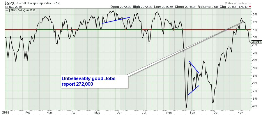
The $SPX closed negative on the year today. Here is a performance chart that shows a negative return so far. This is a daily chart and we can see the market was only able to hold the final high before the August breakdown for 2 days. However, the timing is critical because the NASDAQ 100 ($NDX) broke out and failed after two days of making a new high. This failed breakout, complete with non-confirmation from the $RUT, $COMPQ, $SPX, $NYA are very important failures. This was a major component of the webinar if you wanted more information. Commodities Countdown 20151112.
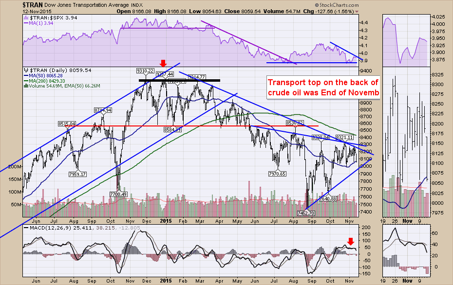
Here is the $TRAN chart. It has spent almost a full year going lower from the high of November 2014.
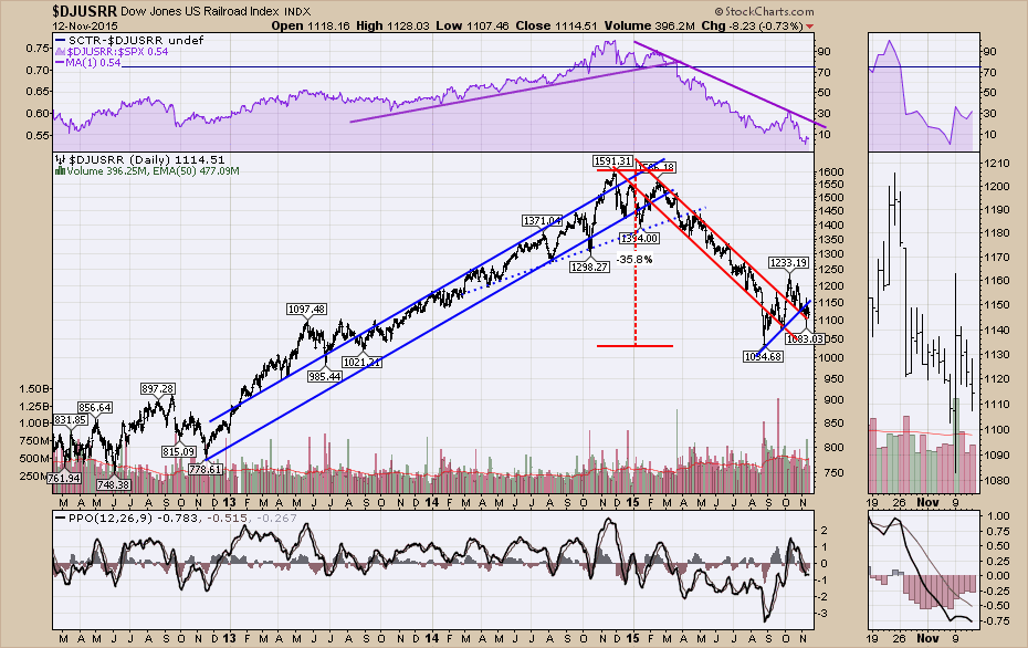
Here is the railway chart. We can see the railways have recently broken their uptrend line shown in blue at the bottom of the long downtrend.
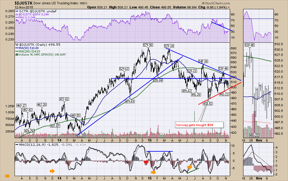
Here is the chart for Trucking ($DJUSTK). Considering we are heading into Christmas, this chart has been working lower all year. Why are the retail stocks breaking down? Why is Maersk laying off people and parking ships in the busiest season of the year? I covered a lot of the correlations in the webinar. The linkages are very significant. Commodities Countdown 20151112.
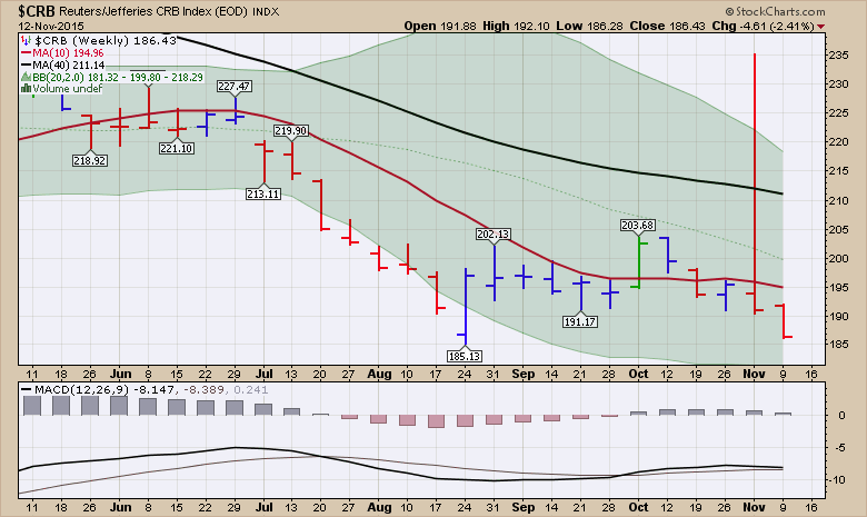
Lastly, is one of the major commodity charts ($CRB). If it closes at the same level as Thursday it will be the lowest close since 2001 for commodities. This deflationary environment continues to approach the 40-year trend line at 181 which is very concerning. The August 24th week closed considerably higher on the candle.
There is so much more including the Gold and Silver charts. I also explained why every chart from the bond area seems to be very interesting right now. Commodities Countdown 20151112. Lots to consider. I closed the webinar with why I am bearish and what it would take to change my mind at this point.
Good trading,
Greg Schnell, CMT