It's time to take a new approach to the stock market. There are plenty of times where it's just "rinse and repeat" and we use the same old strategies we've always used. Well, those days are gone. For me, it's been about trading only companies whose management teams are executing their business plans. That has meant that they've delivered on their revenue and earnings per share (EPS) promises and their charts are technically strong. As I look forward, I could see the best trading opportunities being companies that currently don't meet one or both of these criteria.
I watched the market yesterday and wasn't too surprised to see the S&P 500 leaderboard. Here it is:
Check out the industry groups. Recreational services (cruise line). Gambling. Airlines. Integrated oil & gas. Hotels. These are the WORST groups in the market right now. So why did they bounce? Well, for market makers, it was like eating Lucky Charms. They were magically delicious. Yesterday was options expiration day and I cannot begin to tell you the enormous value of net in-the-money puts that were on the table at the start of the day. But I can tell you this - there was a lot less by the end of the day. Market makers turned into bank robbers for a day. They do this every month and if you don't understand the concept, be sure to check out the webinar that I'm hosting later today at 2pm EST. Details are at the bottom of this article.
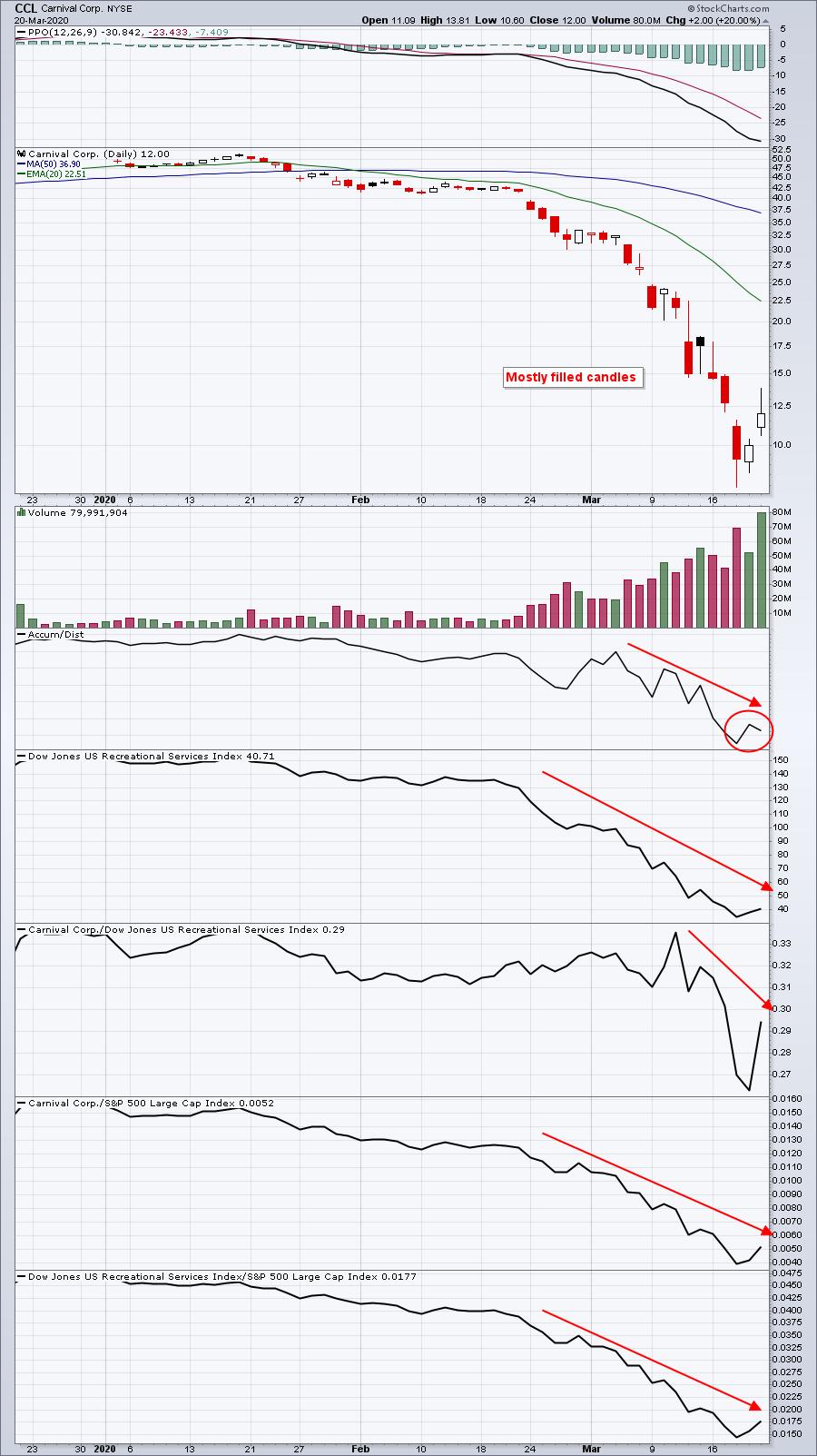
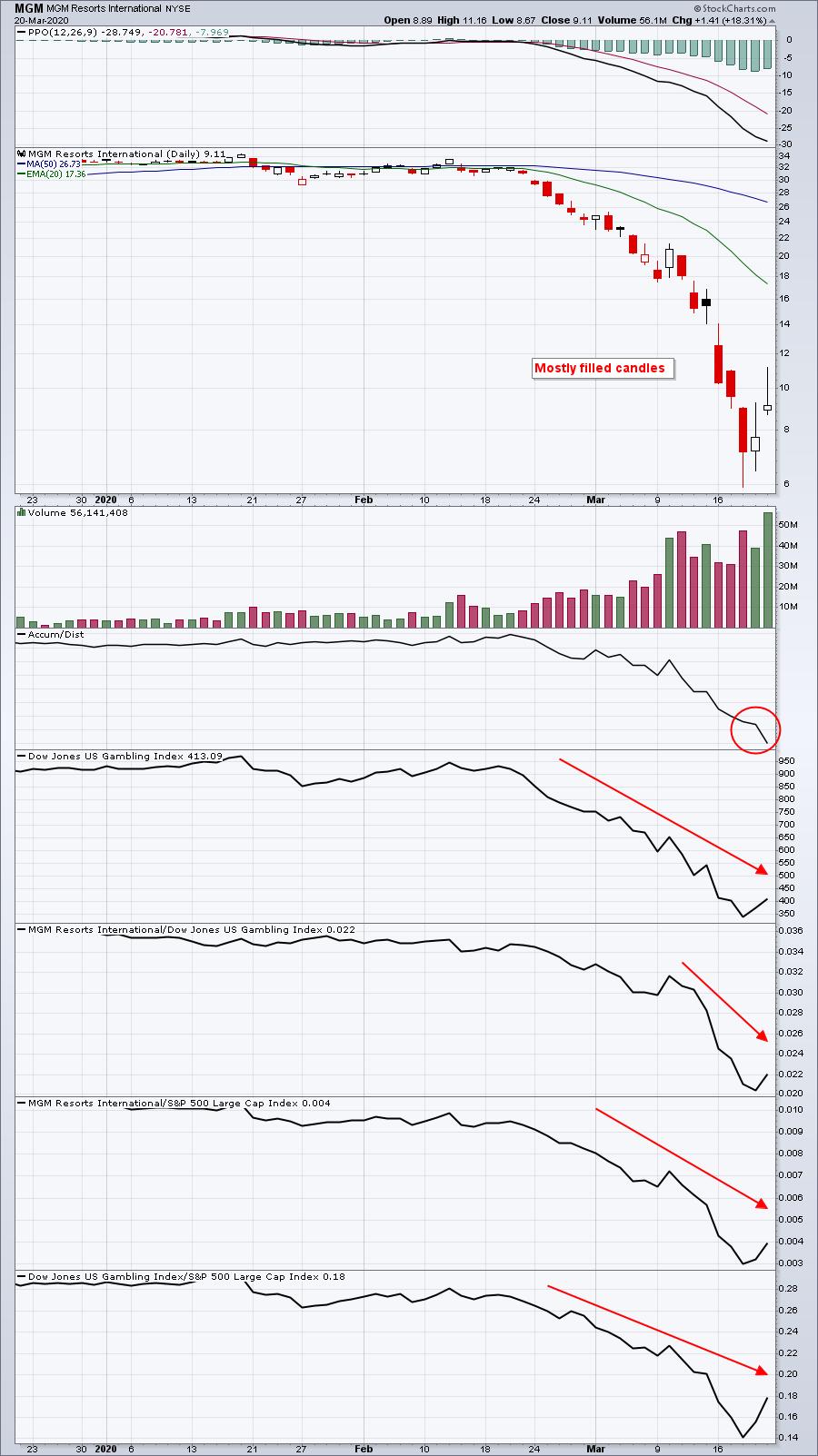
I would be extremely careful with this list of S&P 500 "winners." I want you to look at the charts of three of the four leaders - CCL, MGM and UAL, which have SCTR scores of 2.2, 3.2 and 2.4, respectively. These are very badly beaten-down stocks that have been heavily distributed. Check them out:
CCL:
MGM:
UAL:
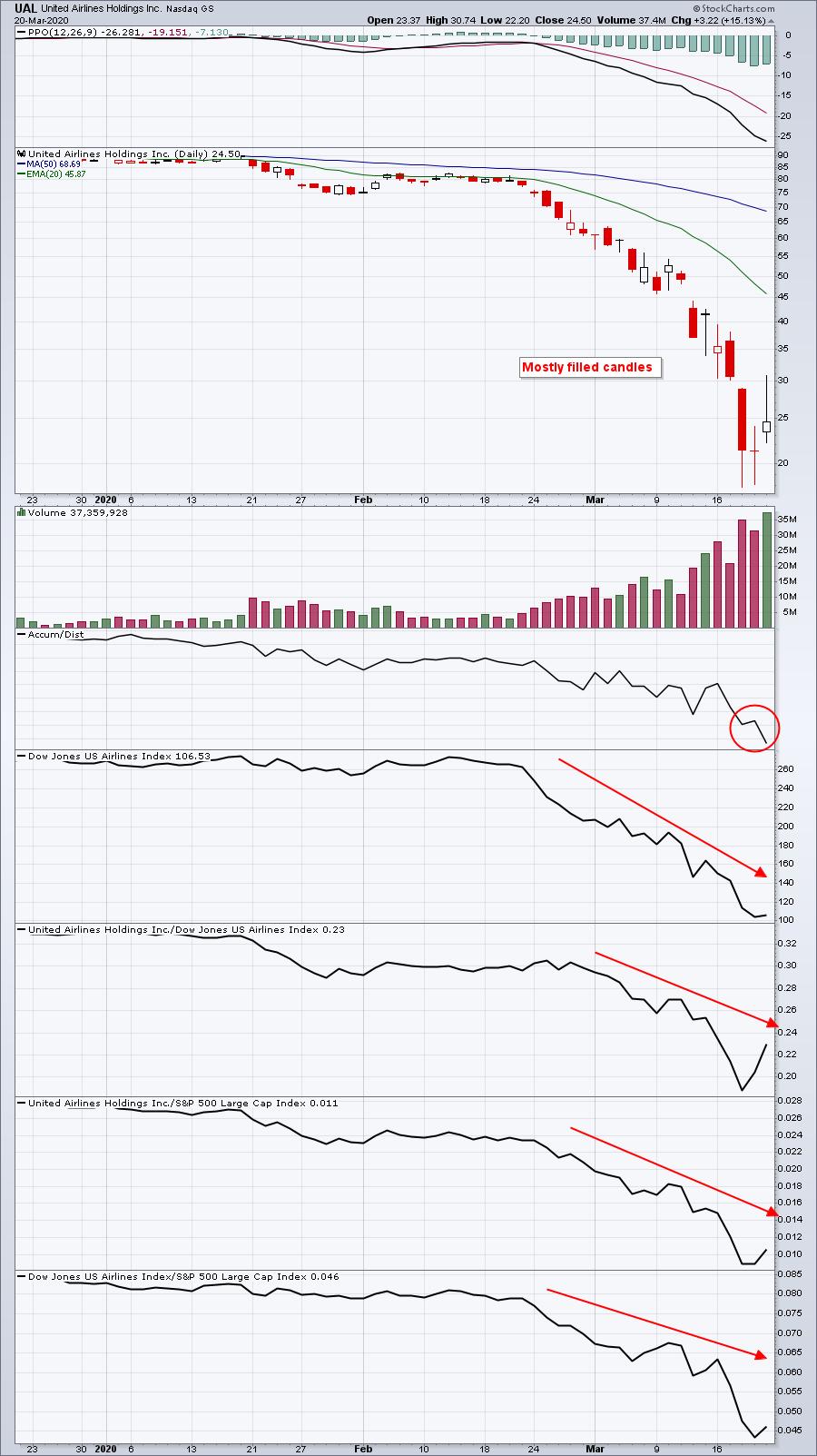
These three charts look remarkably similar. Wall Street is trashing them. It's not necessarily their fault, but they belong to industry groups that will likely require bailouts to survive COVID-19, unless a quick discovery is found to successfully treat patients. A long, drawn-out process, awaiting an approved vaccine in 12-18 months, would very likely result in business failure. As a result, in all three charts above, we saw short-term recoveries as options expired. There was financial incentive for market makers to drive these stocks higher late in the week. Tesla (TSLA) was another perfect example of options manipulation; I wrote about it in my Trading Places article on Friday.
For those of you that follow my work, I've made a change on my default chart. Have you noticed it yet? The RSI has been replaced by the accumulation/distribution line. Given the current market environment, I believe the latter is a much more important tool. We've been watching a ton of gap downs in equities over the past month. Futures have seen multiple lock limits to the downside and we've witnessed multiple circuit breakers trigger in early action. Just about every stock is opening lower each day, but many stocks are diverging after the opening bell. Here's a "Did You Know?" fun fact for you:
Did You Know.....that if you (1) started with $100,000 portfolio, (2) remained in cash overnight every single trading day since Friday, February 21st, (3) invested your entire portfolio in the QQQ at the opening bell every trading day since Friday, February 21st and (4) sold your entire portfolio in the QQQ at the closing bell every trading days since Friday, February 21st, that you'd now have a portfolio worth $100,736.96? That total is AFTER a $6500 drop on Friday. In other words, much of the damage is done at the opening bell. After the opening bell, however, there's been a TON of rotation and that's where the accumulation/distribution line comes into play. That indicator provides us an analysis of what happens to a stock after the opening bell!
Let me give you an example of a stock that's been going down, but shows that it's being accumulated on the move lower:
WORK:
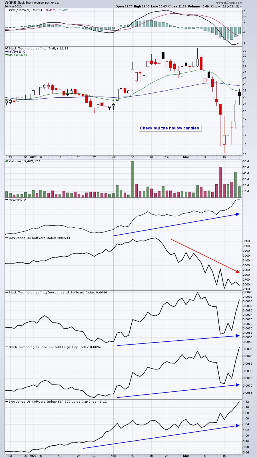
Software ($DJUSSW) is going down on an absolute basis, as is WORK. But the difference here vs. the other three charts above is that during the trading day, the accumulation/distribution line is telling us that this stock is being BOUGHT, not SOLD.
Folks, there's a paradigm shift in play here. I announced a webinar for this afternoon at 2pm EST to discuss the above and many other topics (like finding companies that could thrive given the new social distancing that will be required) so that we can better prepared to handle what we're going to face in the next several months. Many of us are mostly confined to our homes to conform to the new "social distancing" requirements and likely will find that you have plenty of time on your hands. For me, there's no basketball March Madness, so I'm turning my attention to Wall Street March Madness. If you'd like to join me today, CLICK HERE for more information.
Wishing everyone a safe journey in 2020 and beyond!
Happy trading!
Tom